Here's a short animation I produced over Christmas that uses recursive patterns to produce an interesting effect.
The music's "Decisions, Decisions", something I wrote around 1992.
<
Here's a short animation I produced over Christmas that uses recursive patterns to produce an interesting effect.
The music's "Decisions, Decisions", something I wrote around 1992.
<
I will be one of the panellists at the third Eye Forum being held at London College of Communication on 22 January.
If you've got a question on the topic you can email it to the magazine or contribute from the floor on the night.
If you're coming along, let me know!
Eye Forum no. 3: ‘Design and education’
The third Eye Forum promises to be the best yet, so we hope you can come. The Forum takes place at the London College of Communication (LCC) on Tuesday 22 January at 6.30pm. Please come along to debate some of the ‘burning issues’ in design education, together with broader issues such as recruitment, lifelong learning, design literacy and the role of self-taught designers. As before, after the main event in the lecture theatre, there will be drinks, canapés and plenty of time to network and socialise.
There’s plenty to talk about, so we are again inviting delegates to submit questions – in the manner of the BBC’s long-running TV show Question Time – which can be short or long, plain or nuanced, serious, heartfelt, flippant or funny. And this time, I'd like to encourage delegates to read their questions from the floor. The chair will open up each question to the audience, so that everyone is free to join the debate, and to challenge or develop points made by the panel.
Please get involved.
To submit your question(s), email eye.freelance@haymarket.com by 7 January 2007, or add them to this blog.
Here are some of the ‘burning issues’ already suggested for the Forum:
* Standards: is everyone speaking the same language?
* Do educators select students on their mark-making ability – at the expense of communication?
* Do employers regard new talent as a renewable source of cheap labour?
* Is design art? Is it time to separate the two?
* Is it important to have a visually literate nation (in a post-literary world)?
Our distinguished, expert panel will comprise:
- Jonathan Baldwin (design historian and lecturer, University of Dundee),
- Jamie Hobson (head of marketing and admissions, London College of Communication).
- Lesley Morris, (Design Council),
- Tim Molloy, (head of design, Science Museum)
- Simon Sankarayya (art director, AllofUs)
- The chair will be Alan Livingston (principal, Falmouth College of Arts)
Please come along to join us for ‘burning issues’ and warming drinks on a cold night - Tuesday 22 January 2008.
To book your place, email clare.mcnulty@haymarket.com, call 020 8267 4804, or go online Tickets cost £30 (£25 students) including wine and canapés.
Be seeing you
John L. Walters, editor, Eye
The sponsors for this Forum are Represent, the bespoke recruitment agency and Quark.
There's a great (and somewhat worrying) article over at The Guardian about a forthcoming documentary on one of my favourite composers, Ralph Vaughan Williams:
One of television's most imaginative film-makers has condemned Mark Thompson's leadership of the BBC as a 'catastrophe' and accused the corporation of undermining its worldwide reputation by insulting the intelligence of viewers.
Tony Palmer, who has won more than 40 awards including Baftas, Emmys and, uniquely, the Prix Italia twice, criticised the director-general after the BBC turned down a documentary of his. The film, about English composer Ralph Vaughan Williams, has been produced by Five instead.
Palmer said he received an extraordinary rejection letter from a BBC commissioning editor explaining that, 'having looked at our own activity via the lens of find, play & share', it had been decided the film did not fit with 'the new vision for [BBC] Vision'.
Bizarrely, Palmer said, the letter concluded: 'But good luck with the project, and do let me know if Mr. V. Williams has an important premiere in the future as this findability might allow us to reconsider.' Vaughan Williams died in 1958.

InterSections podcasts are starting to appear - essential listening for anyone interested in the future of design.
The conference was a gathering of hundreds of designers and design users to talk about how the different disciplines are breaking down traditional barriers and contributing meaningful solutions to real problems.
If you ever used AOL back in the 90s (I was a Compuserv user - same sort of thing) this video will bring back painful memories of not being able to use the phone and the internet at the same time, life before the world wide web, hourly charges, annoying 'friendly' voices and 'channels'.
A student on the Institute of Design's Masters in Design Methods writes:
Many people still think of design in terms of creating logos (graphic), cars (industrial), or the good ol' haute couture (fashion). These all fall under the broad umbrella of big D Design, but for a marketing manager at a Fortune 500 to leave to work on what many envision is a degree in making logos and pantsuits doesn't really make sense to a lot of people. So to make sure they don't have a mental image of me appearing on Project Runway, I inevitably fill in the pause after 'That's cool!' with a five-minute explanation of what design-centered thinking, planning and strategy is, how that leads to innovative products, services, business models, and ultimately revenue to a company, and how it's the Future of Business, and that programs like ID are years ahead of mainstream business, fancy MBA programs and super narrowly-focused 'design as a trade' schools. Not surprisingly, I often end up boring people. In fact, I might have just lost some of you readers.
Therefore, I thought I'd try my hand at writing up a brief explanation of design in the context of the program I'm attending. A quick way to get the gist across when I tell someone what I'm currently up to. Here it goes:
Design is a strategic way of thinking that places the user at the center of all decisions, using an iterative approach to deliver on unmet needs that creates real value for users and thereby for the organization.
Does that work? Is it too light on conveying the power of design? Is it too vague? What do you think?
This video of Bruce Nussbaum (from here) is interesting for several reasons, but it really strikes home with me for one in particular.
About a year ago I went to a teaching and learning event in Dundee which attracted colleagues from all over Scotland. The event was quite successful with people being quite imaginative about changing the way they teach design, and approach the subject.
But late in the afternoon the discussion turned to the environment in which we teach. It was suggested that the traditional art school, with its plaster cast statues everywhere, its portraits of famous designers and pictures of 'classic' designs, sent out completely the wrong message to students in the 21st century. Why not replace the sculptures with plasma screens showing what was going on that day, or showing video of design in action? The presenter went on with some pretty good ideas for turning design schools in to modern, energetic environments rather than fusty old museums to the 19th century way of doing things.
Somewhat predictably, the idea was shouted down pretty vociferously. A colleague from an august institution in a city that rhymes with 'has go' went quite pale at the suggestion. "Those statues are what tell a student they're entering a place of creativity" he said. "They're inspirational".
Really? I found them quite off-putting. Certainly I wouldn't walk in to some of the design schools I've visited and think "wow, this place is forward looking - this is the place for me to learn how to innovate and tread the cutting edge". Instead I'd think "blimey, I've walked through a time warp".
The equivalent of Nussbaum's swapping of the CEO's photos would be to rip down anything that spoke of the past without criticism, and replace it with images of the present. And not 'great' design - 'crap' design.
Get rid of the photo of the Bauhaus founders and their chairs and lamps. Get rid of the William Morris prints and furniture. Throw away the plaster cast sculptures and the Neville Brody posters.
Instead lets get photos of children learning in schools that haven't been updated since the 1960s, of people using cars that are creating smog, of kids slaving away in China to produce the textiles we design, of towns gridlocked by congestion, of factories blotting out the sun, of people waiting in villages for buses that never turn up, of individuals in wheelchairs who can't get into places they should be able to get into, of farms that have been rendered barren because the dye from the local denim factory has left a thick crust everywhere...
Those are are the questions we face as designers, the challenges. And through the door, on the courses, would be the answers, taught by people who are angry that the world is the way it is and determined to educate the people who will change it. Screw 'employability' if by that you mean entry level jobs just repeating the mistakes on that wall of shame. We shouldn't be happy if our students get jobs like that, we should be ashamed.
It's the only way to change the mindset of those who practice, teach and study design. Stop looking to the past and start looking to the present and the future.
Richard Roty on Foucault's (inadvertent) influence on English departments:
"I think that the English departments have made it possible to have a career teaching English without caring much about literature or knowing much about literature but just producing rather trite, formulaic, politicized readings of this or that text."
(Via Foucauldian Reflections.)
In my first job I occasionally had to spec up interiors for photo shoots for bathrooms and kitchens. It was an interesting process, especially if I got to go to the shoot (though we had a ban on the use of models, so no fun there I'm afraid!)
When cleaning out an old filing cabinet I found an ancient catalogue from the late 70s, full of brown and 'avocado' bathroom suites (and, much to my annoyance, the occasional half naked model - why were the 90s so prudish??). The interiors and the kitchen and bathroom suites were awful, much like those presented on Eurobad '74 "an exhibition of Europe's worst interiors of 1974".
Some of these, if you still have them in your home, are probably fashionably dated now. I think I developed my hatred of brown and orange from having to grow up in the 70s. Never mind, the 80s would bring rescue in the form of... grey.
Incidentally, one little snippet of info I can bring you from my experience in the plumbing trade is this: the most popular choice of bathroom suite colour is... white.
Via It's nice that. (a site run by two of my former students, incidentally!)
Jeremy Mulvey (Cambridge School of Art) on the drawbacks of the traditional art education model:
Unfortunately ... there were a number of key problems... The new empty curriculum and emphasis on the student’s subjective responses left the staff with the problem of how to teach such a course. … From what others have told me, it is clear that some tutors found effective ways of teaching the new open curriculum and of encouraging students to flourish, students mostly unfamiliar and unprepared for such a style of education. But I think these tutors were few and far between, certainly in the early days.
For the most part, it seems, the staff, bereft of a coherent teaching strategy for the new curriculum, fell back on a number of tactics. Firstly there was the ‘macho crit’. The students would be allowed to do what they wanted for a few weeks. Then towards the end of each term there would be a big gathering of staff and students. The students’ work would be examined in front of the others and clear examples of success and failure pointed out to the year group. It seemed that the educational idea underpinning this was that a hard-hitting attack would encourage the students. Angry observations and insults were exchanged. It could be frightening.
According to Roy Trollop, who was a student in the 50s at St Martins Art School and who later became Head of the Fine Art Department at Central St Martins School of Art, the first ‘macho crit’ was imported from the United States in 1963. An American abstract expressionist came to St Martin’s Art School to show his art and stayed around to discuss the students’ work. He launched into a scathing attack on the work as a whole and any individual who contradicted him. …
Clearly, a number of tutors saw in the performance that took place that evening in St Martins … something very potent. It offered them a useful way of containing the daunting freedom that students and staff encountered as a result of the new curriculum. … I suppose the ‘macho crit’ was meant, at best, to be a bracing experience. At worst, it could feel as though you had got caught up in a modernist boot camp.
Another tactic was ‘huddling’. There was a significant level of alcohol dependency amongst most of the tutors I came across. Discussions about aesthetics would transfer from the studio to the college bar or a nearby pub. Often the topics were complex to begin with but got cruder and more heated as the evening wore on. I suspect these occasions could be very useful opportunities for gaining insights if you got invited to them. But a degree of huddling took place: only students the staff felt comfortable with were taken along. More importantly, these ‘fatherly chats’ or ‘family rows’ meant that the tutors were undercutting the potential openness of the new fine art course by trying to mould students in their own image.
The onslaught of identity politics of the 70s and 80s dented this form of cloning a little. Alcoholism in art schools diminished for some reason in the late 80s, and as it did the occasions for huddling became fewer.
The notion that teaching staff’s job was to identify the students as ‘exceptionally talented’, ‘talented’ or ‘not talented’ was still prevalent in the 60s. A greater clarity about the universality and flexibility of human creativity emerged with post-war psychology and sociology. This greater understanding began to take hold in higher education in the 80s and increasingly marginalised the practice of ‘labelling’ students. The ‘open model’ of the fine art curriculum inherited this practice from centuries of art teaching. Moreover, the idea of teaching as a process of selection and grading of people rather than performance was contrary to the democratic spirit and thrust of the post-war education agenda.
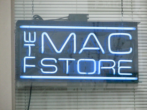
This new logo for Wacom has apparently been designed by Wolff Olins, creators of the appalling 2012 London Olympics logo.
Mmm... time to let the work experience school kid go, and bring the proper designers back?
The Crisis of Success in Design/Innovation.: "I'd like to speak tonight about a crisis—a crisis in design. Of course, design has had many crises. There was the crisis of acceptance. Business just wouldn’t give respect to design. There was the crisis of money. Designers were paid miserably for their work. Then there was the bubble crisis. Tech collapsed and work disappeared.
Today, we have a another crisis—the Crisis of Success. Everywhere in every sphere, people are asking the question, Can Design Help? Why is the answer to so many problems today design?"
(Worth reading in full.)

From The Guardian, 16 October 2007. Click the image for a larger version.
Diplomas could become the 'qualification of choice', says the Schools Secretary Ed Balls, raising the prospect they will replace A-levels.
Mr Balls has announced new diplomas in academic subject areas - science, languages and the humanities - for 14-19 year olds in England.
[...]
Diplomas, a new type of qualification intended to bridge the divide between academic and vocational learning, are to be initially introduced from next year, in a limited range of vocational subjects.
[...]
'If diplomas are successfully introduced and are delivering the mix that employers and universities value, they could become the qualification of choice for young people,' said Mr Balls.
[...]
The success of diplomas will depend on how they are recognised by employers and universities - and Universities UK stressed that the new qualifications will need to 'genuinely provide an appropriate progression route on to higher education'.
A statement from the Russell Group, representing leading universities, also cautioned that 'we are concerned to ensure that the diploma sufficiently equips candidates with the skills and knowledge they need to flourish on our courses'.
There have already been 14 diploma qualifications announced, with the first five - construction and the built environment, creative and media, engineering, information technology and society, health and development - beginning in autumn 2008.
All of the diploma qualifications will include a basic skills element, in English, maths and information technology.

Ecolect is a new and interesting site dedicated to sustainability. It contains lots of news and resources that should be useful to anyone (and why isn't everyone?) interested in sustainable design.

Apple announced the release of Leopard, the new version of the Mac OS, this week.
What hasn't got so much attention is 'Leopard Server' which has two features that make it particularly appealing as an educational tool.
The first is 'iCal server' (above) which seems a simple way to handle room and equipment bookings in a transparent way - anyone with iCal or a standards-based calendar program could see when that data projector was being used, for example, and by whom.
But here's the potential killer: a Wiki server.
Most wikis suffer because they look awful and are really tricky to edit, but Apple's solution looks like it has great WYSIWYG editing tools. The potential for collaborative research sites, student writing/research and VLEs is massive - I can see this being much better than systems like Blackboard, for example.
Worth checking out if you're into that sort of stuff.
Two bits of interesting news today from the BBC. Firstly, BBC content will be available free of charge from some wireless hotspots in the UK. And secondly, thanks to a deal with Adobe, it looks like Mac and Linux users will be able to use the iPlayer to download programmes, something that only XP users have been able to do.
Except...
But Mr Highfield [the BBC's director of Future Media and Technology] said the BBC had not committed to offering the iPlayer to Mac and Linux users who want to download and keep content on their machines for a limited period.
He said: "We need to get the streaming service up and look at the ratio of consumption between the services and then we need to look long and hard at whether we build a download service for Mac and Linux
"It comes down to cost per person and reach at the end of the day."
Here's an interesting campaign from Dove, though as David Airey points out, Dove are owned by Unilever who also sell SlimFast slimming aids...
He also mentions that
Unilever’s subsidiary based in India, Hindustan Lever Limited (HLL), markets Fair & Lovely Skin Cream and Lotion, the largest selling skin care product in India. Fair & Lovely is being promoted as a ‘fairness face cream’ that will lighten your dark skin. Through their advertisements, Hindustan Lever spreads the message that a light skin is better than a dark skin.
Seriously - does anyone think this is a good idea? "I love shopping with a credit card - you never run out of money!"
You see, this is what academic research is all about. Sorting out age-old arguments!
"The Quirkology team has joined forces with Professor John C. Brown, Astronomer Royal for
Scotland,to provide an answer to the age-old question "did the earth move for you?"
The answer, it seems, is always yes, but we have gone all the way to find out just how far."
Design Council cuts sustainability - Design Week:
"The Design Council is to axe its sustainability project leader post, Design Week has learned.
The decision comes as a surprise, following assertions that sustainability is ‘the defining issue’ for the organisation at its ‘Wake up to sustainability’ event, held at the London Design Festival only last month.
Design Council chief executive David Kester declined to comment on the decision, held by Clare Brass, but said that sustainability would underpin all of the organisation’s programmes going forward. Although sustainability will not have a dedicated programme, Kester says, it will be a common element to its programmes for business, skills and public outreach.
The programme for the integration of design into business, Designing Demand, the skills programme, in conjunction with the Higher Education Funding Council for England, and Designs of the Time 07 are key areas where sustainable design will be ‘embedded’ into the Design Council’s work.
‘Design is a driver for change, but the things that will make a real difference will be shared business, education and policy thinking,’ says Kester. ‘It’s about joining things up.
There is a market for environmental businesses and products. It is the clever designer that is involved from the start.’ But while programmes like Dott have a clear agenda to promote the role of design in providing solutions to environmental and sustainable challenges, there is concern that without a dedicated function, sustainability will simply become an ‘add-on’ to Design Council programmes."
(Via Design Week.)
"Design in the Times is still mostly about style, aesthetics and fashion. Glitzy, cool stuff with skinny models and empty, but beautiful homes. ... The entire evolution of design out of simple form to process, methods, strategy and more just isn't in the newspaper. Even the business side of fashion, which is huge, is barely covered. Ditto for architecture. [...]
Part of the problem is that the business section of the Times doesn't get innovation. Doesn't understand the true and changing nature of innovation (beyond the speed and performance of technology)"

Click image for larger version.
An extract from the 1931 Highway Code shows how a rotating whip could be used to indicate which way the car was turning. Picture: Hughes Walker Solicitors, via The BBC
Non-Designers Taught Design: "
I found out my friend studying chemistry, computer science, and physics is ‘taught’ to design websites and letterheads…Fortunately she says she still doesn’t have a clue what she’s doing with anything design-related, so there’s still jobs for us out there. But seriously, computer science students should not be tested on their design skills. That’s just mean.
(Via the Graphic Student.)
According to the BBC: "China orders strict curbs on Pop Idol-style TV shows."
Very funny video wondering what life would be like if it followed YouTube comments protocol
Mark Lawson on the US media and the McCann case:
"Marshall McLuhan, prophet of the modern media age, would be thrilled. The McCann case has shown that we truly are a global village."
(Via The Guardian.)
The Scotsman - Scotland - Dundee - Mother dies on the same date she was born, engaged and married:
"A woman who got engaged and married on her birthday has died on the same date.
Moira Brodie was born on 16 September, 1938. She got engaged on 16 September, 1959, married husband Peter exactly two years later and died on 16 September, 2007."
I can never really remember the true reason I got out of industry and went in to education. So many reasons, most of them realised after the event.
This cartoon reminds me of one very good reason.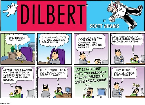
This happened to me so often...
Treat the undergrads like they're grown-ups (which they are); show them crazy respect, and ask their opinions all the time.
An interesting-looking (in all senses of the word) new design criticism blog: A Brief Message:
What do people really want from design writing? More importantly, what can people do without?
Our mission for A Brief Message is a simple one : we want to give you design criticism in short form. We want you to do without. And we’re betting that brevity paired with smart editorial — and the occasional felicitous illustration — will go a long way.
...
By the time you finish reading each Message, you’ll hardly have finished a cup of coffee or taken the after-lunch stretch. Before you know it, it will be over. Just like that. And just like that you’ll know more. You’ll have more opinions. More context. More inspiration.
We actually debated that. While grammatically it's right to say "fewer," we decided that it's colloquially more acceptable -- or familiar, anyway -- to say "less." And we were definitely going for less formal. :-)


She didn't seem particularly engaged with what was going on and I got the impression she was increasingly frustrated - I glanced at the screen in front of her and it seemed while everyone else was covering the 11am 'service' live, she was being bumped down the running order for sports news.
When she did go live I carefully 'wandered' in to shot. I hate it when people do that. But at least I can now put 'appeared on NBC News' on my CV...
"A couple of weeks back Apple came out with a new keyboard, and due to the local Mac retailers not receiving their shipments immediately, I decided to order direct from Apple. I picked up the box today, and expecting something vaguely keyboard-sized, I nearly choked when the receptionist pulled out a rather large box. Inside of which was another box. Inside of which was another box. Not to mention the plastic. Observe:"

Figure: The seven levels of hell product packaging.
(Via mezzoblue.)
From BBC News 'Have Your Say':
Jeremy Paxman has criticised the BBC and the TV industry as a whole at a lecture in Edinburgh. He said there was too much focus on audience reaction. Do you agree?
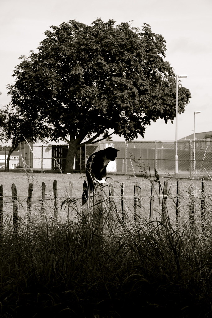
I photographed this cat last week while on a walk in the Scottish countryside. It was staring intently into the long grass, presumably waiting for something warm, small and furry to show itself.
It's not a great picture but I love it.
Britney Spears's perfume logo is a rip off?
Read this article for the full story. If it's a coincidence it's bizarre. And if it's theft it's brazen.
(Via Daring Fireball)
Instant eBay fortune collector's item! Quick, get out there and buy them...
The Sun has issued an article explaining the recall of the Doctor Who 2008 Annual. According to The Sun, the show's title was printed on the cover as Doctor Hwo.
THOUSANDS of Doctor Who books have been pulped — because of a spelling mistake on the front cover.
"Publishers Penguin had sent the 2008 annual — featuring current Doctor David Tennant — to shops before the error was spotted.
But a red-faced insider, who refused to reveal the gaffe, said: ‘It’s embarrassing. The books are cherished so the publishers decided to recall them.’"
(Via Outpost Gallifrey.)
"At this point it is important to know that my house has central heating. I have it configured to blow hot air out on the ground floor and take it in at the second floor to take advantage of the fact that heat rises.
The blimp which was up until this moment a fun toy here embarked on a career of evil. Using the artificial convection of my central heating, the blimp stealthily departed my office. It moved silently through the living and drifted to the staircase. Gliding wraithlike over the staircase it then entered the bedroom where my wife and I lay sleeping peacefully."
Worth reading in full....
(Via AlwaysBETA)
A funny counterargument to the concept of "Intelligent Design".
Thinking about it, if the Universe is actually 'designed' then it would pretty much get an F. Nice in places, but really not very good in others...
Wil Wheaton (yes, he of Star Trek: The Next Generation infamy, keeps it measured and reasonable when telling us why going to the movies sucks:
for me, going to the movies has been only slightly less annoying than going to the DMV, thanks to outrageous ticket prices, mega-multiplexes that leave stains on their screens and never enforce the 'Hey, shut the hell up' rule beyond an entirely ineffective announcement at the beginning of the film, parents who think it's entirely appropriate to bring small children into R-rated movies, and the latest joy: teenagers who leave their goddamn cellphones on and when they're not talking to each other light up the theater with hundreds of tiny screens while they send and read text messages.
Yeah, I'm really glad I have this home theater system, because ... there's a good chance I'm going to snap one day and force feed some fucking idiot his goddamn cell phone.
(Via WWdN: In Exile.)
I like the philosophy here - that design which only contributes towards offsetting its own environmental impact is not 'good' for the environment, simply not as bad as it could have been.
Perhaps this needs to be considered more widely. The last time I flew I offset the carbon. It only cost £1. Well why not pay £2 and offset the carbon of the person next to me, just in case he hasn't? Or even if he has? Why do we think in terms of ofsetting our personal impact when it would be far more cost-effective and probably easier to jump right in and think more socially.
Would this encourage others not to do it, thinking that do-gooders like me will do it for them? Well not if you subscribe to Richard Dawkin's ideas of altruism in The Selfish Gene where he explains why strangers risk life and limb to save the lives of other people's kids. Because we know that if we do we encourage a society that will look after our own kids when we're not able to.
Unless a 'green' building actively remediates its local environment – for instance, scrubbing toxins from the air or absorbing carbon dioxide – that building is not 'good' for the environment. It's simply not as bad as it could have been.
Buildings aren't (yet) like huge Brita filters that you can install in a city somewhere and thus deliver pure water, cleaner air, better topsoil, or increased biodiversity to the local population.
I hope buildings will do all of that someday – and some architects are already proposing such structures – but, for the most part, today's 'green' buildings are simply not as bad as they could have been.
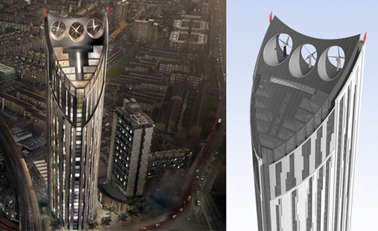
A high-rise that off-sets some of its power use through the installation of rooftop wind turbines is great: it looks cool, magazine readers go crazy for it, and the building's future tenants save loads of money on electricity bills. But once you factor in these savings, something like the new Castle House eco-skyscraper still ends up being a net drain on the system.
It's not good for the environment; it's just not as bad as it could have been.
(Read the whole thing at BLDGBLOG: Architectural Sustainability.)

The Guardian has a supplement today that shows you how to draw various animals in several easy steps. If you can't get hold of the paper, you can download PDFs to print out.
Sod the kids, this is going to keep me quiet for hours!
Mary Beard emailed me in response to my little rant yesterday (I could blame the late hour but what's my excuse at other times?) on A-levels pointing me to her very interesting article in The Times Literary Supplement which is well worth a read.
This paragraph struck home for me:
"I know of at least one A level examiner who has given up because he was forced to mark down candidates who wrote really intelligently about a subject but didn’t give the points that were demanded by his ‘marking criteria’.
"When they get to university the hang-over of this is still horribly apparent. Students will press you to say what kind of class you think their essay would be given. If you respond ‘a 2.1’, their next question is likely to be, ‘So what have I left out that would get me a first’. As if getting a first was simply about fulfilling all the assessment criteria.
But tub-thumping about standards is a bit of a thoughtless response to all this. The sad thing is that the tick-box style of marking is an almost inevitable consequence of the very proper attempt to democratize A levels. It’s all very well thinking that the open ended intellectual essay style is what should be rewarded. But what do you do if you go to a school where they don’t know the rules for that genre? Isn’t it reasonable for you to expect to be told what you would need to do to get an A?
Perhaps even more pressing is the question of the examiners themselves. In the old days, when A levels were a minority option, you had a small group of experienced (and, no doubt, underpaid but devoted) examiners. You might trust them to make reasonably independent judgments about a kid’s essay (and, in any case, the numbers were small enough for them to be checked up on). Our recent mad fixation with formal assessment has more than quadrupled the numbers of examiners that are needed – the demand being such that in some subject trainee teachers are used to mark the most important tests in a child’s career. So, of course, we have to generate firm rules and fixed criteria, simply to train and police the examiners.
The real question isn’t whether we are dumbing down. It’s what on earth we think all this examining is for. If it’s for choosing the brightest, it’s a blunt, time-consuming and inefficient instrument indeed. But maybe that’s not its point – and we should be thinking of quite different ways to do that."
The Scotsman reports that my local police service*:
"yesterday revealed some of the more unusual requests made to them in the past two years.
Tayside Police showed under Freedom of Information (FOI) legislation that officers were asked if police dogs used treadmills or exercise machines to stop them becoming overweight, what a beggar's average daily income is and how many parking tickets are given to foreign nationals.
Other bizarre questions submitted to the force included a request for information about an incident in which a flowerpot was 'criminally damaged'.
Another was for details of how many Dundee taxi drivers accessed internet paedophilia sites between the hours of 4am and 7am.
The force was also asked whether it employed psychics to help with the work it carries out. A spokeswoman confirmed they did not.
The health of police dogs seemed a particular cause for concern. As well as being quizzed over their exercise regime, the force was also asked whether the animals became travel-sick, and if so, how they overcame it.
A Tayside Police spokeswoman said: 'All the police dog handlers exercise their dogs several times a day in the normal fashion - by taking them for a walk'."
(Via The Scotsman.)
Michael Johnson writes almost exactly the same thing I woke up this morning thinking about (I really must get out more):
Earlier this year, Fallon beat off several proper design companies to review BBC radio’s idents.
Here was a chance for advertising to flex those design muscles, and show ’em how it’s done. And yes, they are better than they were, but that’s damning with faint praise - look how awful they were before.
Taking their cue from the previous Radio 1 identity (a ‘1’ in a circle) they’ve taken the decision to, er, put all the numbers in circles. Coloured circles, mind you. Some of the numbers have little ‘gags’ - the ‘3’ contains a bass clef (for music, you see), the ‘4’ a quote mark (I guess that must be for talking), and so on.

Not being a Radio 7 listener I presumed it aired DIY shows until it was pointed out that the symbol was a smile, not a bent nail (shame - that’s an interesting idea for a logo).
What was probably quite a neat little system fell apart somewhere between soho and white city - rather than have any gags for radios 1, 2, 5 and 6, we just have coloured numbers. Oh, and some hair for the Asian network. All for 120,000 pounds.Now don’t get me wrong, I really like Fallon’s work and think they have a better ‘design’ eye than most. But if we’re applying the ‘wish I’d done that’ test, well I don’t. Had this been a blind tasting I’d have guessed this came from a mid-table design company who had their first idea messed up by the client.
Mmm. Maybe this design thing isn’t as easy as it seems?
This is an adaptation of an article by Michael Johnson in this week’s Campaign magazine
(Via the johnson banks thought for the week.)
The A-level results were published today (for those not in the UK, those are the qualifications studied at 17-18 years and used to gain entry to university).
Once again, grades are improving, sparking the usual crap about them getting easier, usually from people who think we should still be using slide rules in maths and not teaching people about media literacy.
But there are some interesting things in there. For a long time it's been claimed that students are choosing 'soft' subjects like arts and media studies over 'hard' subjects like maths and science because they're easier.
Well take a look at the results presented here and see if gambling on getting a higher grade in media studies over maths is one that will pay off.
To my eyes, giving this a quick glance would suggest not that it's easier to get an A in science than it is in media studies (the comparison's bizarre - apples and oranges) but simply that media studies isn't a ticket to a guaranteed 'A'.
Maybe some students are choosing media studies rather than science for ease rather than interest, but anyone who thinks media theory is a walk in the park clearly hasn't read any! (I mean, really, I dare you).
Something else that strikes me about the results is the remarkably even distribution of grades. Hardly a bell curve in sight except maybe for business studies - another 'soft' subject that seems rather loathe to award A grades.
All very interesting...
I have no idea what it means, though, to be honest, and I wish the idiots who get trotted out at this time of year would admit they don't either. It is possible for more people to get better grades than fifty years ago - it's what you'd expect of any civilisation that claims to be advancing.
Here's an interesting idea from the uNiversity of Bath. Cityware is a Facebook application that connects to a Bluetooth-enabled device and logs who you encounter throughout the day (assuming they are also on Facebook and using Cityware).
It has a lot of potential in teh social networking area, not to mention making those adverts in Time Out redundant ("to the girl with blonde hair on the 7.12 to Paddington. I was the weirdo who kept staring at you. Call me.") as you could, in theory, look at your daily log and then pry in to the personal details of anyone who even so much as wandered past you in the supermarket.
Scary. But there you go. I'm up for giving it a go, in the name of science.
(Of course, it'll give the civil liberties lot nightmares. If the government suggested everyone wander round with devices tracking their movements there'd be uproar. But as it's Facebook, it's okay...)
To sign up you need to visit the Cityware page on Facebook. Oh, and you also need to be living in a Cityware node but there are only three in the world at the moment. However, it's easy to set your own computer up as a node.
So although I'm now using this application, as I don't have any plans to visit UC San Diego, the University of Bath, or UCL in London any time soon it'll be a long time before I pop up on anyone's radar. Unless we can get one started where I work. In the interests of science.
On second thoughts I've just thought of several reasons why this might be a bad idea... It would obviate the need for gossip, for one thing. Just check Facebook every morning and you'd immediately see if your suspicions about Jill from Accounts and Fred from Catering were true (made up names and people, incidentally - heaven forbid I've stumbled on something there!)
Edit: In a (rare) moment of self-doubt I looked up 'obviate' wondering if it's one of those words I've either misheard or used incorrectly. Like 'fulsome'. Turns out I'm right - it means 'avoid' (which makes me wonder why I didn't say that - but wrong in that 'obviate' means 'avoid the need for' so instead of 'obviates the need for gossip' I should've said 'obviates gossip'.
You learn something new everyday!
A Chinese couple who wanted a distinctive name for their baby boy and came up with the symbol @ have earned a rebuke from the government's language watchdog.
The parents claimed the commonly used email symbol, pronounced in English as 'at', sounded like the Mandarin for 'love him' when spoken by Chinese.
But the government's state language commission has taken a dim view of the attempt to break the mould in a country where almost 90% of the country's 1.3 billion people share just 129 surnames."
Ever wondered who takes part in opinion polls? YouGov, a web-based polling company, is recruiting participants. All you have to do is sign up on their web site and reply to any emails they send you. You don't have to take part in every survey but for those you do take part in, your account will be credited with 50p. When you've got £50 in your account they will send you a cheque. (You will be credited with £1.00 when you sign up).
If nothing else, it's a way to earn a bit of cash ;-)
Surveys are commissioned by clients on everything from voting intentions to shopping habits. But you won't be hounded with spam or marketing messages from clients - your details are confidential.
Click here to sign up and feel free to pass the information on.
Baudrillard missed a trick missing cats out of his analysis of the system of objects. Cats, I'm convinced, would be gold medallists if that game where you have to spot what object has been taken away or added to a table or tray were ever an Olympic event (and cats could enter).
Cats think in a unique way that has been harnessed by many of the great programming languages. Object oriented programming (OOP) is the driver behind Java, for example, and other computer languages I can't be bothered to look up on Wikipedia.
This is how cats assess anything you might bring in to the house. Note that they will spot anything new immediately. This is known as a 'cat scan'.

A new advertising campaign is launching in the UK aimed at stopping parents pushing their kids down the university route when it doesn't suit their aspirations.
I'm in two minds about this - aganst it because I think there's nothing wrong with a plumber having a degree in philosophy, for it because I think a lot of people sign up for degrees who don't really want one, or intend to do what's required, but just want a job for which other routes are - or should be - available.
In design, other routes are available if you only want to be a designer without doing a degree and all that entails, but they're not as successful in recruiting applicants partly because the industry itself places an emphasis on getting graduates in to non-graduate level jobs. Should you need a degree to be an artworker? No.
The irony is, the newest non-academic route in to the design industry is the Creative Apprenticeship championed by Creative and Cultural Skills (i.e. the design industry itself). In this, school leavers go to work in the industry and are trained on the job.
Early trials of that weren't successful because, they admitted, employers prefer graduates because they don't have to pay them (in other words, free 'placements' and 'trials' - odd behaviour for an industry against free pitching) or pay for their training.
So it's not the level of education that is important, it's the low cost of recruiting a graduate that makes it the prime entry route in to the industry...
You can watch the ad here - I think it's rather good.
More on the campaign at www.edge.co.uk
ITV is to go back to basics with its news bulletins and cut back on gimmicks. Ever since Kirsty Young changed convention by perching on a desk at Five News, broadcasters have been striving for new ways to make news bulletins more innovative and informal.
Bulletins have also increasingly relied on the more hi-tech graphics pioneered by 24-hour news channels. However, sources say ITV plans to ensure there are fewer distractions for viewers and is planning 'more substance' to its news bulletins.
Proposed changes are understood to include allowing ITV's 6.30pm bulletin anchors Mark Austin and Mary Nightingale to sit down to read the news. Their height difference has often caused comment.
According to sources, ITV's director of news and sport, Mark Sharman, is reviewing all areas of the output and prefers gravitas to graphics.

Dundee is dominated by a massive hill (the photo above doesn't tell the whole story - I took it when I was nearly at the top) called the Law (it means 'hill'), formed by the plug of an ancient volcano. A smaller one forms Balgay Hill which is just up the road from me and is home to Britain's only public observatory.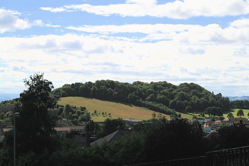
(Balgay Hill, above)
After a year of promising myself I'd do it, I finally got round to walking up the Law the other week and it was well worth the effort. The views from the top are stunning.
The photo above is the view across the Tay (known as the Silvery Tay for obvious reasons) to the Kingdom of Fife.
This photo shows the Tay Rail Bridge. The first one collapsed famously one New Year's Eve just over 100 years ago, killing everyone on the train. Spookily, you can still see the original piles next to the current bridge. At the time it was the longest rail bridge in the world and is still the longest in Europe, apparently.
The white building in the bottom left corner is the life sciences building at the university. My office is just behind it.
To the north you can see all the way to the Sidlaw Hills, but between here and there are relics of Dundee's industrial heritage. Several of the old textile mills, some of them massive, remain and even where they've been knocked down some of the chimneys remain. Its shipping heritage (Dundee was home to ship builders and Britain's whaling fleet until relatively recently) can be seen in the east of the city.
At the top of the Law is a large war memorial that towers over you, and over the city. The lamp is lit on a few occasions each year, in particular Remembrance Sunday, and can be seen for quite some distance. This photo doesn't do justice to the scale of the thing.
When youreach the summit you can see over towards the east and the mouth of the Tay where it meets the sea. In the distance you can see Broughty Ferry and its castle on the left, and Tayport and its large sandy beach on the right. Just past Broughty Ferry is Carnoustie where this year's Open golf tournament was held.
At the moment a large pod of bottlenosed dolphins is making this part of the Tay its home, as it does each summer.
The bridge in the distance is the Tay Road Bridge that replaced the ancient ferry service connecting Angus to Fife.
You can see all the photos I took here, or as a slideshow.
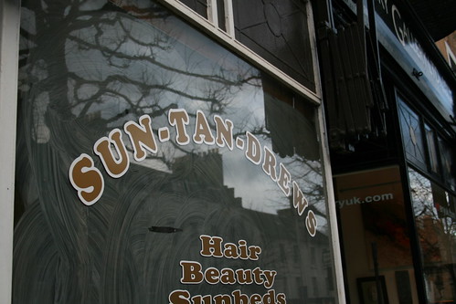
There is a bit of a tradition for barbers and hair salons to have silly names like "Beyond The Fringe" or (if up a flight of stairs) "A Cut Above".
Last year I found one in St Andrews, pictured above, called "Sun Tan Drews" (ho ho). I put it up on Flickr and was recently invited to add it to a group of other punny salon photos. There are 138 at the moment and they're well worth a look if only for a bit of a groan.
Click here for a slideshow, or click here to visit the gallery.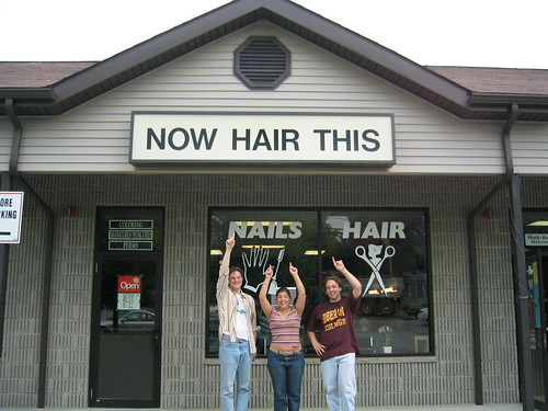
From ghisroy.com - Rants, Comics & other Sillyness:
As everyone knows, graphic designers are the reason there are so many wars in this world. They get inside our heads with their subliminal advertising, force us against our will to spend money on the worst pieces of shit, and eventually, drive us to depression and random acts of violence. And of course, most of them are communists.
So to do my part to save the world from them, i made a list of things you can do when working with a graphic designer, to assure that they have a burn-out and leave this business FOREVER.
1-Microsoft Office
When you have to send a graphic designer a document, make sure it's made with a program from Microsoft Office. PC version if possible. If you have to send pictures, you'll have more success in driving them mad if, instead of just sending a jpeg or a raw camera file, you embed the pictures inside a Microsoft Office document like Word or Powerpoint. Don't forget to lower the resolution to 72 dpi so that they'll have to contact you again for a higher quality version. When you send them the 'higher' version, make sure the size is at least 50% smaller. And if you're using email to send the pictures, forget the attatchment once in a while.
2-Fonts
If the graphic designer chooses Helvetica for a font, ask for Arial. If he chooses Arial, ask for Comic Sans. If he chooses Comic Sans, he's already half-insane, so your job's half done.
3-More is better
Let's say you want a newsletter designed. Graphic designers will always try to leave white space everywhere. Large margins, the leading and kerning of text, etc. They will tell you that they do this because it's easier to read, and leads to a more clean, professional look. But do not believe those lies. The reason they do this is to make the document bigger, with more pages, so that it costs you more at the print shop. Why do they do it? Because graphic designers hate you. They also eat babies. Uncooked, raw baby meat.
So make sure you ask them to put smaller margins and really, really small text. Many different fonts are also suggested (bonus if you ask for Comic Sans, Arial or Sand). Ask for clipart. Ask for many pictures (if you don't know how to send them, refer to #1). They will try to argument, and defend their choices but don't worry, in the end the client is always right and they will bow to your many requests.
4-Logos
If you have to send a graphic designer a logo for a particular project, let's say of a sponsor or partner, be sure to have it really really small and in a low-res gif or jpeg format. Again, bonus points if you insert it in a Word document before sending it. Now you might think that would be enough but if you really want to be successful in lowering the mental stability of a graphic designer, do your best to send a version of the logo over a hard to cut-out background. Black or white backgrounds should be avoided, as they are easy to cut-out with the darken or lighten layer style in photoshop. Once the graphic designer is done working on that bitmap logo, tell him you need it to be bigger.
If you need a custom made logo, make your own sketches on a napkin. Or better yet, make your 9 year old kid draw it. Your sketch shouldn't take more than 5 minutes to make. You don't want to make something that's detailed and easy to understand, because the less the designer understands what you want, the more you can make him change things afterwards. Never accept the first logo. Never accept the 9th, make him do many changes, colors, fonts & clip art. Ask him to add a picture in the logo. Bevels. Gradients. Comic Sans. And when he's at his 10th attempt, tell him that you like the 2nd one the most. I know, it's mean but remember: graphic designers are the cause of breast cancer among middle aged women.
5-Choosing your words
When describing what you want in a design, make sure to use terms that don't really mean anything. Terms like 'jazz it up a bit' or 'can you make it more webbish?'. 'I would like the design to be beautiful' or 'I prefer nice graphics, graphics that, you know, when you look at them you go: Those are nice graphics.' are other options. Don't feel bad about it, you've got the right. In fact, it's your duty because we all know that on fullmoons, graphic designers shapeshift into werewolves.
6-Colors
The best way for you to pick colors (because you don't want to let the graphic designer choose) is to write random colors on pieces of paper, put them in a hat and choose. The graphic designer will suggest to stay with 2-3 main colors at the most, but no. Choose as many as you like, and make sure to do the hat thing in front of him. While doing it, sing a very annoying song.
7-Deadlines
When it's your turn to approve the design, take your time. There is no rush. Take two days. Take six. Just as long as when the deadline of the project approaches, you get back to the designer with more corrections and changes that he has time to make. After all, graphic designers are responsible for the 911 attacks.
8-Finish him
After you've applied this list on your victim, it is part of human nature (although some would argue weather they're human or not) to get a bit insecure. As he realises that he just can't satisfy your needs, the graphic designer will most likely abandon all hopes of winning an argument and will just do whatever you tell him to do, without question. You want that in purple? Purple it is. Six different fonts? Sure!
You would think that at this point you have won, but don't forget the goal of this: he has to quit this business. So be ready for the final blow: When making final decisions on colors, shapes, fonts, etc, tell him that you are disappointed by his lack of initiative. Tell him that after all, he is the designer and that he should be the one to put his expertise and talent at work, not you. That you were expecting more output and advices about design from him.
Tell him you've had enough with his lack of creativity and that you would rather do your own layouts on Publisher instead of paying for his services. And there you go. You should have graphic designer all tucked into a straight jacket in no time!

Here's an interesting project. Stoppedclocks.com aims to catalogue Britain's thousands of stopped clocks on high streets and in villages, and then work with the people involved to get them started again.
There's something a bit sad about a stopped clock - it suggests all is not well with the world.
From the site's creator:
I once took a walk around a square mile in central London, I found 11 stopped clocks, either Municipal clocks, church clocks or otherwise public clocks. After poking about and doing some research, I discovered that it really does not cost much to fix a clock, as there is a tendency within clock repair to replace very old clock mechanisms with a mix of digital and analogue mechanisms. For an average of £1,000, each of the clocks that I found could be repaired.
Clocks in the public sphere were once really vital - not everyone had watches, let alone wrist-watches until the early 70’s - you needed to be able to see what the time was and so they truly had a public function. Nowadays, with digital watches and mobile phones being the norm, the function of these clocks has disappeared.
As a metaphor for our relationship with our past I think that stopped clocks are a potent symbol of the loss of our analogue past, how almost unknowingly we left behind so much when we entered this digital age. I hope you enjoy the blog, and will help me create a deep database of stopped clocks around the country, with the aim of getting them fixed.
In my book, Visual Communication: From Theory to Practice" (what? I'm not allowed to plug that?) I talk about how design operates at two levels: the aesthetic, and the affective/effective, and that too often we critique design as if it is purely an aesthetic discipline.
There's an interesting interview with Jakob Nielsen, the web usability 'guru' over at The Guardian that's well worth a read.
My eye was caught by this line:
"all designs work in three main ways: visceral, behavioural and reflective."
 Visual Communication: From Theory to Practice
(Winner of 'Best Higher Education Title' at the British Book Awards 2006)
by Jonathan Baldwin and Lucienne Roberts
Buy from Amazon.com
Buy from Amazon.co.uk
Visual Communication: From Theory to Practice
(Winner of 'Best Higher Education Title' at the British Book Awards 2006)
by Jonathan Baldwin and Lucienne Roberts
Buy from Amazon.com
Buy from Amazon.co.uk
 More Than A Name: An introduction to branding
by Melissa Davis and Jonathan Baldwin
Buy from Amazon.com
Buy from Amazon.co.uk
More Than A Name: An introduction to branding
by Melissa Davis and Jonathan Baldwin
Buy from Amazon.com
Buy from Amazon.co.uk