A blog about design, education and anything else that takes my fancy

Showing posts with label UK. Show all posts

Saturday, December 20, 2008

English Ways of Saying Goodbye

My friend Qin, who is Chinese, rang me the other night and after about 30 minutes the time came to say goodbye. I had to go do something (can't remember what - eat, I think) so I said so. "Okay, bye" she said.
I panicked. "What?"
"Bye" she said.

This was new to me. Normally when the English (I would say British but I don't know if it's true of the rest of the UK) say goodbye they enter into a protracted process of drawing things to a close. I first became aware of this when watching The West Wing, and then other US TV shows. In those, a telephone conversation would suddenly end, often without any form of goodbye at all. The last sentence would be spoken and bang the phone would be hung up.

How rude. How very un-English. But how efficient.

I think most of my hang-ups (no pun intended) about the telephone revolve around the whole process of starting up and winding down the conversation. It is almost entirely redundant but you start off with the "how are you?" stuff that takes up a few minutes before you get on to the meat of the conversation. If you're calling someone you've never spoken before you have to give your life story and explain who you are.

But it's the "good bye" that is particularly draining. We can't just say "bye" and hang up. When I told Qin I had to go eat I was telling the truth but I was signalling that I would shortly have to go and do this. I wasn't saying "go away I need to have food". To the English the signal is like the coda in a piece of music. It says "right, we're all done but let's bring things nicely to a halt". Saying "well I suppose I'd better go let the cat in" is just that - it's a polite signal that the conversation has run its course, you have nothing new to say and, much as you may love the person on the other end of the line, pretty soon all you'll be able to do is resort to a bit of heavy breathing cos you're all out of conversation. The signal is a way of politely saying you know you're both about to get to the end of the conversation and moving the discussion on to a roundabout way of acknowledging it.

When Qin said "okay, bye" it pulled the rug from under me. "What?" I said. "Bye" she repeated.

If she'd been English she'd have said "ok - what you having?" I'd have said "a ham sandwich" or something and she'd have told me what she'd had to eat, or was planning to eat. We may have riffed on that for a minute, swapped recipes, delighted in each other's preferences for mustard or mayonnaise, brown bread or white before gently bringing the conversation to a halt. "Okay, I'll let you get on" is often the preferred conclusion to the coda, the imperfect cadence, if you will, (to keep the music metaphor going) that leads to the final "good bye" and hang up.

It always has to be the person who made the call who "lets the other one go" - the receiver of the call can't do it.

I tried to explain to Qin the etiquette she was breaking by simply accepting that I had to go and hanging up but she couldn't get it.

There are similar things in English behaviour: we can't buy anything without saying thank you several times, for example. I seem to remember hearing a comedy routine on this years ago but can't remember. Basically it goes like this...
We take our goods to the counter and put them down. "Just those, thanks" we say. The cashier puts everything through and tells us how much. "£5.65, please". We hand over the cash. "Thanks" we say. We get our change. "Ta". We gather up the bag. "Cheers". We head off "See you later. Thanks" We may add another "Cheers, bye" and then we're off.
I count at least five or six instances of "thank you" or its variants.

It's hard work being English, sometimes.

Bookmark and Share

Friday, October 31, 2008

Northumbria University Design School

I was invited to go down to Newcastle on Wednesday to give a talk at the University of Northumbria's School of Design, now situated in its rather spiffy new building (the one on the left in the second image below)

IMG_0212.JPG


IMG_0213.JPG


Northumbria is Jonathan Ive's old stomping ground. Like me, he got his first break designing for the toilet industry so it's almost like we're twins. Er...

I was given an open brief which is always a bit tricky so I decided to do an amalgam of two talks, my annual "Good Design/Bad Design" lecture (where I challenge conventional wisdom on what 'good design' is) and the best bits of the keynote I gave in Texas in June (where I suggested university-based design education should be about making a difference in the world, not just churning out industry fodder).
When I arrived in Newcastle (I hadn't been there for a while and had forgotten how cold it can be, despite it being a few hundred miles south of where I live now) I was pleasantly surprised to see this sign:

IMG_0215.JPG


Resisting the urge to add the missing apostrophe and correct the spelling of my name (ahem) I quickly took a photo with my iPhone and emailed it to my boss. I've now decided to make similar notices and pin them up around my own uni to make me seem much more popular than I am.

The lecture theatre we were moved to unfortunately was a little lacking heat-wise which (and here's my excuse) led to me forgetting quite a few of the points I wanted to make, as did the fact that the head of design for Philips was in the room and I had planned on making quite a few criticisms of some of their products, including an electric shaver I was asked to review for Amazon.co.uk! (I must post that this weekend, in fact - suffice to say it doesn't get very good marks from me, largely because of the excessive packaging and use of proprietary chemicals for cleaning). Needless to say I hastily skipped all the slides relating to that but because I couldn't quite remember where they were I was keeping half an eye on my presenter display ready to click my remote furiously.
I was told later he'd have loved to have heard my take on things. Oh well.

It was, incidentally, a pleasant surprise to be greeted by a never-before seen sight: students voluntarily sitting on the front row:

IMG_0217.JPG


Despite the cold (the hats and scarfs above were a necessity) and having to skip through the last bits due to time constraints (top tip: when combining two different talks, both an hour long, you might want to chop half of it out if you still want to stick to 60 minutes) I think it went okay. I'm always a bit nervous about these things - as an outsider I'm able to be a bit more controversial than I could be normally and drop a few metaphorical bombs before leaving them to carry on the discussion, and I had planned a few zingers but was in the end a bit more restrained than usual, even skipping my traditional (half joking) rant about typography. Oh well.

I was also a bit down what with it being my birthday - enough to depress anyone the wrong side of 35.

Excuses, excuses.

I was really pleased to be asked and appreciated the audience's participation in some of the 'magic' tricks (one of which I tried on a colleague in the pub when I got back to Scotland that night and, much to my surprise, it worked). I won't tell you any more about it - if you want to see it you'll have to invite me to come and talk ;-)

My thanks of course to the students who found their way to the new venue and suffered through the cold (and my talk), to Jamie Steane, Head of Visual Communication and Interactive Media Design, for inviting me, and to Dr Joyce Yee for taking me to lunch and giving me a tour round the new building. Design is clearly a feather in Northumbria's cap and the university's investment in the building sends a clear signal about that. One that, I noticed on my way home, lights up for all in Newcastle to see at night:

IMG_0219.JPG

Bookmark and Share

Friday, September 19, 2008

Designers win medals too

This is something I wrote for the study guide for my Design History, Theory and Practice (DHTP) module which starts next week. The first lecture asks "what's the point of DHTP?" and I try to head off the usual complaints about having to write and read and go to the library. I've found spending the first lecture on making the case for approaching design from an intellectual point of view not only saves time later, it tends to improve attendance and grades!

Plus, I happen to believe in it.

The 2008 Beijing Olympics offered a showcase not just of excellence in sport, but in design as well. Everything from the equipment being used to the garments being worn was designed. Ask the average person what we mean by this and they will undoubtedly talk about what things look like - the ‘style’ of the outfits, the shape of the bikes and so on.

brennan_sydney_main.jpg
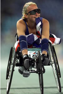
But to take a view like that is to miss what we might arguably call the ‘real’ design, the design that’s the product of years (if not decades) of intense research into textiles, alloys, aerodynamics, ergonomics and more. When people talk of the millions of pounds spent on sports in the UK, they may think that all gets spent on training. But it doesn’t. Chris Hoy’s bike, Rebbeca Adlington’s swimming costume, Charlotte Burgess’s bow, and Deborah Brennan’s wheelchair are all the result of investment worldwide in design research.

And then there are the games themselves - everything from the obvious opening and closing ceremonies to the transport networks, the global television feeds, the ticketing systems, the catering, even the queues — all designed.

Design history and theory are no longer simply endless slideshows of the great and the good; pictures of this designer and that piece. Over the next three years you’ll be exposed to, and encouraged to discover, not what’s gone before but what’s possible. DHTP is about the future as much as it’s about the past. It’s also about broadening your view of what design is, from the ‘man on the street’ idea of design as style to something a little more ambitious and all-encompassing. And it’s about encouraging you to pursue a role in the cutting edge through your own research.


If I get the time, I'm going to do a video to go with it too...

Bookmark and Share

Wednesday, September 03, 2008

Diplomas explained

The Guardian has a handy summary of changes to the school curriculum in England from today, including this summary of the new Diplomas:

Starting this term are the first five diplomas in engineering, construction, information technology, creative and media studies, and society, health and development. There will be 17 in place by 2011. [including product design - see this post for news of the announcement]

The new qualifications are intended to be an alternative to GCSEs and A-levels for 14- to 19-year-olds, blending hands-on learning and theory.
There are three different levels of diploma: foundation (level 1), higher (level 2) and advanced (level 3).

All are made up of three parts: principal learning; generic learning and additional specialist learning.

Principal learning is made up of qualifications, or units, specifically developed for the diploma subject and a project.

Generic learning includes 'functional skills' such as English, maths and ICT, alongside presentation, communication and teamworking skills.

Additional specialist learning involves more academic theory, an extended project and other qualifications, such as a GCSE or A-level, chosen from a catalogue of approved awards.

Diplomas will also involve 10 days' work experience, ideally in a field related to the diploma subject.


Remember, if you recruit English students to design courses at college or university, you need to know what's in the diplomas as they are intended as entry qualifications to FE and HE. They won't show up for a few years yet, but they will eventually. It would be worth finding out if a school near you is offering a diploma in your subject and getting in touch to make sure there's no mismatch between what's offered and what's needed, and maybe to offer some time to give a talk or demo.

Bookmark and Share

Tuesday, September 02, 2008

The problem with graphs

Take a look at this graph. It accompanies a story on the BBC News website about the property market and today's announcement of Government measures to boost flagging sales.

78A03079-0C51-4047-BE71-E169735DFE8A.jpg


The graph plots the change in house prices as measured by two banks, The Nationwide and The Halifax. On the face of it things look pretty dreadful.

Except that the graph is wrong*. The values it is plotting are 'rates of change', so it's a bit like plotting a car's speed by plotting its acceleration and deceleration. You wouldn't really do that as you can't use such a graph to say what the car's actual speed is at any one time, without making some tortuous calculations.

Let's give an example. The graph plots changing values from April 2007 to August 2008. But the individual points relate to the relative change in house prices during the year to that date. So if you look at the point for the Halifax figures in April 2007 you see approximately 11%. What that means is that a house bought in April 2006 for £100,000 (good luck finding one that cheap) was typically worth £110,000 in April 2007.
Now look at April 2008. The graph shows that house prices fell by 1% in the previous 12 months. So that house which was worth £110,000 is now worth £108,900 - so it's still 8.9% higher than it was two years previously.

What you can't do with this graph is look at the August 2008 part of the graph and say what the value of that house is now, because it wasn't bought in August 2007 - the figure is meaningless, therefore the graph is meaningless. (This is the same problem you get with monthly inflation figures - a figure of, say, 5% might be seen as high but it means prices went up 5% over the last 12 months, not in the last month. If prices stay at the same level, inflation will be 0% but that doesn't mean things are getting cheaper. It means they're staying just as expensive as before)

If I had bought that house in April 2006 I couldn't use these figures, or this graph, to predict what the house is 'worth' now. But that would still be irrelevant unless I was thinking of selling now. But house purchasers don't tend to buy and sell in a year, but after several years (often decades). A graph on that principle would show a steady and sustained increase in the value of houses. There's a lot of people worrying over nothing - if you're not thinking of selling your house then you have nothing to worry about, yet this graph is intended to make you worry.

(Let's say that house price inflation stood at -10% in April 2009, then I could calculate the value of my home. It would be £98,010 - a drop in value for sure but of £1,990. In other words my house would be worth 1.99% less than it was when I bought it, not 10% less. See how it works?)

The only conclusion I can draw from this graph is that whoever inserted it is attempting to make things look more dramatic than they really are.
Which leads to a suggestion: the best way to increase confidence in the property market would be to ban stupid measures of the market that plot relative values over 12 months. The housing market doesn't work on such small cycles.


(*Actually, 'wrong' is not the word, rather it's 'misleading', but it's so misleading it might as well be wrong)

Bookmark and Share

Monday, September 01, 2008

New design-related schools diploma - competition or support for product design degrees?

The Guardian reports that:

The government's qualifications regulator, Ofqual, has accredited five new diplomas that will be taught from September next year.

The diplomas will be in business, administration and finance, environmental and land-based studies, hospitality, and manufacturing and product design.


Whether this diverts potential design students straight in to industry rather than in to colleges or universities remains to be seen. And of course, whether that's a good thing or a bad thing also remains to be seen. But the immediate(ish) implications are clear: in the next few years product design courses will start to see applications from students with diplomas, not A-levels. That needs some preparation.

Bookmark and Share

Wednesday, August 27, 2008

Designers asked by UK Government to tackle MRSA

Design Week is reporting that five UK design consultancies are being sought by the Department of Health and the Design Council to collaboratte with scientists and healthcare professionals. They will be asked to develop "innovative design-led hospital furniture and equipment that could improve cleaning and reduce patients’ exposure to healthcare-acquired infections".

The programme, called "Design Bugs Out" starts with a briefing on 2 September and will focus on research in three hospitals, identifying key problem areas.

Having identified five key areas, each team will be asked to focus on one and given a £25,000 grant.
After the closing date for submissions on 10 October, final teams will be announced ten days later and given seven weeks to develop prototypes. Winning designs will be exhibited next summer.

Bookmark and Share

Tuesday, August 26, 2008

Art and design degrees 'need overhaul', say academics

The Guardian reports that:

A group of 50 academics have called for major changes to be made to the teaching of art and design at UK universities after a review concluded it was not fit for purpose.

The Group for Learning in Art and Design (Glad), a forum of academics who discuss learning in the sector, said teaching needed to better prepare students for work in a fast-paced, changing world.

[...]

Students should learn more than the bones of their own subject to reflect 'the multi-disciplinary nature of the creative industries', and work with different groups of people during their studies.

Prof Linda Drew, dean of academic development at the University of the Arts London and editor of the study, said: 'The creative industries have changed dramatically and so must we. Art education is at risk of becoming conservative – it is important that art and design remains at the cutting edge of higher education.'

Teaching staff should also be given extra training to improve the general quality of education, says the report.


The GLAD conference is taking place next week where I'm assuming this report will feature prominently.

This echoes much of what was discussed at New Views 2 in July (see this post, this one and this one).

So we're all agreed. Let's get on and do it, shall we?

Bookmark and Share

Saturday, August 16, 2008

"You have to scream"

Here's a clip from my recent trip to Brighton and a short ride on a fast machine.

I should explain that just before the thing got going, I felt my harness come undone. So I spent the whole half hour (in actual fact it was probably less than a minute) clinging on for dear life. So when my friend, Qin, says "you have to scream" I am in fact holding my breath in anticipation of being flung out to sea. Rest assured, you'd have heard me scream then...

Bookmark and Share

HSBC. The World's Dumbest Bank?

hsbc.jpg


Spotted this ad in Dundee today. A few points spring to mind. Firstly, it's a crap ad (sumo wrestlers do budge - it's the whole point of the sport. In fact they don't half get a wriggle on sometimes...)

But most importantly, given the strapline "The world's local bank" it should perhaps be pointed out to whoever at HSBC signed off on this space being hired that, erm, there is no HSBC branch in Dundee.

In fact, the 'local' branch is a half hour drive away in Perth. Might as well be in Japan - which is the only thing that might help this ad make some sort of sense.

Bookmark and Share

Tuesday, July 22, 2008

Spot the difference


(Via http://photoshopdisasters.blogspot.com/feeds/posts/default.)


Yes, that's right. There's a disembodied knee in the bottom picture.

Bookmark and Share

Wednesday, July 16, 2008

New Views discussion


It's an hour or so long but if you really want to listen in on the (at times rambling) final conversation of the Responsive Curricula group at New Views 2 feel free.

Bear in mind some of the trains of thought relate back to two full-on days of discussion so may not make sense. Oh, and because I was holding the camera, my voice is the loudest...

Apologies for the jumpy video - something wrong with the encoding, not sure what, but the audio's fine.

(If you were involved in the discussion, or want to add comments, use the (+) button to type your thoughts, bookmark important points or clarify anything that needs it)

Bookmark and Share

Sunday, April 13, 2008

Creativity

In New Paltz, New York last week I gave a presentation to senior students there on the Master of Design programme at the University of Dundee. One of the core philosophies of the course is its concern with 'design for a changing world'.

I illustrated this by showing a satellite image of the campus, courtesy of Google Earth, showing the proximity of the University's life sciences building to my own office in the College of Art and Design.
On the image I placed two labels, one saying 'Anti-cancer gene discovered here', the other saying 'my office'.

The point I was trying to make was that when it comes to the word 'creative', surely it's the people who work on cures for cancer, among other things, who are engaged in true creativity? Designing logos and leaflets doesn't really compare at all.

It was interesting to note the vigourous nodding of heads at this. I felt like someone explaining this new thing called fire to a group of people bathed in electric light.

At the start of the academic year I asked my new undergrad students to choose a term from a grid I presented on the screen - terms such as 'ageing', 'poverty', 'ethics', and 'disability' - and consider how their own disciplines were affected, or could affect, that particular area.
After a few minutes I asked what people had written.

"What do you study?" I asked one.
"Graphic Design".
"And what did you choose from the grid?"
"Disability"
"So how can graphic design intersect with disability?"
"Well graphic designers can design the signs that go on toilet doors so you know which one is for the disabled".

Now it's easy to laugh at that, and to dismiss the student, but remember this is someone starting out and, to be honest, that's how graphic design represents itself. In the last lecture of the year I ask students to return to that exercise and ask themselves if their ideas have changed - if they have, I've done my job properly.

To a lot of people,'creativity' and 'creative thinking' means exactly what that student said: coming up with good-looking ways to communicate a fact. You're disabled, you want to know which toilet is for you, here you go.

What I think we're trying to do in Dundee (and I'm speaking entirely for myself here) is to change that idea: creativity and creative thinking are about changing attitudes to disability, not designing ways to describe it; about designing the world in such a way that a disability is simply a physical condition, not a way of life or an obstacle.

Can graphic design do that? That's an interesting question - one that makes it ripe for that type of study. The Masters programme is more interested in the question-asking than the answering (although if the questions are answered, that's great of course) and this makes it an exciting course to work on.
Being in Dundee means we're well-placed to interact and work with other disciplines: medicine, law, economics, education, computing, engineering. And in doing so we've in part got rid of the one thing that stops interdisciplinarity happening: disciplines.
So although we occasionally describe a Masters student by the discipline they studied at undergraduate level (graphic designer, textile designer, architect, weaver etc) we don't ask them to identify a problem and say "How can I, as a graphic designer, tackle this?" We ask them to say "How can we, as designers, help tackle this?"
Because designers shouldn't be constrained by disciplinary boundaries, they shouldn't work alone, and they shouldn't claim to know better than anyone else.

Personally I think it's a shame this level of thinking has to wait till Masters, but until the creative disciplines start being creative about their own practice, I don't think that's going to happen anytime soon.

When I was a child I used to be taken to Mass and week after week read the words on the order of service. The longest of sections was the Credo ("I believe"). It wasn't until I was about 13 or so I realised this thing actually consisted of words and sentences, rather than just sounds (Vatican II really not working in my case), and I began to wonder if I actually did believe in these things at all. When I started teaching design I found colleagues telling me how they taught and assessed. Unlike them I'd never gone through 'art school' and so my first reaction was to think "why on earth do you do it like that?" They were reciting the credo, enacting the rituals, despite the fact that the world had moved on and it was clear that few of the methods worked anymore (if they ever did).

While at New Paltz I met the inspirational head of the print-making course. He was lamenting the burden of tradition within his own discipline. I asked him if he knew anything of the English Reformation. At the time, crowds of people went through the medieval churches, cathedrals and abbeys ripping out and smashing statues, icons, stained glass and anything that smelt of Popery. It is widely held to be one of the biggest acts of cultural vandalism the world has seen, and something that set it aside from the more general reformation happening on the continent. Yet it also meant that as far as English crafts were concerned, everything had to start again - there were no models to work from, no statues to copy or paintings to emulate.
This, in part (and until European methods of teaching art and craft invaded our shores) explains why English craft, thought and science developed the way they did. Unburdened by tradition, without the constraints of paying deference to all that had come before, the English Reformation, for all its evils (and there were many) paved the way for innovations we take for granted.

(An historian of the period would no doubt go ashen faced at my summation here but, hey, I'm being 'creative'!)

Design education needs that reformation, a bold sweeping away of tradition. It needs to stop being so disciplined and learn to embrace the mess of fuzzy logic, intuition and sheer creativity that comes from letting go of the past. Whatever was true of design in the 19th and 20th centuries is no longer so true today. We are no longer the 'creative disciplines' because we like tradition too much, and see skills as rituals rather than a grammar - like people intoning a Mass without understanding the meaning of the words they're saying. Or teaching in a certain way without wondering if it does more harm than good.

We can't wait for a Martin Luther or Henry VIII to turn up and change things. We can do better.
Subject area aside there is one thing that separates the 'creative disciplines' from the truly creative disciplines: they eat their own young. By which I mean they identify their best students and they keep them. They continue teaching them, they let them do research, they show them how to teach. And then they let them loose on students and start it all over again.
In design, we identify our best students, spend ages on them so they can win an award or two, help them get jobs at prestigious firms and then either get them in every so often to give guest talks and praise us (after all, we must be good cos look what happened to them) or we wait thirty years until they're burnt out and then ask them to come and teach when they repeat the rituals they went through (after all, they must be good cos, etc etc).

This myth, that only practitioners can teach, has to be ended.
Our Martin Luther is sitting in our courses right now. And there's more than one...

Bookmark and Share

Sunday, March 30, 2008

Percentage wars

Anna Pickard in The Observer:

Marvellously, The Apprentice brings with it a welcome return of moronic businessisms, as candidates trot out trite examples of things that sound fine in brightly coloured motivational books, but idiotic when tumbling out of mouths.

A favourite is the search for the highest percentage. You may have thought that the highest percentage would be 100, but that would be naive and non-managerial.

For some time, it has not been enough to give 100 per cent effort. To impress, nothing less than 110 per cent is necessary. Or 150 per cent. Or 200 per cent. Percentage wars have broken out and 1,000 per cent is bandied about.

At this point, the notion of percentage flies out of the window and the contestants find themselves stuck in a 'who can think of the biggest number' competition. These are, apparently, some of the best new business minds in the country. Which terrifies me 38,476 per cent.

Bookmark and Share

Saturday, March 29, 2008

Time for designers to take responsibility for Terminal 5?

When Heathrow Airport's terminal 5 opened it was hailed as a marvel of engineering and design. Now that it's all descending in to disaster, everyone seems to be blaming British Airways and the British Airport Authority. Why not the designers?

Take a look at this excerpt from The Guardian:

The overnight BA inquest looked at how luggage was loaded on and off the airplanes - one of the biggest failures in Thursday's fiasco.

According to airport sources, the baggage hold-ups were caused by handling teams being in the wrong place to pick up checked-in bags, which had been delivered down chutes from the main conveyor belts.

If those bags are not picked up and loaded on to planes, the sources added, the chutes become full and the conveyor belt overloads.


If this had been a success you could guarantee that someone somewhere would be hailing the miracle of service design, the technical feat of automated luggage sorting systems and, ooh, doesn't the ceiling look lovely too?
But now it's all going pear shaped the role of designers in the mess is being ignored.

Design can't be selective. It can't crow about its successes and then vanish in to the night when it falls apart.
No doubt in 50 years time it will crop up in lectures as an example of 'when design goes wrong' but that's too late. It needs to be looked at now as a case study for current designers to learn from.

Update

Having just had my flight from Edinburgh to Heathrow cancelled, the first leg of my trip to New York, I'm not best pleased with this story.

Jeff Howard says it's system design at fault, not service design and he's technically right, but it's really just semantics - I don't separate systems from services and I'm not convinced you can. Indeed that's a problem we encounter when trying to teach service design - people come up with great ideas for services but ignore the back-end stuff that makes it worse. I suspect selling service design is rife with the same problem.

The 'service' here is checking in your bags. The system supports the service and it's all part of one big whole.

But Jeff's right to point out that the problem is exactly the back-end aspect of the service. Seeing the images of all those cases piled up makes you realise that no matter how shiny the terminal building, or how long the conveyor belts, at some point your bag is going to be tossed on top of hundreds of others by guys in overalls.

Bookmark and Share

Saturday, March 22, 2008

Universities fear imminent student drought

EducationGuardian.co.uk:

The number of school leavers is expected to plummet over the next 10 years, leaving 70,000 university places unfilled - the equivalent of nearly six universities.

Universities will have to compete harder, target more mature students and those from outside the EU to fill seats in lecture halls as a historic dip in the birth rate translates into fewer student numbers, vice-chancellors said.


Or as some would have it: Head, meet sand.

Bookmark and Share

Wednesday, February 27, 2008

Academics denounce courses tailored for businesses

I've been writing a blog post on topics similar to this over the past few days but as it's reached over 5000 words I might have to edit it down before I post it. In the meantime, read this Guardian story.

I share the worries, but wonder why it's come as a surprise given that Sector Skills Councils have been around for about four years now with an overt policy of getting the government to make universities stop pushing the boundaries of knowledge and instead deliver nicely formed employees. Oh look, I'm off again - I'll stop now and let you read the article yourself...


Lecturers today condemned reports that the government is planning a major expansion of the role business plays in the delivery of degrees, warning it will lead to graduates being 'churned out' of 'identikit' institutions.
A leaked document, seen by the Financial Times, suggests that ministers are considering ploughing extra funding into degrees jointly designed and funded by employers.

It also suggests that degrees could be redesigned to make them shorter and more intensive, reflecting an increasing interest in two-year qualifications.

The document, Higher Level Skills Strategy, dated from last November, recognises the 'risks' for universities in tailoring courses for businesses.

But it makes clear that the short-term expansion of higher education will be dominated by courses involved with industry.

'An institution may worry about its public image,' the FT reported the document as saying.

'We expect the majority of this growth to be in provision that is developed with employer input - either foundation degrees [two year vocational degrees co-designed by employers] or employer co-funded places,' it said.

A spokesman for the Department of Innovation, Universities and Skills, refused to comment on the leaked document but confirmed an announcement made last December to plough £105m into 'employer engagement', including co-funded places.

Sally Hunt, the general secretary of the University and Colleges Union, said: 'University is about so much more than just getting students through their degree and out the other side. We should be celebrating universities that are prepared to take risks and push the boundaries in their pursuit of knowledge and research.

'We need to trust people who have spent their lives working in education, not allowing business to dictate the short-term direction universities should be taking.

'The creeping marketisation of higher education seems only concerned with a bottom line and treating students as commodities. Identikit institutions in all our towns and cities churning out graduates in a couple of years is not what the country needs to protect its proud position as world leader in teaching excellence and innovative research.'

Bookmark and Share

Wednesday, February 13, 2008

'Universities should offer more information about courses to Facebook generation'

EducationGuardian.co.uk:

Universities should offer more detailed information about courses to the Facebook generation, the shadow universities secretary, David Willetts, said today.
The Guardian's Higher Education summit heard that students were sharing information about the offers they receive for university courses on social networking sites, forcing universities to rethink the kind of information they give out.

Willetts said students should be able to find out how crowded seminars were likely to be, how much access time they would receive from lecturers and what form this access would take.

'Universities are going to have to become more proficient at answering these kinds of questions, even if it is something that many are uncomfortable with,' he said.

Willetts also gave a cautious welcome to a new commercial website designed to plug into social networking sites and disseminate information to 5,500 higher education institutions across the world.

Jancice Kay, deputy vice-chancellor of the University of Exeter and chairwoman of the student experience policy group of the 1994 group of smaller research-led universities, said it was important for universities to become more transparent in response to the increasing use of Facebook sites by students exchanging information about their courses. This was the only way they would be able to maintain control of the information that students received and make sure it was accurate, she said.

Les Ebdon, vice-chancellor of the University of Bedfordshire and chairman of the Universities UK student experience committee, warned that much of the information available to students over the web is misleading and inaccurate.

'If there are questions to be asked, what better place to ask them than on an open day?' he said.

Bookmark and Share

Tuesday, February 12, 2008

Five hours of 'culture' a week for kids

The Guardian reports:

The green paper (to be published this month by The Department of Media, Culture and Sport ) is also expected to call for a £200m national film centre, as well as 19 other schemes intended to turn Britain into the 'world's creative hub'. Other pledges include the launching of a global arts conference, dubbed the 'World Creative Economy Forum' modelled on Davos, the creation of a new college of digital media and the protection of live music venues such as the Astoria and the Hammersmith Apollo in London.

The government is also expected to reveal plans for a new creative festivals season, a new film centre on London's South Bank and a permanent home for London fashion week.

Under plans to be announced by Gordon Brown and the culture secretary, Andy Burnham, children will be given the right to 'five hours of culture a week' encouraging them to visit galleries and museums, attend the theatre, or study a musical instrument.

And some 1,000 creative apprenticeships for young people are also being proposed, which will be managed by a new Skills Academy.

Bookmark and Share

Monday, February 04, 2008

The difference between broadsheet and tabloid

The Guardian reports:

Chinese court upholds death sentence against businessman accused of defrauding investors in would-be ant-breeding scheme


Or as the Sun would report it if they cared about such things:

Ant and Dec-apitate

(Only British readers will get it)

Bookmark and Share

Visit my 'official' site

www.jonathanbaldwin.co.uk
contains links to my articles and books.

Tags

Books by Jonathan Baldwin

Visual Communication: From Theory to Practice (Winner of 'Best Higher Education Title' at the British Book Awards 2006) by Jonathan Baldwin and Lucienne Roberts Buy from Amazon.com Buy from Amazon.co.uk

More Than A Name: An introduction to branding by Melissa Davis and Jonathan Baldwin Buy from Amazon.com Buy from Amazon.co.uk

Followers