A blog about design, education and anything else that takes my fancy

Showing posts with label branding. Show all posts

Sunday, March 08, 2009

Is MacHeist's Tweetblast an example of how advertisers will destroy Twitter?

Like many people (19,000 at the last count) I took part in MacHeist's recent "tweetblast" which, as Cult of Mac explain:

is a simple concept. All you have to do is post a tweet on Twitter using a particular phrase, which in this case is:

‘@MacHeist Yeah, I’ll take a free copy of DEVONthink! http://macheist.com/tweetblast #MacHeist #free’

And once you’ve done that, you can claim a license code for DEVONthink worth just shy of 50 bucks.


I did it for several reasons - firstly I thought it was DEVONagent I was asking for, which is a rather good internet research tool. But it wasn't - it was DEVONthink which is also a neat tool but which, as an Evernote user, I don't really need. Secondly I wanted to make sure I didn't miss out on MacHeist which in the past has led me to getting hold of someinteresting software at knock-down prices.
But mainly I was intrigued. I'd seen companies use Twitter for promotional purposes before - for example Evernote themselves are asking people to send tweets on Fridays for a chance to win prizes, while of course at the same time telling anyone who follows them about the product.

But Evernote's strategy relies on people being bothered to compose a short and meaningful message - to me it's still within the realms of what Twitter is all about. The MacHeist approach is different. To get the "prize" (which is guaranteed) you simply have to send a set phrase. It's easy to do - in fact I read someone else's tweet and simply copied and pasted it and sent it on. It's the equivalent of a chain letter. It's not a meme, before anyone uses the term, as a meme is an idea that develops and mutates. This is cloning, not memetics.
It strikes me as being similar to those advertising campaigns where you would have to find someone or be approached by them and say a certain phrase word-for-word to win the prize. They still happen: radio stations phone people up randomly and if they answer with the required phrase they get money, but anything else (like "Hello?") loses.
It's sort of exciting, but it's also very useful for the organiser because it's a sure fire way of getting hundreds, thousands, if not more, people to memorise a phrase and rehearse saying it over and over. Then telling their friends.

There's no memorising going on here, of course, but there is certainly friend-telling. Tweeting the message ensures it's seen by anyone who follows you and, if your updates aren't protected, by anyone looking at the public timeline. Because it will happen quickly, it means the timeline will be flooded with the same message for an hour or so, and that it will crop up in any clients that track popular topics.

It's very, very clever. But it's also rather worrying. Why? Well I'll let Cult of Mac explain:

By asking people to turn their Twitter streams into advertising billboards, the MacHeisters are damaging the community there. Twitter’s supposed to be about the sharing of status, it’s all about conversation. I find it sad to see it being co-opted by commercialism. Sad, but not surprising.

The more Twitter grows, the more advertisers are going to try and game it. I don’t want the people I follow to be tempted into doing the spammers’ work for them. I don’t want to see advertising where I expected to see real people.


I think this is right: MacHeist has distorted Twitter to suit its own ends and I fell right in to it for a piece of software I didn't need (I even had to unprotect my updates temporarily to take part). Skittles did something similar last week, turning their home page in to a Twitter search for #skittles - the only problem being that it resulted in people posting racist and crude messages. MacHeist's approach is cleverer. If other companies cotton on to it (which they will if people like me blog about it!) we could soon see Twitter flooded with advertising messages like this one:

‘@Coca-Cola Yeah, I’ll take a free can of cola and the chance to win a trip of a lifetime! http://whatever.com #Coca-Cola #free’

You get the idea...

Bookmark and Share

Tuesday, October 07, 2008

Being too literal in logo design

Cross posted from my other blog:

In one of my lectures, on visual communication, I use a little exercise to illustrate an aspect of semiotics.

I give the students a brief: they are to design a logo for a law firm that specialises in family law, dealing with families who are facing some form of legal entanglement. I tell them they have two minutes to come up with an idea.
Two minutes later I stop them and ask them all to stand up. I then start eliminating them by saying things like "sit down if you drew a police badge". That usually gets rid of about half. A gavel gets rid of several more, as do jail bars, a law book, a police light and so on.
Before long we're down to the last few students and I can usually get rid of them too with 'hands' or 'cut out people'. I also eliminate anyone who used just words or initials (words aren't so bad of course, I'm just being mean, but initials for firms always bemuse me - IBM and a few others aside, of course).

If there's anyone left standing it's either because I've missed a really obvious one (last year it was a bird, this year it was a court house) or because they've done something quite abstract - this year it was a square with four circles around it. Nice one. We have a winner.

(Just remembered, Orlando Weeks now of The Maccabees, "won" this a few years ago when he did a logo of "a unicorn jumping over a rainbow". Mmm...)

The point I'm trying to make in that exercise, other than it being a bit of a break from them listening to me drone on, is that when faced with a quick challenge like that, students (everyone) tend to to think not in cliches (I happen to think cliches are good things - they're how we communicate) but in too literal a sense. The last thing, I say, someone who is facing juvenile court on a shoplifting charge wants to see is a logo for a lawyer that screams "you're going to jail!".
Look at supermarkets - how many of them have logos that show a basket of shopping? (I seem to be the only one who thinks the Lidl logo looks like someone pushing a trolley)

BE4D2667-9A33-42F8-B82D-D820A5871AB2.jpg


I came up with this little game (which makes more sense in the context of the lecture than it does here) a few years ago when some graphic design students at a previous job were asked by a local law firm to come up with a logo for a similar brief. The winner was a half open door with light coming through it. The tutor loved it, the clients loved it. I hated it. They thought it said "there is hope". I thought it said "you're doomed". But then, that's me for you.
It did, however, make me look anew at logos to try to find the overly literal. And while there are a few, they're pretty rare and almost universally poor. I won't link to any here - look for yourself you lazy git.

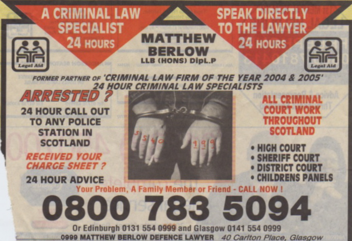
All of which brings me to something that amused me. A couple of years ago, after I'd done this exercise with them, some students came in to my office with something they'd found in the Yellow Pages. An ad for a law firm which fell in to exactly the trap I'd laid for them (click on the image for a larger version). I think this is a pretty amazing/bad piece of advertising - I'll have to add prison tattoos to my list for next year's lecture.

Lawyer ad.jpeg

Bookmark and Share

Thursday, November 01, 2007

Wolff Olins: Have they given up?

This new logo for Wacom has apparently been designed by Wolff Olins, creators of the appalling 2012 London Olympics logo.


Mmm... time to let the work experience school kid go, and bring the proper designers back?

Bookmark and Share

Wednesday, August 22, 2007

Whoops! She did it again

Britney Spears's perfume logo is a rip off?


Read this article for the full story. If it's a coincidence it's bizarre. And if it's theft it's brazen.

(Via Daring Fireball)

Bookmark and Share

Thursday, August 09, 2007

Legal fight over the red cross symbol

The BBC is reporting a lLegal fight over red cross symbol:


Medical firm Johnson & Johnson (J&J) is suing the American Red Cross, alleging the charity has misused the famous red cross symbol for commercial purposes.
J&J said a deal with the charity's founder in 1895 gave it the 'exclusive use' of the symbol as a trademark for drug, chemical and surgical products.

It said American Red Cross had violated this agreement by licensing the symbol to other firms to sell certain goods.

The charity described the lawsuit as 'obscene'.

It said many of the products at issue were health and safety kits and that profits from their sale had been used to support disaster-relief campaigns.

The lawsuit asks for sales of disputed products - also including medical gloves, nail clippers, combs and toothbrushes - to be stopped and unsold items to be handed over to J&J."


Read the rest....


Makes you feel all warm inside, doesn't it?

Bookmark and Share

Conservatives rebrand - again


Design Week reports:

The Conservative Party is changing its tree logo from green (above) to blue, less than a year after its launch.

The identity redesign retains the scribbled tree shape, but it is now sky blue and features a cloud and a ray of sunlight.

The £40 000 scribbled tree logo was created by London design group Perfect Day to replace the flaming ‘freedom’ torch identity, which was introduced in 1977.

The new logo invited criticism when it was unveiled in September 2006, being compared to a child’s drawing, broccoli, and a coin scratch on a lottery card.

Party officials said last year that the tree represented ‘strength, endurance, renewal and growth’, and emphasised the party’s Green credentials.

Onlookers are speculating that the change in hue is calculated to appease the Party’s right-wing members, coming at a time when party leader David Cameron’s authority has been under attack. A party spokesperson responded by saying that the Tory logo was always intended to be flexible, to ‘display any number of background images’.

At the party’s spring conference, the logo was covered with blossom, while at the autumn conference in October it was given a yellowish tinge.


A blue tree? A blue fucking tree?

This is why I got out of design. I can imagine the agency that came up with this logo being told by some politician to make the tree blue because 'that's the colour of the Conservative Party'. 'But it's a tree, you tosser' would have been my considered response. 'Oh and it says 'Conservative' right next to it so it's not like anyone's going to mistake you for the 'Tree Party' is it?' Though given their current situation (David Cameron has achieved the impossible and returned them to their former status in the polls, by coming third in two by-elections) it might not be a bad idea to go for a radical rebrand and hope people do indeed confuse you for the Tree Party. Whoever they are.

Bookmark and Share

Tuesday, June 12, 2007

Survey: Most youngsters 'hate' 2012 logo

See the list of links on the left side of this page for some of The Guardian's coverage of the London Olympics logo.
Here's the latest - a report on a survey suggesting the logo hasn't hit home with the group it was supposedly aimed at:

Almost 70% of 11- to 20-year-olds dislike the youth-targeted London 2012 logo, according to a study.
The logo, which aims to tap into the youth market with a multimedia design, has come in for heavy criticism since being unveiled last week.

Now, a Q Research survey focusing on the core market London 2012 is hoping to attract - 11- to 20-year-olds - has found that 68% of respondents said they 'hate' the design, with more than half saying it was because it did not say anything about the capital city or the UK.

While 75% of the 431 respondents said they were 'excited' about the Olympics coming to London, just 30% of 11- to 16-year-olds and 35% of 16- to 20-year-olds said they 'loved' the new design.

The survey group was asked why they thought so many people do not like the new logo, supplying a response from a list of four answers.

In responding to these options, 30% said it was because the design 'doesn't say anything about the UK'; 24% said it 'doesn't say anything about London'; 32% simply said it 'wasn't a very good logo'; and 14% thought it was because adults do not understand it.

A second question asked if the logo - designed to be usable online - actually looked better in print or on the internet.

In reply to this question, 30% agreed that it looks better online, with just 11% saying it looks better printed in magazines, newspapers and posters.

'We were pleased to see more than three-quarters of the young people we surveyed were excited about the Olympics in London,' said the Q Research executive chairman, Dr Liz Nelson.

'Our survey respondents had clearly given the matter of the logo itself a lot of thought, and their comments showed quite a sophisticated level of understanding design and marketing and its purpose.

'For instance, more than half of respondents said they didn't like the logo because it didn't say anything about London or the UK.'

The survey asked a range of questions of 11- to 16-year-olds and 16- to 20-year-olds between Friday and Sunday.

Views were largely negative in an 'open-ended' response part of the survey, where respondents said what they thought about the logo.

One respondent, Lee, 15, said that it looks 'like a kid made it' and that while the 'designers thought it would attract MTV viewers it doesn't'.

This contrasts with supporter Tamsyn, 15, who said: 'I think it's a brilliant way of introducing the newer generations to the Olympics because it's quite a modern design.'

Several respondents were also concerned with the fact that it cost £400,000 to develop.

Seventeen-year-old Matt said it 'makes London look like it has no design talent to do the promoting'.

However, Caron, 17, took a much wider long-term view of the whole logo issue: 'It doesn't make a difference, the Olympics in London is an amazing thing.'"


(Via The Guardian.)


Incidentally, I saw the logo printed in The Guardian yesterday and found myself thinking 'meh, it looks okay', but then I looked again and realised that I was mistaking familiarity with enthusiasm. I suspect this is what supporters of the logo are doing too. Saying we'll 'get used' to it is hardly a ringing endorsement. I might get used to a boil on the back of my neck, doesn't mean I want it there.

Bookmark and Share

Tuesday, June 05, 2007

You can't make this stuff up: Epilepsy fears over 2012 footage

A segment of animated footage promoting the 2012 Olympic Games has been removed from the organisers' website after fears it could trigger epileptic fits.
Prof Graham Harding, who developed the test used to measure photo-sensitivity levels in TV material, said it should not be broadcast again.

Charity Epilepsy Action said it had received calls from people who had suffered fits after seeing it.

Organisers London 2012 said it will re-edit the film.

The new logo for the event, which is a jagged emblem based on the date 2012, was unveiled on Monday.

A London 2012 spokeswoman said the health concerns surrounded a piece of animation shown at the launch, which was recorded by broadcasters and put on the official website.

Emphasising that it was not the logo itself which was the focus of worries, she said: 'This concerns a short piece of animation which we used as part of the logo launch event and not the actual logo.'

She said the section of footage concerned showed a 'diver diving into a pool which had a multi-colour ripple effect'.

The spokeswoman said: 'We are taking it very seriously and are looking into it as a matter of urgency.'

'Suffered seizure'

Prof Harding is an expert in clinical neuro-physiology and he designed a test which all moving adverts need to undergo to check they will not trigger a reaction in people with epilepsy.

He told BBC London 94.9FM: 'It fails the Harding FPA machine test which is the machine the television industry uses to test images.

'And so it does not comply with Ofcom guidelines and is in contravention of them.'

Christopher Filmer rang BBC London 94.9FM to say he suffered a seizure while watching the footage on television and his girlfriend also suffered a fit and needed hospital treatment.

'The logo came up on TV and I was thinking about the 2012 Games and then I was out,' he said.

Epilepsy Action said the images could affect the 23,000 people in the UK who have photosensitive epilepsy.

It said it had even triggered breakthrough seizures where people have a relapse after being seizure-free for a long time.

A spokesman for the charity said: 'The brand incorporates both the Olympic and Paralympic Games, which is ironic as the latter is a showcase for athletes with disabilities.

'People can strive for years to gain seizure control and it is important that nothing puts this at risk.'


(Via BBC News.)

Bookmark and Share

Monday, June 04, 2007

2012 Olympics Logo Revealed...


So this is the logo for the London 2012 Olympics. And this is the explanation.

I'm saying nothing.*

You can, however, read what 'the great British public' are saying on the BBC's 'Have Your Say' page.


*That's cos it's shite.

Bookmark and Share

Sunday, May 27, 2007

What does 'Save the Children' do?

The British design group Johnson Banks have been working on an interesting project for Save the Children.

The basic problem faced by the client was that, despite the name, no one really knows what they do. Added to that, their corporate identity is a little, er, dull, and their corporate guidelines are quite strict about the use of Gill Sans as their typeface. (Guidelines do that - that's the whole point - but the problem here is that they maybe take 'corporate' too far, and make the charity appear less than friendly).

The idea they came up with was to give outlines of the font, in several weights, to children to get them to fill them in. Then the best were chosen, digitised, and are now being used in Save the Children publicity - the guidelines are adhered to, but with a little creativity they also manage to make Save the Children a little bit more childlike without being childish.

Here are some images from the project. You can see the whole story at Johnson Banks's blog (which is worth subscribing to). Of note is the fact that they had to get permission from Monotype, who 'own' Gill Sans, to treat the typeface in this way.


Bookmark and Share

Chewing Gum Wars


From the BBC's Money Programme site comes this article about the chewing gum market, and the recent entry in to the UK of Cadbury's new 'Trident' Brand.

NB The programme on which this article is based was broadcast on BBC2 on Friday 25 May 2007.

See also 'Big Gum Battle' and 'Gum campaign branded racist'.

Chewing gum is at the centre of a retail battle between Wrigley, the dominant player in Britain for decades, and Cadbury, the world's biggest confectionary company. At stake is the £250m a year the British spend on gum.

Cadbury launched four Trident products in Britain in February. They appeared on newsagents shelves alongside the 32 gum products sold by Wrigley.

Cadbury's campaign hit the headlines two months later when the Advertising Standards Authority (ASA) banned its TV advertisement for Trident featuring a "dub poet" enthusing about Trident on stage in a nightclub.

The ASA received more than 500 complaints that the ad was racist in its stereotyping of the over-excited, Jamaican-style character.


Now Cadbury Trebor Bassett's managing director, Simon Baldry, tells the Money Programme that he wants to apologise for the advert.

"It was never our intention to offend anyone," he says.

"If we have offended people then clearly we would like to apologise for that."

But he denies the campaign was intended to stir up controversy.

"Let me be very clear, controversy was never part of launching this brand. Many consumers love this ad and it's been a great vehicle for us to communicate to the nation about a great new gum experience."

Fun race

Five years ago, Cadbury bought into gum with its purchase of Adams, an American gum company, which, like Wrigley, has its roots in the 19th Century.

Adams products, such as Trident, Dentyne and Certs, were big sellers in the US and elsewhere, but were not sold in Britain.

The attraction of Adams for Cadbury was that gum sales are growing at three times the rate of chocolate, a Cadbury staple.


Changing tastes key to gum war

But the UK was a market out of step with global growth.

"Britain had been chewing below its weight," says Cadbury's Director of Global Gum, Jim Cali. Here, gum sales had actually fallen by 4% in the past two years.

Wrigley says it anticipated Cadbury's move into its territory. "We've been expecting it for a number of years, since they've been buying gum companies around the world," says Gharry Eccles, managing director of Wrigley UK.

And Mr Eccles says he would relish the prospect of increased competition.

"If you're running a race, running it on your own is actually no fun," he says.

"When you're running against someone it becomes a whole new ball game, and a lot more fun."

Pleasure and indulgence

Cadbury does not appear to have been harmed by its controversial campaign.

According to the latest market figures from AC Neilsen, Trident is taking a 12.5% share of the market, leaving Wrigley with a still-dominant 86.3%.


The good news for both companies is that the £12m total gum market is up almost 20% on this time last year and Wrigley itself has grown its sales by 5%, with new products such as Orbit Complete.

Both companies have been seeking to differentiate themselves.

Cadbury wants to stress how it is bringing its confectionary experience to the chewing gum business.

"Pleasure and indulgence is what we know best," declares Mr Baldry.

"It's our expertise in our total confectionary field, and we're bringing that to the gum category too."

Agrees Mr Cali: "Gum is fun."

Health benefits?

Wrigley is anxious not to be painted as the functional alternative to the indulgence of Cadbury, but nevertheless has set up a research programme under the title The Wrigley Science Institute.

Based in Chicago, its head, Gilbert Leveille, sponsors research at universities around the world, looking for health benefits of chewing gum.

So far, they have established that gum can help reduce tooth decay, but have yet to confirm some of the newer claims, such as that chewing during learning can improve memory.

Mr Leveille is hopeful, explaining that "chewing gum increases blood flow to the brain very significantly, and that could be a plausible explanation for why some of these mental benefits seem to be associated with chewing gum".

The irony is that Trident, whose name in Britain today reminds people of missiles rather than mastication, was originally named in the 1960's because it contained three ingredients that were supposed to be good for your teeth - hence "tri-dent".

Fighting litter

For all the competition between the two companies, on the question of chewing gum litter, Wrigley and Cadbury are united.

Both companies want to keep regulation at bay and are cooperating with a government initiative to control litter.

Under the auspices of Defra (The Department for Environment, Food and Rural Affairs), the companies are represented on the so-called Chewing Gum Action Group.

The Group, with a budget of £600,000 provided by the manufacturers, helps local authorities publicise anti-gum litter messages.

Defra minister Ben Bradshaw is responsible for dealing with the litter problem, and says his department has been "working very closely with the chewing gum manufacturers".

Mr Bradshaw accepts the manufacturers' argument that the problem lies with consumers, rather than being the direct responsibility of chewing gum makers.

"We don't want to penalise a legal product that the public enjoy, but we want to try and change people's behaviour when they use that product," he says.

But anti-gum campaigners such as Westminster Councillor Alan Bradley, are unimpressed, describing the Defra group as "dancing to the manufacturers' tune".

He points to a similar group in Ireland that has a higher budget per capita, and will be active in all local authorities, rather than in just the 15 a year in the UK that the Defra group is targeting.

There is no sign of a limit to the global consumption of gum. Indeed, Wrigley's sales worldwide are up by almost 30% in its latest figures.

When William Wrigley settled on gum as the way to make his fortune in Chicago at the end of the 19th Century, he had no idea that the brands he created - Juicy Fruit, Spearmint and Doublemint - would still be growing, more than a century later.

Bookmark and Share

Thursday, April 26, 2007

More designer bullshit

Design Week has a brief article (their articles are rarely long, seeing as how the entire magazine appears to be made up of gloating press releases from various companies puffing about something insubstantial, and very little actual analysis) about the long-awaited (like 25 years) rebranding of Morrisons supermarket.

Now even though I'm sort of anti-supermarket ('sort of' as in I am currently forced to use them but would gladly not if I had the choice - as someone said on TV last night, the coming Scottish parliamentary elections are pretty much moot as Tesco basically own the whole country) I do have a soft spot for Morrisons, it being the Yorkshire supermarket I grew up with and that for a long time was our smug regional secret.

Their old logo, though, was a bit oppressive. It looks more like a construction firm than a family-run supermarket:


And here's the new one:


Well, it's okay. I like it. Keeps a link with the old version while looking much more friendly. I'm not sure what else you can really do, to be honest.

But here's an example of the sort of designer bullshit that I reckon is more to blame for clients dismissing designers and refusing to pay good money for the job than the usual culprit, the PC and cheap software:

Peter Knapp, creative director at design firm Landor Associates, says: 'We used yellow in a very dramatic way. It is a colour that Morrisons has ownership of. Lots of people are trading heavily for green, but yellow is relevant. It signifies brightness and freshness’

What exactly is 'dramatic' about a yellow circle? It's a yellow circle, for crying out loud. It was in the old logo too. It's not dramatic, it's just familiar. And 'Lots of people are trading heavily for green' - what does that mean?
You could have said something less arty, like 'it suggests the sun' or something but no, you have to say something that will make most people say 'Dramatic? I could have done that' and then laugh at whatever was charged.

Seriously, we need to stop talking gibberish when it comes to design. It's a nice, clean and bright logo, but it sure ain't 'dramatic'. War footage is dramatic, Bush resigning would be dramatic, Shakespeare is dramatic but this... it's just a logo.

Bookmark and Share

Visit my 'official' site

www.jonathanbaldwin.co.uk
contains links to my articles and books.

Tags

Books by Jonathan Baldwin

Visual Communication: From Theory to Practice (Winner of 'Best Higher Education Title' at the British Book Awards 2006) by Jonathan Baldwin and Lucienne Roberts Buy from Amazon.com Buy from Amazon.co.uk

More Than A Name: An introduction to branding by Melissa Davis and Jonathan Baldwin Buy from Amazon.com Buy from Amazon.co.uk

Followers