Take a look at this miserable excuse for an advertisement. (The word in the middle is 'shirt', not 'shit').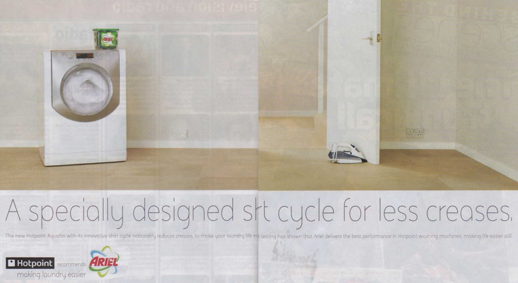
Why am I so down on it? Forget the layout that means the key word is lost in the fold, forget the weak weedy typography, forget the far-too-subtle joke, or the fact that the washing machine appears to be unplugged and in the living room. Take a look at the headline.
Spot the mistake?
It's 'fewer creases', not 'less'! It's wrong, no matter what you might say about "well everyone says 'less' these days". I don't care. It's inexcusable. It's up there with apostrophes in the wrong place, ellipses with two dots or more than three, 'I' instead of 'me'.
(Marks & Spencer, the leading high street retailer in the UK, changed their checkout signs from 'Five items or less' to 'Five items or fewer', I'm told because of a customer complaint. Sadly no other store seems to have followed suit).
If I were Ariel or Hotpoint I'd be having serious words with my ad agency...
But it's not as bad as this example of piss-poor proofing. The cheese company Leerdammer recently launched a new brand extension complete with inappropriate apostrophe. I first noticed this over a year ago and they're still doing it!
I mean, I might expect it of a greengrocer, but not an international food company:
Unbelievable. Who approves this crap?


 Visual Communication: From Theory to Practice
(Winner of 'Best Higher Education Title' at the British Book Awards 2006)
by Jonathan Baldwin and Lucienne Roberts
Visual Communication: From Theory to Practice
(Winner of 'Best Higher Education Title' at the British Book Awards 2006)
by Jonathan Baldwin and Lucienne Roberts
 More Than A Name: An introduction to branding
by Melissa Davis and Jonathan Baldwin
More Than A Name: An introduction to branding
by Melissa Davis and Jonathan Baldwin
No comments:
Post a Comment