A blog about design, education and anything else that takes my fancy

Saturday, December 31, 2005

Countdown to 2006

Okay so here I am celebrating New Year in traditional fashion (for me at least): on my own at home free from all the disappointments this particular date seems to hold for anyone who dares plan 'a good time'.

Seriously, I've had so many f***ing disasters on New Year's Eves I took the pledge about six years ago never again to venture outside after 4pm.

'Twas not always thus - up north I had a couple of good New Year's at the Hammond's legendary new year's eve bashes (before Richard became a famous TV celeb) and then on to the market square for torch-lit processions and random snogs from strangers. (Er, for all except me... never quite figured that one out!)

In later years it was New Years Day that was the major event, it being a friend's birthday and what with her having a father with a very well-stocked beer and wine collection it was probably my first introduction to serious Roman debauchery. One year I entered into the most hallowed of institutions: local gossip. I believe the tale is still told of how I - but no, I will save you the lurid details.

But those occasions are, as I'm sure is true of most people, rare islands in a sea of shipwrecks.

There was one 'perfect' new year, that popped up quite randomly - me, a friend and two of her girlfriends, gatecrashing the mayor's party and dancing on the town hall balcony as the chimes of Big Ben (on the radio) counted us in to 1998, several bottles of wine and a classic Carry On movie on TV when we finally got home for copious cups of tea. So good it was that we decided to attempt to repeat it the following year. And therein lies the mistake. You can never repeat the experience of a good new year - you might as well admit that you've had your one and only good one, and submit to the call of pipe and slippers for the rest of your life.

So here we are - ten minutes to go. I've just finished watching Revenge of the Sith on DVD, listening to a pleasant bit of 20th century English classical music and drinking a few bottles of quite frankly abysmal German lager (brewed in Wales).

Time for another cup of tea while I watch the fireworks outside and then to bed, because while New Year's Eve is always going to be disappointing unless you do what I do and stay in, I have high hopes for 2006: England winning the World Cup, me winning the lottery, and maybe - just maybe, the patter of tiny feet. That's right: I'm thinking of getting a hamster.

Bookmark and Share

Ego massage: I've been reviewed!

The kind folks over at The Weblog Review have taken a look at this blog and given it a rating of 4.5 (out of 5, I'm hoping! God, if it's out of ten forget I mentioned it!)

The review reads:

(the) weblog, “A Word in Your Ear”, has the potential to be a hit. Before even beginning my journey through Jonathan’s archives, I tried to block out the fact that the site is hosted through Blog*spot and does use one of the many charming Blogger templates. Thankfully, Jonathan has done a bit to spruce up the design. I’m hoping his writing does even more.

The archives date back to May 2004, giving Jonathan over a year and a half of posts to go through. His first post is actually an essay written in 2002 about graphic design in education. It didn’t take long for me to realize that when Jonathan posts, he puts a lot into what he is writing and the end result is something that is very easy to read and, while it may not pertain to the general blog-reading population, he is able to make each topic understandable.

Jonathan writes a lot about graphic design and about creating website using HTML and CSS and whatever else is the latest and greatest designing code. With as much talent as he possess in his writing, I have a feeling his coding skills are just as polished. No excuse for a Blogger template, Jonathan, none at all! :)

This site is extensive. The entries are long and there is quite a bit to read considering the site is updated nearly daily. Jonathan dabbles in a little bit of everything and makes it no secret to his readers. Whether he shares music he’s been working on or ideas of his future employment, guessing the content from each post to the next is nearly impossible. With such a wide variety of topics, readers can easily become enraptured in one topic or another.

Jonathan falls into the category of bloggers that like to write. A lot. His daily posts are lengthy, but are well written and easy to read. “A Word in Your Ear” is a site that is at least worth a glance, simply due to the wide range of topics the author can competently scribe in his entries.


I'm not sure what's wrong with Blogger as the engine of choice (it's free after all) and yes, I do keep meaning to fiddle with the design more than I have done but... well, you know how it is!
Other than that I'm rather happy with this review; I was dreading reading it!
Mind you the 'dabbles in everything' bit bothers me. I was a t a job interview recently, for a 'leading' university, and it was clear they were rather disdainful of my finger-in-pies approach. But I like to make connections between things - what's wrong with that? Why is polymathy and interdisciplinarity so out of fashion in universities nowadays?

Mind you, this review is easily topped by a comment I found thanks to a late night, end-of-year peruse through my visitor logs. I found that someone had recently come to my site via a link on another blog, and this is what 'bindigrrrl' (who I now want to marry) says about me:

I've made the most astounding discovery in the writings of Jonathan Baldwin, Academic, Designer, Writer and fellow Scorpion. Not since Gord have I savoured the words of another so delectably. I'm fascinated by this gentleman's mind, and anyone who knows me can attest to that being no small feat. From political coverage to dirty weekends in Brighton, and ironing board mishaps, it all makes for an excellent read! Jonathan's writing is to be enjoyed with a glass of chilled merlot and the score to The Hours by Philip Glass. It can also be enjoyed over breakfast. Pop over and have a look. You'll not regret it.


The grating sound you hear is me trying to get my head through the door ;-) Nice way to end the old year!

Bookmark and Share

Sunday, December 18, 2005

Bargain over at iTMS


Now I don't know if this is a mistake or what, but I just spotted that you can download all nine of Ralph Vaughan Williams' symphonies from the iTunes UK music store for the princely sum of £7.99 - that's 7.5 hours at about £1 per hour!

If you've never heard his music, it's worth giving it a go. My favourites: The first symphony is a huge setting of Walt Whitman poetry, the second a marvellous requiem for London before the Great War, and the first movement of the sixth has one of the most famous musical openings ever. The seventh symphony is based on the music RVW composed for the film Scott of the Antarctic. The 2nd and 5th are probably the most accessible but at this price, take a gamble - one of Britain's greatest composers.

Also included are the beautiful 'Tallis Fantasia' and 'The Lark Ascending'

Highly recommended: iTunes UK link


Vaughan Williams: Complete Symphonies and Other Orchestral Works


(NB There's an error in the track listing on iTunes if you do download this - they list 'Symphony No. 6 in E Minor twice. In fact, the second listing - the one with five movements - is Symphony No. 7 'Sinfonia Antarctica'. The movement titles are correct).

Bookmark and Share

Wednesday, December 07, 2005

War posters (and more) online


I've been using this resource for a while in my teaching and been meaning to mention it here for some time. So the following message appearing in my inbox today gave me the prod I needed. This site is well worth checking out, not just for the war posters but for the other collections available online too.

There were few more powerful mediums for influencing pubic opinion in wartime Britain and abroad than posters. They were used, most famously, for recruitment - think Alfred Leete's famous design of Lord Kitchener and James Montgomery Flagg's 'Uncle Sam', but also for all kinds of propaganda in general, promoting an official viewpoint and justifying the need for wartime restrictions.

The Imperial War Museum has the largest and most comprehensive poster collection of its type in Britain, documenting the social, political, ethnic and cultural aspirations of warring nations from the First World War to more recent conflicts. The collection includes work by leading twentieth-century designers from Britain and abroad, and is an essential resource for looking at the development of mass communication, propaganda, publicity, commercial art and graphic design.

Over 3,000 posters from this internationally important collection are now available via AHDS Visual Arts. The digital images form part of the AHRC Posters of Conflict project carried out in partnership between the Imperial War Museum and the Manchester Institute for Research and Innovation in Art and Design at Manchester Metropolitan University. The first two-years work of this three-year project are now available online, with more to come...

The Posters of Conflict collection complements other Imperial War Museum collections already available from AHDS Visual Arts including the Concise Art Collection and the Spanish Civil War Poster Collection.

AHDS Visual Arts now has over 60,000 high quality images freely available for use in research, learning and teaching.

visualarts.ahds.ac.uk

Bookmark and Share

Thursday, November 24, 2005

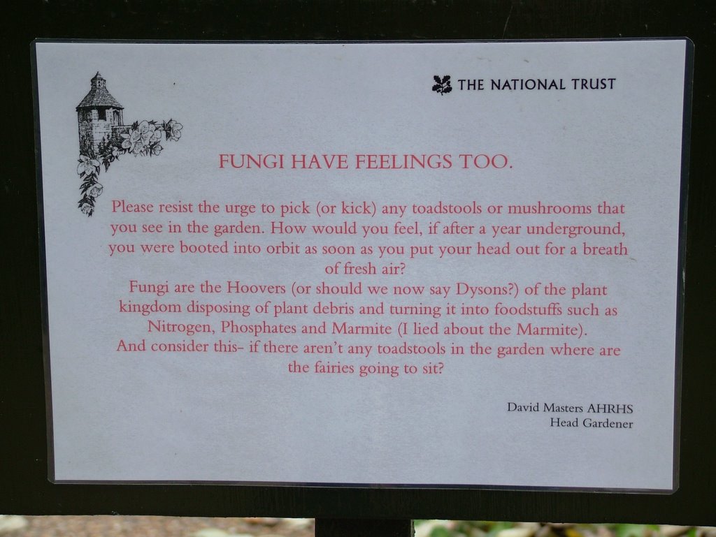
Please be kind to the mushrooms

Click on the image for a bigger version

Bookmark and Share

Friday, November 11, 2005

Stupid, stupid, stupid design!


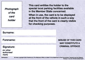
According to The Campaign for Plain English, complaints are flooding in from people after they have been fined for displaying their disabled parking cards the wrong way round in the windscreens.
Take a look and see if you can guess why... (answer at the bottom of this post)

Despite the (rather obvious) problem, nothing seems to be being done about it.


(answer: the front is not the side with the driver's photograph on it, but people are apparently assuming otherwise. You see, contrary to popular myth, being disabled does not lead to the development of a sixth sense.)

Bookmark and Share

Book details changed!


Argh...

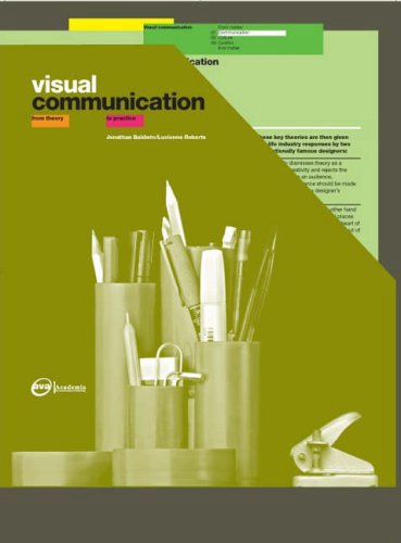
It seems the ISBN of my book 'Visual Communication: From Theory to Practice' has changed (to 2940373094), along with the cover. It happened yesterday or today, so I'm not sure what that means for people ordering it through Amazon, as the old version is still there but with a message 'try ordering it used'...

Anyway, here's the UK Amazon link.
The publishers have changed US distributor, which is why it isn't appearing on Amazon.com so if you're in the US you might have to use the .co.uk link to order it. I'm told it will be solved soon, though.

First good review came in last week. A former student, who doesn't hold back on the criticism so can be trusted as objective, said the first chapter had made the concept of semiotics become clear after she'd looked at just about every other book on the subject. Considering the book is aimed at students and not fellow academics, that's good to know. She said that now she can read the other books and they make sense - which was the aim of the book: a quick introduction to complex ideas that can then be pursued in more detail.

Dumbing up, not dumbing down!

Bookmark and Share

Wednesday, November 09, 2005

Carry on up the charts!

I've just finished with the digital proofs of my book, 'Visual Communication: From Theory to Practice'. No major changes, just a rethink on the biography for the inside flap - I don't know what I was on when I wrote the first one but it's bizarre!
So they should be winging their way back to some Far East printer today for quick amendments then the all-important press of the button.

I just checked out the book on Amazon.co.uk and I've moved over a million places up the charts from a lowly 1,600,000 to 181,634. I can see this becoming obsessive.

Mind you, I reckon you could do that if you only sell three books (I know of at least one sale so far) - how many other titles are also at 181,634 I wonder?
Still, considering it's not even out yet it's not bad I suppose. I bet Dan Brown is quaking in his boots...

Bookmark and Share

Saturday, November 05, 2005

Looking for the perfect Christmas gift?


If you're wondering what to buy people for Christmas, could I suggest visiting Heifer International and buying livestock for a family in a developing country? The idea's a marvellous one and you can even stick to your vegetarian principles by buying Honey Bees and the hive to put them in (just $30 - that's £16 to us Brits, and the cost of about eight jars of decent honey).

In fact, at that price you could still buy your loved ones that expensive and short-lived luxury item and do something that makes a difference as well!

Bookmark and Share

Why has no one thought of this before?

One of those ideas you think we should be forever cursed for not thinking of before:

Before:


After:


More details from http://www.hipporoller.org/

Bookmark and Share

Friday, November 04, 2005

Speak Up

I was recently invited to become a contributor to the 'Speak Up' design site - quite an honour for me personally.
Of course the moment I was asked I froze up, wondering what the hell I could write...
In the past few weeks I've started articles, finished quite a few, discarded others and lost notes that I was sure at the time were going to revolutionise the field of graphic design criticism.

Well today I finally submitted my first article: Pizza Flyers: The Height of Good Graphic Design?, which resulted partly from the New Views conference last week and partly from a series of discussions I had with my students yesterday.

It's not a masterpiece by any standards, but it sort of sets out my stall and - I hope - provokes a reaction! I think I might follow it up soon with further 'evidence' that we really should be taking everyday graphic design more seriously.

Bookmark and Share

Monday, October 24, 2005

My new website

Well it's not going to win any design awards but in true DIY fashion I've finally got a proper web site up. Designers, like builders, should never do their own work. As I'm fond of reminding people (see an early post on this blog) even Mozart never finished any of the compositions he did for his wife...

The site's really aimed at people who read the book and look me up. It was quite painful writing some of the stuff: selling myself was never something I was any good at.

No doubt I'll continue tweaking it - I'm not keen on the logo but it'll do for now. I'm trying to go for an anti-consumerism, design criticism type of look but it's just not coming off. Never, ever, do your own design work.

The blog will continue for now - I toyed with moving it over but that can wait.

Anyway, feel free to visit: http://www.jonathanbaldwin.co.uk, if my overenthusiasm hasn't put you off ;-)

Bookmark and Share

Monday, October 17, 2005

Exclusive: Quark didn't steal their new logo from the Scottish Arts Council...

About a month ago I and many others pointed out the similarity between Quark's new logo and that of the Scottish Arts Council.


Well let me be the first to say that we were wrong. It wasn't copied from them. The reason I know is because on the way back to work from lunch today a van drove past me with this logo plastered all over the side:


The company is PDQ Direct, a courier. What's notable here is that whereas the Scottish logo represents an 'A', here it represents a 'Q', as it does in the Quark logo.
Apparently Quark are claiming their branding company did a thorough search. Not thorough enough, it seems. I'd be asking for my money back if I were them!

Bookmark and Share

Sunday, October 16, 2005

Three Design Podcasts

There are a few interesting podcasts around that look at design and visual culture. Here are three worth subscribing to, all very different.

A new series, live language looks useful. One of them includes a contribution from one of my university colleagues - it never ceases to amaze me how things like this can happen without others knowing! It's a wonder universities achieve anything considering how badly internal communications take place. The podcast URL (for subscribing via iTunes) is http://feeds.feedburner.com/livelanguage. Give it a look if you like intellectual discussion of art and design.

On a more practical bent, Media Artist Secrets offers a regular set of hints and tips for creative professionals. You can subscribe in iTunes directly using this link.

8th Floor Gallery is an interesting one, particularly if you are thinking of using podcasts in education, as I am. It offers a series of interactive tours of MOMA with students and a tutor discussing various artworks. The Discussion on Cindy Sherman's 'Untitled 92' is a personal favourite. Note that if you have the 'album artwork' visible in iTunes you can see an image of the artwork under discussion. Click on it for a larger floating window. On newer iPods, this artwork will appear on your screen as you play the podcast - obvious potential there for digital tours, as I think is the point of the exercise. The idea is that people can hear 'unofficial' discussions rather than the more formal ones you get from the institutions themselves. Fine art and art history courses might think about this as teaching and learning tool for their students. Others (like graphic design) can easily adapt it - I'm asking my second year students to record 20-minute podcasts in groups for their Christmas assessment.
Subscribe to the podcast in iTunes using this link: http://feeds.feedburner.com/8thFloorGallery. The same link also works in RSS news readers for text updates on the site.

Bookmark and Share

Wednesday, October 05, 2005

New Views: Repositioning Graphic Design History

NEW VIEWS: Repositioning Graphic Design History

A two-day symposium that takes a fresh look at Graphic Design History
and its relationship to design education and professional practice
27-29 October 2005

£150 before 1 October
£135 Design History Society members
£180 late registration after 1 October
£75 for students

For details of registration, speakers, paper abstracts and related events:
www.newviews.co.uk

Venue:
London College of Communication,
Elephant & Castle, London, England SE1 6SB

For delegate information and registration:
HELEN Hopkins: h.hopkins@lcc.arts.ac.uk

For speaker information and related exhibitions:
TEAL Triggs: t.triggs@lcc.arts.ac.uk

Bookmark and Share

Tuesday, October 04, 2005

Speed Reading... not

I was having a conversation with a student today and Tony Buzan's 'Mind Mapping' book came up. 'I've got his 'Speed Reading' book from the library.' she said, writing something in her note book. 'I've renewed it eight times.'

(Beat. Eye contact. Fits of laughter from us both as we realise what she's said.)

Funniest thing I've heard in weeks.

Bookmark and Share

Fork Handles


There are a few ways to make me smile: saying 'Fork Handles' or 'G-Granville, f-fetch a cloth' are just two.

Ronnie Barker, one of my all time heroes, has died. It's the sort of news that immediately sends you back to your childhood.

A friend and I used to have a competition to see who could let the other one know about a celebrity death first. It was a little sick but it stemmed from the fact that she and I both defined our lives in terms of the TV programmes and catch-phrases we grew up with.

Over the past few years more and more of the familiar faces have been passing away and apart from anything else it makes you feel old, nostalgic and mortal.

I don't know how well Ronnie Barker is known internationally - certainly he's very well known in Australia and New Zealand and I don't doubt his shows (The Two Ronnies, Porridge, Open All Hours) are on endless loop on PBS in the USA. Barker appeared with John Cleese on the Frost Report before Monty Python, and was a radio actor before that, appearing with Jon Pertwee (among others) in 'The Navy Lark'.

Apart from being one of our greatest comedy actors he was also one of the most talented writers around. Famously, the Two Ronnies show used to receive scripts from an anonymous writer (Gerald Wiley?) who was eventually persuaded to turn up for an end-of-series dinner. Turned out it was Barker - he didn't want his work to be accepted simply because it was by him.

He retired at the top years ago leaving us wanting more, and citing the examples of Eric Morecambe and Tommy Cooper - both of whom died of heart attacks on stage (I remember seeing Tommy Cooper collapse) - as the way he didn't want to go. Barker received a lifetime achievement award from BAFTA last year - as he put it, a 'get 'em before they die' award. It was clear he wasn't well and he had himself, and us, in tears as he accepted it.

Last year a poll of British TV viewers for the favourite comedy sketch of all time came up with 'The Hardware Shop' (or 'Fork Handles' as it's more commonly known). You have to see this sketch performed by the Two Ronnies - it is so much funnier than reading it. But if you can't (Amazon have DVDs) then here it is:

In a hardware shop. Ronnie Corbett is behind the counter, wearing a warehouse jacket. He has just finished serving a customer.

CORBETT (muttering): There you are. Mind how you go.

(Ronnie Barker enters the shop, wearing a scruffy tank-top and beanie)

BARKER: Four Candles!

CORBETT: Four Candles?

BARKER: Four Candles.

(Ronnie Corbett makes for a box, and gets out four candles. He places them on the counter)

BARKER: No, four candles!

CORBETT (confused): Well there you are, four candles!

BARKER: No, fork 'andles! 'Andles for forks!

(Ronnie Corbett puts the candles away, and goes to get a fork handle. He places it onto the counter)

CORBETT (muttering): Fork handles. Thought you said 'four candles!' (more clearly) Next?

BARKER: Got any plugs?

CORBETT: Plugs. What kind of plugs?

BARKER: A rubber one, bathroom.

(Ronnie Corbett gets out a box of bath plugs, and places it on the counter)

CORBETT (pulling out two different sized plugs): What size?

BARKER: Thirteen amp!

CORBETT (muttering): It's electric bathroom plugs, we call them, in the trade. Electric bathroom plugs!

(He puts the box away, gets out another box, and places on the counter an electric plug, then puts the box away)

BARKER: Saw tips!

CORBETT: Sore tips? (he doesn't know what he means) What d'you want? Ointment, or something like that?

BARKER: No, saw tips for covering saws.

CORBETT: Oh, haven't got any, haven't got any. (he mutters) Comin' in, but we haven' got any. Next?

BARKER: 'O's!

CORBETT: 'O's?

BARKER: 'O's.

(He goes to get a hoe, and places it on the counter)

BARKER: No, 'O's!

CORBETT: 'O's! I thought you said 'O! (he takes the hose back, and gets a hose, whilst muttering) When you said 'O's, I thought you said 'O! 'O's!

(He places the hose onto the counter)
BARKER: No, 'O's!

CORBETT (confused for a moment): O's? Oh, you mean panty 'o's, panty 'o's! (he picks up a pair of tights from beside him)

BARKER: No, no, 'O's! 'O's for the gate. Mon repose! 'O's! Letter O's!

CORBETT (finally realising): Letter O's! (muttering) You had me going there!

(He climbs up a stepladder, gets a box down, puts the ladder away, and takes the box to the counter, and searches through it for letter O's)

CORBETT: How many d'you want?

BARKER: Two.

(Ronnie Corbett leaves two letter O's on the counter, then takes the box back, gets the ladder out again, puts the box away, climbs down the ladder, and puts the ladder away, then returns to the counter)

CORBETT: Yes, next?

BARKER: Got any P's?

CORBETT (fed up): For Gawd' sake, why didn' you bleedin' tell me that while I was up there then? I'm up and down the shop already, it's up and down the bleedin' shop all the time. (He gets the ladder out, climbs up and gets the box of letters down, then puts the ladder away) Honestly, I've got all this shop, I ain't got any help, it's worth it we plan things. (He puts the box on the counter, and gets out some letter P's) How many d'you want?

BARKER: No! Tins of peas. Three tins of peas!

CORBETT: You're 'avin' me on, ain't ya, yer 'avin' me on?

BARKER: I'm not!

(Ronnie Corbett dumps the box under the counter, and gets three tins of peas)

CORBETT (placing the tins on the counter): Next?

BARKER: Got any pumps?

CORBETT (getting really fed up): 'And pumps, foot pumps? Come on!

BARKER (surprised he has to ask): Foot pumps!

CORBETT (muttering, as he goes down the shop): Foot pumps. See a foot pump? (He sees one, and picks it up) Tidy up in 'ere.
(He puts the pump down on the counter)

BARKER: No, pumps fer ya feet! Brown pump, size nine!

CORBETT (almost at breaking point): You are 'avin' me on, you are definitely 'avin' me on!

BARKER (not taking much notice of Corbett's mood): I'm not!

CORBETT: You are 'avin' me on! (He takes back the pump, and gets a pair of brown foot pumps out of a drawer, and places them on the counter) Next?

BARKER: Washers!

CORBETT (really close to breaking point): What, dishwashers, floor washers, car washers, windscreen washers, back scrubbers, lavatory cleaners? Floor washers?

BARKER: 'Alf inch washers!

CORBETT: Oh, tap washers, tap washers? (He finally breaks, and makes to confiscate his list) Look, I've had just about enough of this, give us that list. (He mutters) I'll get it all myself! (Reading through the list) What's this? What's that? Oh that does it! That just about does it! I have just about had it! (calling through to the back) Mr. Jones! You come out and serve this customer please, I have just about had enough of 'im. (Mr. Jones comes out, and Ronnie Corbett shows him the list) Look what 'e's got on there! Look what 'e's got on there!

JONES (who goes to a drawer with a towel hanging out of it, and opens it): Right! How many would ya like? One or two?

(He removes the towel to reveal the label on the drawer - 'Bill hooks'!)

Bookmark and Share

Ah, clients...

The Design Rants site is well worth a visit - I've subscribed to the RSS feed. Basically designers post their stories about the bizarre behaviour of their clients, and they're all too familiar.
Of course, a lot of the problems could easily be solved with better communication between designer and client: things we see as odd or unreasonable on the part of the client are completely ratonal to them, and if we started involving ourselves in their business we'd be sure to sound just as daft.

But don't let rationality get in the way of a good rant - or laugh.

This story was posted today and, like many others, it's one I lived through almost word for word:

So, the client (a small sporting goods store) draws up their little schematic of the ad that they want. In one spot they want a coupon, and they have sketched out an example of what they want: the whole coupon in reverse, with a white box in the middle of it with black type advertising their sale price on whatever, beneath that white box is the name of the store in reverse, and then beneath that, in another white box, they've sketched in this weird...thing. It just looks like a bunch of vertical lines. Then, they've drawn an arrow, pointing at the box with lines. Next to the arrow it says: "bar code."

Right. Must be they're gonna supply that later. So, compose the ad, send it out to the accout manager, who calls back: "They're sending the bar code over to you now."

Me: "Okay, great, are they emailing it or sending hard copy?"

Account manager: "No, faxing it."

Me: *headdesk*

It gets better. So what do you think the client faxes over? A BARCODE FOR A COMPLETELY DIFFERENT ITEM SOLD AT A COMPLETELY DIFFERENT STORE. A national department store, in fact. Client's coupon is for athletic shoes, department store's barcode is for sheets. Not to mention the fact that they want me to SCAN a freaking BARCODE.

I call back the account manager, and ask, in politer terms of course, what the hell is going on here. His explanation: "Oh, the client just likes how the barcode looks in the ad. He thinks it makes it look more official."

As it finally turns out, the client doesn't even use barcodes.

Bookmark and Share

Sunday, October 02, 2005

What is Design History?

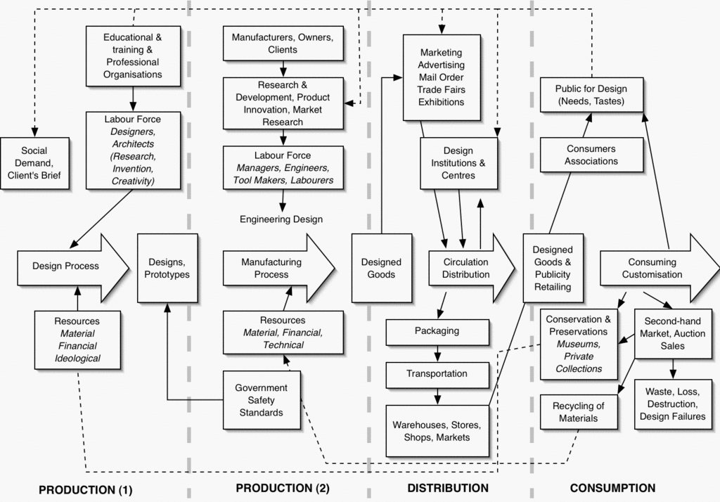
I've been working on the diagram I posted last week to try to present it in a more aesthetically pleasing way (I think the old one's a little confusing) and to make it more immediately relevant to my own students. I've also added in some elements that are covered in the course I teach - government regulation, the recycling of ideas and the role of 'heroes' or 'stars' in the design process. I haven't added globalisation in there yet - it seems to belong in every section both as a positive and a negative.

The amended diagram as it stands today is below. Click for a bigger version (the colours are a bit washed out in the GIF reduction). Any suggestions on changes/additions greatly received. (If you want a version for your own use, let me know and I'll take the text out from the top).

I'm also working on a model of my own but for now the Walker model (or my version of it) will do. I'm hoping to get colour versions printed up for the first session with the first years next week in which we ask them to say what they think the course will cover. I think they'll be surprised to find that 'design history' consists of very little 'history' - at least in the traditional sense.


All this leads me to answering a question I was asked last week: how would you approach introducing historical and critical studies to a new group of students, most of whom aren't British and most of whom probably have the idea that it has little, if anything, to do with learning graphic design.

Well first I'd ask them the question: what is 'historical and critical studies'? Let the students offer up their ideas about what the phrase means. Typical responses I've had in the past range from simply ‘theory’, to ‘how design works’. A large number of responses revolve around ‘teaching us how to be critical’ and ‘learning about who the best designers were’ – this being an interesting misinterpretation of the phrase ‘critical studies’.

Asked why they think they are ‘made’ to study H&CS, responses in the past have included ‘to make the course a degree’ and ‘to make us more employable’.

Recent research in the UK* offers a useful set of categories with which to view student responses. It derives four hierarchical categories of student conception with the highest (category A) being students who see an almost unquestionable link between ‘theory’ and practice – to such an extent that the interrelationship is difficult to articulate.

The next category sees a clear relationship, and finds theory interesting, but sees no integration. I'd suggest that this is the fault of the separated design curriculum, which often allows for no integration between the two aspects of history/theory and practice, resulting in the predominance of category B responses that could so easily be category A.

Category C students see a value for theory, but only in terms of adding academic legitimacy (‘it makes the course a proper degree’ being a typical response to my question, distinguishing it from a ‘cutting, sticking, gluing, painting sort of degree’ as one of the respondents to the research put it) or to employability (as another one put it: ‘instead of saying oh you make dresses don’t you? Oh it’s a fashion designer we think, with the honours, the dissertation, she can read and write as well … that little extra academic cherry on the top of the cake’).

The lowest order of response (Category D) sees theory as a distraction from practice, failing to see any value in it whatsoever, and criticising the amount of time spent on it that could be spent on practical work.

An important question arises from this, one I think we're avoiding: why do students who see no value in H&CS sign up for degrees in the first place? This is not a criticism of the students, but of the system that either signs them up to courses they are likely to be immensely dissatisfied with, or that fails to provide alternatives. Category D students may excel in other areas, but are likely to present themselves to H&CS staff as ‘poor’ or ‘bad’ students, and suffer accordingly. Accepting students on to a course they are likely to fail, or be disaffected with, seems somewhat irresponsible and it would be interesting to look at how courses are marketed and whether H&CS is seen as important enough to be a consideration in offering a place. It's noticeable that few, if any, design courses seem to involve H&CS staff in the selection process. If courses don't take H&CS seriously, (even 'nodding through' students that fail it) it's hardly surprising some students don't either.

This latter point came up in a meeting I had last week with representatives from the AV media industries. They're planning on 'validating' media degrees in the UK that meet industry-stipulated standards in terms of the skills and knowledge given to students. Now, I can hear the complaints from academia already - it's industry's job to train its employees, not the tax-payers, and it's shortsighted of industry not to see the value of academic approaches to the critique and study of its own practices. In other industries, medicine, physics, geography, earth sciences, law etc, it is universities that lead research and understanding. Turning university courses into training workshops risks stagnating the industry as all the innovation would be left in the hands of a few companies - a dangerous situation for consumers, society and industry itself.

However, they had a good point: a lot of students are signing up to media studies degrees thinking they are quick routes into the industry when in fact they're more like 'cultural studies' degrees but given a far more 'saleable' badge. It's mis-selling, and that's why 'Category D' students end up on degrees and dismiss the part of the course that is actually probably the most important.

As I put it in an interview last week, and countless times on this blog, it's the difference between learning how to 'do' graphic design and 'being' a graphic designer. I don't see the point in forcing a student who just wants to learn Photoshop to learn about the ethics surrounding digital manipulation. Nor do I see the point in a student who wants to understand the ethics and practices of the profession and learn Photoshop from being prevented from doing so by having their learning disrupted by students who'd be better off somewhere else.

There should be (and are) courses for both ambitions. The trouble is degrees mis-sell themselves to get 'bums on seats', and industry is pressuring degree courses to ditch the thinking for the doing because it can't be bothered to stump up the cash to train its own damned workforce.

Mmm... I seem to have strayed from the point somewhat. Or have I? Because I see this discussion as being another essential aspect of design history, as shown in the diagram: the role of education, training and industry bodies. It's a debate which bubbles to the surface every so often, and increasingly so. This year, for example, at least four of my third year students are undertaking dissertations which look at this area.

If industry got its way they'd be told to shut up and learn how to use the Page Curl filter, or something equally 'useful'.


*Pritchard, T, Heatly, R, Trigwell, K (2005). "How art, media and design students conceive of the relation between the dissertation and practice." Art, Design & Communication in Higher Education 4(1): 5-15.

Bookmark and Share

Sunday, September 25, 2005

Abandoning History

A colleague and I are speaking at a conference in London at the end of October (on my birthday in fact). The conference is called 'New Views' and our paper, 'Abandoning History' is a case study looking at how we teach design history to graphic design students.
It's shaping up okay and I'll maybe post some excerpts up here nearer the time. The basic premise is that when graphic design started being taught as a degree subject all that happened to give it 'academic legitimacy' was courses imported design history staff to show a few slides of the great and the good, give some lectures on historical aretfacts, and then demand a few essays.
Hardly surprising that this part of the course is traditionally hated by everyone concerned.

So we're proposing a few things. Firstly, that we abandon the idea of history as canons, heroes and artefacts and instead adopt what I've called 'history-less history' (or a Marxist view of history to be more precise - though I've found using the 'M' word seems to turn people off for some reason) which looks at history as a series of causes and effects with particular emphasis on the systems of production and consumption of design. This allows us to bring in social studies, cultural studies, psychology, audience studies, politics and issues that are often ignored: ethics and human ecology.

The second thing we're proposing is that historical and critical studies is no longer taught by part-timers on hourly contracts, as is so often the case in the UK. The only result of this is that the subject never gets developed, staff have no commitment to their students' ongoing progress (through no fault of their own) and studio staff and students naturally see it as a completely separate aspect of the course. If it's so unimportant that staff are paid by the hour and only during term-time, it's obviously not important at all. Design degrees need full-time H&CS staff who are available to the students at all times and seen in and around the studio. Sadly this rarely happens. No wonder students are still bored stiff with slide shows and 'survey' courses that are completely irrelevant to them.

My first draft of the paper was over 9,000 words long and I hadn't even got to the case study! But there's a lot to say and a lot of evidence to present. It would make an interesting book, that's for sure. So last week I cut it down dramatically and it's around 5,000 words now with the case studies and conclusion to add on. Next week we're going to interview a few students for some quotations to illustrate our points and then we have to put it to bed, so to speak.

Anyway, last week while I was struggling with how to explain my model for a production-consumption approach to design history I stumbled upon the diagram below. Actually, I'd seen this last year and remembered at the time how I thought it closely resembled what I was trying to do. Then I promptly forgot about it!
Now it's going in the paper and, as I've just spent an hour in OmniGraffle trying to redraw it I thought I'd post it here for those who are interested. Click on the thumbnail to open the full version.
I think it's rather interesting and it shows the interconnectedness of different aspects of the curriculum. I'm going to try to update it and add some examples (for instance, educating students about how choices about ink and paper have a huge effect on the environment, discussions of the ethics of branding and globalisation etc). I'm going to give a version of this out to first years in a couple of weeks to help explain what we mean by 'design history'.


Source: 'Design History and the History of Design' by John Walker (1989) London: Pluto Press

Bookmark and Share

Friday, September 23, 2005

What's in a name?

From the BBC News web site

Jordan, K'tee, Kloe and Bobbi-Jo are all names to make some teachers' hearts sink, apparently.

Teachers have confessed to making snap judgements about children from their names on the register.
In a light-hearted debate on a teachers' website, they have listed the names they associate with problematic and charming pupils.

Poppys are seen as hyperactive, Kayleighs as a pain and Ryans as hard work, according to chat on the website of the Times Educational Supplement.

Kyle, Liam, Wayne, Charmaine and Charlie are among the names teachers say they associate with problem children.

One teacher wrote: "I went through my new class list and mentally circled the ones I thought would be difficult. I reckon I have a 75% hit rate..."

Good list
Kate, Gregory, Sean, Charlotte, Jamie, Daniel, Lucy, Isobel, Ben, Sam, Harpreet, Imran, Asam, Alice and Joseph


According to the website, names which get a negative response from teacher include those with hyphens, like Bobbi-Jo, ordinary names with unusual spellings such as Kloe or K'tee, Kristopher, Jayne, Gyaike and Chevaughn, plus the various spellings of Jordon.

Names which teachers associate with delightful children include Kate, Gregory, Sean, Charlotte, Jamie, Daniel, Lucy, Isobel, Ben, Sam, Harpreet, Imran, Asam, Alice and Joseph.

However, perhaps proving that one's response to a name is dependent on one's personal experience, many names appear on both lists.


Bad list
Bobbi-Jo, Kloe, K'tee, Kristopher, Jayne, Wayne, Charlie, Liam, Ryan


The debate has sparked a row with parents chatting on another website, bounty.com.
Some were appalled, complaining that children were being labelled and pre-judged before they had even stepped inside a classroom.

One mother said she had complained to the Department for Education and Skills, saying: "I and many other parents are disgusted by the attitudes of the teachers on the forum.

"I realise this is a small number of teachers, but they have taken time out of their day to post these comments and I presume... they actually mean what they are saying."

But others on the site sympathised with the teachers, saying they understood how if you had had a bad experience with a child, their name would continue to have bad associations for you.

Bookmark and Share

Thursday, September 22, 2005

Wallace and Grommet

When I saw Charlie and the Chocolate Factory recently the trailers went down a storm: King Kong looked excellent, Harry Potter was worth a squizz, but the audience really came alive for Wallace and Grommet's 'Curse of the Were-Rabbit'. The trailer had more laughs than the whole of Charlie.

There's an 'exclusive' clip over at the BBC site - worth a look. Watch out for the policeman's line: maybe it says something about me but I was laughing like a drain (whatever that means)

Very British, very dark, and very cheesy (as in 'Wensleydale: Crackin' Cheese, Grommit!'). Can't wait to see this.

(Interesting fact: I used to live next to Wensleydale - a beautiful part of the world and one of the finest, crumbliest cheeses you could ever hope for. Lovely on fresh crusty bread with a bit of pickle... Now there's an idea...)

Bookmark and Share

Saturday, September 17, 2005

Brazil's double standards?

Talking of the shooting of an innocent Brazilian in London reminds me of a point that had me seething over the summer.

As shameful as the shooting was (though hardly unexpected given the huge pressure on people to get results), the reaction of the Brazilian government was disgraceful. As Private Eye pointed out, it took arond 30 hours for them to issue a statement condemning the shooting - a happy coincidence as 30 was the number of innocent Brazilians shot by their own police force only days earlier.

This led to quips when Brazil sent over representatives to talk to London police about the shooting that they were not so much after evidence but possibly offering tips for next time...

Bookmark and Share

Conspiracies


There's an interesting article in the current edition of The Fortean Times (a magazine I used to do illustrations for, and quite an entertaining read) about the conspiracy theories surrounding the 7/7 London bombings.
One of the best bits is a comment by the article's writer that it isn't stupid for people to believe in conspiracies, giving a fairly long list of previous events that have turned out to have been the handiwork of the authorities in different countries, including the UK. (The sinking of The Rainbow Warrior is a good example, with the French being the culprits there, and Noam Chomsky gives a good account of US and UK activities in other countries in Hegemony or Survival).

But ultimately each of the various 7/7 conspiracies is shown in the article to be flawed. Although it doesn't mention the shooting of the Brazilian on the London Underground two weeks later, the subsequent distress of much-quoted 'eye witnesses' (who described the victim as wearing a padded jacket with wires trailing from it, and leaping over ticket barriers only to see photographs of his body shoowing quite clearly that he was wearing summer clothing and hear that he used his 'Oyster' card to calmly get through the barriers, and that it was the poliec who jumped over the barriers, not him), show that not only does the rumour mill take over but that we quite literally can't believe our own eyes. Our brain seems to fit our observations together into a narrative that makes sense. We see someone jumping over a barrier, we remember reports of what the 7/7 bombers were wearing, we see someone get shot - consequently we add the details from one memory to another and produce a version of events that makes sense.


Mark Whitby said: "I was sitting on the train... I heard a load of noise, people saying, 'Get out, get down'.
"I saw an Asian guy. He ran on to the train, he was hotly pursued by three plain clothes officers, one of them was wielding a black handgun.
"He half tripped... they pushed him to the floor and basically unloaded five shots into him," he told BBC News 24.
"As [the suspect] got onto the train I looked at his face, he looked sort of left and right, but he basically looked like a cornered rabbit, a cornered fox.
"He looked absolutely petrified and then he sort of tripped, but they were hotly pursuing him, [they] couldn't have been any more than two or three feet behind him at this time and he half tripped and was half pushed to the floor and the policeman nearest to me had the black automatic pistol in his left hand.
"He held it down to the guy and unloaded five shots into him.
"He [the suspect] had a baseball cap on and quite a sort of thickish coat - it was a coat you'd wear in winter, sort of like a padded jacket.
"He might have had something concealed under there, I don't know. But it looked sort of out of place with the sort of weather we've been having, the sort of hot humid weather.
"He was largely built, he was quite a chubby sort of guy"


It doesn't help that the media takes the stories and prints them without question. On 7/7 I swapped channels to see how the BBC, ITV and Fox News were covering it. Fox was clearly getting its coverage and info via Sky, Murdoch's satellite service in the UK, but adding comment from studio guests and reporters in London via phone. Fox's coverage was awful with the descriptions of the city bearing little relationship to the truth and seeming to come more from a Dickensian depiction of the place than any other. Bloomsbury, the area of town where the bus blew up, was described in overly romantic terms, for example, more because of its historic associations than its present situation.

The thing that marked out the BBC's coverage from that of other stations was that while other agencies were reporting everything - every rumour, every estimated death toll - the BBC only reported official sources. This meant that ITV and Fox were reporting estimated deaths of between 30 and 50 (only guesses because no one had even reached the body-strewn carriages underground at the time), while the BBC reported one confirmed death and several injuries. After the event the BBC was criticised for being the mouthpiece of officialdom but to my mind what it showed was that when news agencies report rumour and gossip as fact, they soon become facts. Take the 'discovery' of WMD in Iraq that recent polls showed a large proportion of US citizens to believe had happened, even though none have been found. But if you remember, there were constant reports during the Iraq war of things being found (that later, but less publicly, turned out to be harmless) and images of reporters and soldiers donning chemical suits.

It's a difficult line to draw for the BBC because on the one hand - as here - being conservative with your reporting means that while you're less sensational than other channels you end up telling the truth in the long run. But on the other, when you make such a thing of reporting official figures you're at the mercy of what those in charge want to release. And there's the conspiracy thing again...

When I was stuck in London on 21 July after the second attempted bombing there was little information, and most people were unconcerned. But I did hear people talking on the streets about what was happening. Most of what I heard was obviously untrue, but they were citing reliable sources such as 'a guy I know' and 'some woman'. This was less than an hour after we'd been kicked off the underground. I rang home and spoke to a friend who was staying with me and she was watching it on TV and although she knew a bit more than I did (that there'd been an incident) she knew nothing more than that. Eventually I used my Palm Treo to access the internet and read the Guardian blog which carries an unedited feed of information that's coming into the paper's news desk. There were a few more 'facts' on there but essentially it seemed the events were less dramatic than 7/7. That didn't stop the stories I could hear from those around me, however. And I knew that it was those stories which would probably be reported as news on TV because the sad fact is that in an age of rolling news, when you have to fill your airtime with nothing but specualtion (laughably prefaced with the words 'It's dangerous to speculate at this time but...') then rumours are all you've got.

(The question that occurs to me, however, is why did I implicitly trust the Guardian's website more than I trusted any other source? One of the paper's mottos is 'Speech is free, but facts are sacred', if that's anything to go by).

Anyway, back to the Fortean Times. It carries an image from a recent Minsitry of Defence exhibition of WW2 paintings. It's 'Premonition' painted in the 1930s by German exile Walter Nessler. It showed, with remarkable foresight, the effects of the blitz on London, years before it happened. (The example above is poor quality - the actual painting is remarkably detailed).
But the reason people are looking at it again is that the painting makes a great play of the city's public transport and two buses are depicted with numbers: 30 is the number of the bus that was blown up and the other '77' is the date of the bombing (the painting even has a blemish between the numerals making it look like 7.7). It makes you think for a minute, but there's a boxout near the painting in the magazine about the numerology of the 7/7 bombings and how the number 7 crops up so frequently (7/7/2005, for example contains three sevens: 2+0+0+5 being the third). But all these permutations, like the accompanying ones for 9/11 are quite ludicrous as they depend on some odd combinations of numbers and mathematical trickery. Like the eyewitnesses to the shooting mentioned above, all they prove is that the human mind likes patterns and rationality, even if the result is something far from rational.

Bookmark and Share

Wednesday, September 14, 2005

Yahoo lands Chinese journalist in prison

From The Guardian, George Monbiot writes:

"In April, Shi Tao, a journalist working for a Chinese newspaper, was sentenced to 10 years in prison for "providing state secrets to foreign entities". He had passed details of a censorship order to the Asia Democracy Forum and the website Democracy News.


The pressure group Reporters Without Borders (RSF) was mystified by the ease with which Mr Tao had been caught. He had sent the message through an anonymous Yahoo! account. But the police had gone straight to his offices and picked him up. How did they know who he was?
Last week RSF obtained a translation of the verdict, and there they found the answer. Mr Tao's account information was "furnished by Yahoo Holdings". Yahoo!, the document says, gave the government his telephone number and the address of his office."

Read the full article

Bookmark and Share

Monday, September 12, 2005

Quark's new identity is old...

I gather I'm not the only one to spot this but in case you hadn't heard, Quark today revealed a new identity which bears a striking resemblance to one already happily being used...

Spot the difference:


The middle bit (the counter if you want to be technical) is slightly different but that's about it.
It's interesting that the stylised letter is a 'Q' in one and an 'A' in another.

Bookmark and Share

Monday, September 05, 2005

Technical difficulties

Along with my podcast feed not appearing to work properly (though that's most likely my fault) it seems that some of my past posts are springing zombie-like from the grave and being seen as 'new' in my newsreader. This is extremely annoying so apologies - I'm looking into what might be causing the problem.

Lots of new posts to upload soon - I've been busy with the book and a conference paper but have a few things saved up, so stay tuned!

Bookmark and Share

Friday, September 02, 2005

CRAP generator

With the new academic year approaching I thought a tool to help generate comments on students' work might be useful.
Introducing the Critical Response to Art Projects auto-comment generator!

You should see the flash file below - a bit small here, but if you download the standalone it'll work full screen. (The 'quit' button only works in the standalone version)


Download Mac standalone
Download PC standalone

Bookmark and Share

Saturday, August 27, 2005

Podcast available

I finally got round to figuring out how to publish a podcast late last night - blimey, it's not as simple as people make out! There are rumours flying around that Apple might create a program that allows you to record and publish podcasts with chapter points, changing images etc and I really hope they do.
I tried so many techniques last night (admittedly late and, er, a little drunk) and the easiest was the one I should've tried earlier but didn't realise existed: feedburner.com (who I use to convert my Atom feed into RSS) provide a facility that detects audio and video files and wraps them in the required enclosure.
Anyway - the upshot of this is that you can now subscribe to my podcast using various bits of software. To subscribe in iTunes (my preferred method now) just drag the 'XML' badge on the right sidebar into your podcast directory. It's pretty much the same for other programs too but the actual URL is: http://feeds.feedburner.com/AWordInYourEar

I'm not sure if I'll get into the podcasting thing (I don't have the voice for it! Plus I'm better at writing than making this stuff up verbally) - the idea is to use it with students and now it seems so easy I'm looking forward to giving it a go.

Podcast

[UPDATE: Well I don't know wht's happening - one minute the podcasts are there in iTunes, the next it says they don't exist. This is more difficult than I thought - am I missing something obvious? I'll try again at the weekend...]

Bookmark and Share

Friday, August 26, 2005

In my opinion

I’ve reviewed a few books in the past few years, all related to education and/or art and design (a term I hate as it implies the two are one and the same). In every case I’ve enjoyed the books I’ve read – even the one I really hated: Class War by Chris Woodhead, a bitter polemic that makes more bizarre claims than you’ll hear from any religious extremist, and making the author a prime candidate for deportation as a proponent of hatred towards educationalists.

But this week my latest review appeared in The Times Higher Educational Supplement (26 August 2005) of Graphic Design School by David Dabner. Reviewing it had been a tricky business for several reasons. Firstly, this is a small world and as I’m currently facing the end of my contract and looking, increasingly desperately, for a new job, I knew that if I didn’t like what I read and told the truth I might find a few doors closing. Dabner works at a university where I have links, largely through my work teaching on their postgraduate certificate in education – a qualification all lecturers are having to gain (quite rightly) but which many deem beneath them though not, I hasten to add, Dabner, so far as I know. If worst came to worst and I couldn’t find a full-time teaching post I knew it was a fairly safe-ish bet that I could get some part-time teaching hours at this place to tide me over (although to be honest it would still not be enough to pay the rent).

So the pressure was on because the likelihood of getting a job, or more likely keeping it, if I wrote a bad review would be remote. Academics, I know from bitter personal experience, don’t like each other but they don’t like people who criticise their colleagues even more. And it isn’t just that particular institution I’m talking about – the fact is that everyone knows everybody else and I could be criticising the Devil himslef but if someone once worked with him (something I don't doubt in some cases) I’d find myself sent to Coventry (except even there I bet I’d be ignored. If you’re already in Coventry, where do they send you?)

The second difficulty arises from the fact that I have a book coming out myself in November. In fact I’ve got two coming out – a book on branding I’ve provided some sections for, and one on Visual Communication I’ve co-written with a well-respected designer. At the time of doing the review I’d just submitted the final manuscript to the publisher and, although relieved, I have to say I was going through the ‘oh my God it’s crap’ phase. I used to think it was just me, that I can never like what I’ve done until a year or so down the line, but I think most people suffer from this. At school I would never let people see my work, and as a designer I would hold off until the deadline (or after) before saying ‘here, what do you think?’
So I was thinking to myself ‘what goes around comes around’ and that if I submitted a negative review I’d find myself being reviewed by someone who felt I was going to get what I deserved.

The third reason, and the biggest, was simply politeness. Somebody has written a book and had it published. That in itself is an achievement, something I can relate to. Just flicking through the pages I was overcome by respect for the mind-boggling complexity of chapters, headings, box-outs, picture captions and footnotes. Would a negative review send the guy into a depression? I know that’s what will happen to me if I stumble upon less than positive feedback of my efforts.

There’s a common phrase in education of the ‘shit sandwich’, a model for providing students with feedback. Start off with the praise, then give them the criticisms, then no matter what the grade they got, end with more praise even if it’s just ‘well-formatted’ or ‘some interesting points of view’. It’s quite a good model actually, less formulaic and more constructive than it sounds and so, I thought, maybe I should use it here.

I have a bit of a process when I write reviews: I skim through the book first to get the general gist and write an immediate response to what I think the arguments are. If you read a lot of book reviews you’ll notice that many talk more about the subject than the actual book, and this is my preparation for that bit. Book reviewing is less about the book than placing it in a context and commenting on its contribution or failings in that context.
Then I read the book more closely and make a mental note of sections that stand out, for good or bad.
Finally I put it away for a bit. I might ‘free write’ my immediate thoughts but either way, I put it away for some time partly out of procrastination and partly because I want my thoughts to mellow. Something that makes you angry one minute might later, after much thought, turn out to be a good point that you simply weren’t willing to accept. I see a lot of this in student essays, incidentally. There’ll always be a body of students who think an idea you introduced them to is stupid and misses the point. In fact this sometimes comes out in the end of year feedback they provide on the course – among the positive comments there’ll be a few that are quite scathing about something and although it’s easy to get upset about them I know from experience that it’s often those students who, when it comes to their third year dissertation, will come up with the goods because they’ve engaged with the arguments and mellowed over time. Well, not always. Sometimes they just don’t like me.

So after the cogitation comes the writing process and again there’s a formula: general comment about the subject, how the book fits in to it, specific points and maybe a quotation or two, show off about your own knowledge, find something to praise or criticise (whichever provides a balance to what’s gone before) and then mention who you’d recommend it to (if at all). ‘Job’s a good ‘un’, as we say in Yorkshire.
Then if time allows leave it again and come back to it. Often I rewrite large sections, move bits around and generally mollify my language.

In the case of this book it needed a lot of mollification. It wasn’t the author’s fault – the problem with this book was that it reflected what I see as a bad state of affairs in graphic design education: the focus on the visual and the idea that all you need to do to be a graphic designer is learn how to use InDesign or QuarkXpress, Dreamweaver and Flash, and learn how to use a digital camera. The book is so broad in its coverage that it says not very much about lots of stuff. In that, it’s a perfect textbook for so many graphic design courses but that doesn’t excuse it. Remember, when someone is asked to review a book they are asked because of their assumed knowledge of the subject or their known views. Newspapers want a review that engages with the book and asks questions of it, that spark a debate. The idea isn’t that the reviewer knows more about the subject than the reviewee, or that their word is sacrosanct. In this case I was asked, I presume, because I’m known to the paper as someone with strong views on graphic design education and as a member of the UK’s higher education academy subject centre for art, design and media. Given that, I told myself, it’s appropriate to say what you think.

There were three main criticisms of the book: its scope, its contradictions and its mistakes.
Scope I’ve already mentioned but to elaborate: animation is not, I believe, graphic design. Nor is photography. There are so many ‘best bits’ of other subjects that graphic design has pilfered in recent years that we no longer seem to know what graphic design itself is. At my last college there were three year degrees in photography, packaging and animation and yet the course I inherited seemed to think you could do each of those in five weeks. If the other courses had run five week modules in graphic design there’d have been uproar.
I don’t deny having a knowledge of those areas helps, as designers often work with or commission photographers, animators and packaging experts. But to suggest that you can be as good as them in, as in this case, two double page spreads, made me a little cross.

As for contradictions, one stood out in particular. On one page about ideas generation (and I take my hat off to the author for claiming, as I do, that creativity can be generated rather than being inate in just a few people) the book warns students to ‘avoid clichés’. I’ve said it before and I’ll say it again: why are clichés seen as bad? It’s another word for ‘easily understood sign’. The ultimate irony here is that just above this particular instruction is a rough for an advertising campaign for the London Underground. It’s a picture of the open doors of a tube train and the words (I’m paraphrasing here) ‘Opening doors to London’ or something. Whatever, it actually works quite well and is exactly the sort of thing you see. It’s a student effort, as so many of the examples in the book are and it’s rather good. But it’s a cliché. Is it there to illustrate the point that you should avoid clichés or is it a contradiction? Either way, in telling students to ‘avoid clichés’ in precisely the easy way that so many lecturers do without providing reasons or examples, he misses the point that humans communicate through clichés.

As for mistakes, there are several. In the section on advertising the text says something along the lines of ‘few people get to work in an agency without an art school background’. Right. Well ignoring the accountants and marketing people, the copywriters and project managers, oh and the ‘creatives’ who tend to come from politics, English, history and psychology degrees (to name a few) you’re left with the art school people. So yes, I suppose if you ignore 90% of the non-art school backgrounds the assertion is true.

What really got my goat though was the section on colours and what they mean. Green apparently means nature and youth. Doesn’t it also mean sickness and envy? Or ‘go’? Or ‘nothing to declare’? The answer, of course, is that it means nothing unless it has a context. Basically the author ignores and even contradicts basic visual theory – something a lot of studio tutors do. The peach is the claim that green causes less eye strain than other colours which is why we find the countryside so relaxing! Oh stop, my sides are splitting! Nothing to do with fresh air, exercise, silence, sun at all, then. And if green is so relaxing how come the first company I worked in spent a small fortune getting filters for the green monitors all the secretaries were using at the time?

Oh dear oh dear. You see, it’s things like that that clinched it for me. If a student had written these things in an essay it would have taken a great deal to pass them, so as I said in the review, for a book the publishers are selling as an essential textbook it is unforgivable.

So that’s the shit in the sandwich – what about the praise? Well my knowledge of how publishers and editors work means I was quite charitable in my review as I know from my own experience that when you’re writing a book you end up putting down complete and utter rubbish. It’s fatigue more than anything else. In my book for example I got the basics of semiotics completely wrong at one point and inadvertently misrepresented the ideas of some well-known authors. Not because I’m crap, but because we all make mistakes. It’s the editor’s job to spot these but it doesn’t always happen if you’ve got an editor who is either not knowledgeable about the topic or, as is usually the case, also working on umpteen other books at the same time. But I suspect that a lot of the problems in the book are to do with bad editing than anything else. Sadly this point was left out of the published review.

Another good point is that, despite the silly errors, the author knows his stuff and writes well. It is actually an interesting book to dip into. After writing the review I gave my copy to a student I bumped into and she told me she found it useful for a specific problem – but the implication there is that apart from the one section she found useful the rest of it was not. A symptom of the breadth of the book certainly, but evidence that the author and publisher would have been better off producing either a series of books on different aspects of graphic design, or getting rid of the other subjects and expanding the core elements.

So as I said, the review was published today. It’s odd seeing your work in the finished format – it stops being your own and you can be objective when you read it, unlike when you look at the original Word document. The same thing happened this week when I received the proofs of my book and I read it almost as though someone else had written it (and I’m a lot happier with it than I was). The review is rather negative and although I stand by my criticisms I can’t help wishing some of my positive points, no matter how trivial, had made it through the editing stage (my own and the publication’s). I know if I received a similar review of my own work I’d be angry and depressed and for that I’m very sorry. Ultimately though I was asked for my opinion and I gave it. I have no doubt that others would offer a different opinion and, although I ended the review by saying I couldn’t recommend it, I’d say here that if for no other reason than seeing if you agree with me, you should get your hands on a copy. There are certainly bits that could be useful – the section on mood boards for example is actually one I might photocopy and give out to students who’ve never been shown one. But as a whole it’s a let down – not because it’s bad (it isn’t) or because it contains basic errors (which it does) but because at the end of the day graphic design doesn’t know what it is, only that it wants to be the best bits of everything else.

Graphic Design School: The Principles and Practices of Graphic Design
By David Dabner
Thames & Hudson, 192pp, £14.95
ISBN 0 500 28526 8


Buy from Amazon.com (USA)

Podcast of this post

Bookmark and Share

Monday, August 01, 2005

Book review problems: to be polite or honest, that is the question...

Here's a sticky problem. I've been asked to review a book on graphic design for the 'Times Higher Educational Supplement'.

The book isn't very good - it fails to put design in any sort of context and makes some fundamental errors when it discusses things like colour theory.
I've just finished writing the review and it is pretty stinging; I'm going to sit on it for a couple of days before I send it off in the hope I can tone it down a bit.

So here's the dilemma: it isn't a book I would recommend (mind you, it's better than many out there) and it deserves to have its faults highlighted (god knows the same's going to happen to me in a few months' time!)
But the author works at a college I may want to work at soon, (indeed I do have strong links with the place already) and the publishers are ones I might want to approach myself in the near future. How do I give an honest review without shooting myself in the foot and (more conscious-prickingly) without causing major offence to a colleague?

It's such a small world...

I wonder if I can ask for the review to be anonymous? I might ring the editor later...

Bookmark and Share

Saturday, July 30, 2005

Cutting edge

This is how the (unelected) leader of the free world watched the launch of the space shuttle last week:


Is it just me or do you find it slightly unnerving that a guy this powerful makes do with such a crappy TV? Now the whole choking-on-pretzel-while-watching-TV thing starts to make sense. You really shouldn't swallow while on all fours squinting at a screen that small.

Bookmark and Share

Job applications

I hate writing job applications - in fact, I've sometimes failed to apply for jobs simply because I hate the whole form-filling, personal-statement-making process.

There's a fine line to be made between showing off and being too humble. In the case of applications for academic posts, it's like making blind bids on eBay. You have to beat your competitor but you don't want to bet too much too fast, or you risk threatening the people making the selection (you really don't want to claim you're the world's expert on XYZ when everyone knows that the person with the job of choosing the successful applicant is firmly of the opinion that she is).

There's a need to make out that you're a star, an expert in your field and a possible attractor of prestige and cash. Yet there's a contradiction in all this: just about every academic post's job description fouses on teaching ability; yet I can guarantee that, from experience, this has nothing whatsoever to do with the actual selection, particularly now that every university in the UK is gearing up for the Research Assesment Exercise. This, for those who don't know, is a long drawn-out process in which universities are rated by the amount and quality of research they do. The score a university receives translates in to funding for the next half decade. Consequently appointments tend to be based on the probable contribution you will make to the RAE results. Thus a researcher who publishes 10 papers in journals that are highly respected but largely unread, but who can't teach for toffee because he hates looking people in the eyes and has zero social skills will be preferred over someone who can make a subject fascinating to passers-by but is so busy teaching the damn subject that they never get round to writing for a journal.

NATFHE, the teaching union I'm a member of, has just published some research that looks at the increasing (but long-practiced) tendency for universities to give all their full-time posts to researchers and give the teaching to part-time, hourly paid lecturers whose contracts are termly and thus have to decide whether to hang on for a telephone call the day before a course starts or accept a full-time job in a call centre. It's not a great way to develop future minds, really, is it? What's the point in publishing loads of research if there aren't going to be any people to read it in a few years because they've all been so badly taught by overstrecthed, undervalued and constantly changing teachers that they leave university as soon as they can and get jobs dishing out French fries?

So the application process is about ticking all the boxes on the job description about 'ability to plan curricula', 'respect for student contributions to their own and each others' learning', 'knowledge of national academic standards' etc while the interview is about making out that given the chance you're the next Albert Einstein of your subject area. Personally I think I'm more like the Jonny Ball of mine (you need to be British and of a certain age to get that reference, so apologies) thus am unlikely to succeed at any of these applications.

Still, birthday number 35 is rapidly looming and I need a full-time job if I'm to retire before the age of 80...

(Here's another thing - can no one in personnel departments use Microsoft Word? I seem to spend all my time correcting formatting errors and overcoming bizarre tabbing and tables instead of actually typing anything. One form I filled in the other week converted everything I typed into 14pt bold italic green helvetica!)

Bookmark and Share

Tuesday, July 26, 2005

Mr Potato Head Joins the Dark Side

No this is not a joke. Introducing the 'Spud Trooper', in shops from September...

Bookmark and Share

Saturday, July 23, 2005

This is what I mean by 'good' design

Now this is what I call good design - a simple idea, simply implemented, that is going to have significant effects.
The only question is: why did no one think of it before?


Labels improve patient drug use

A GP has designed a way to help patients understand why they are taking particular medications.
Dr Nigel Masters, from Hazlemere, Buckinghamshire, adds phrases such as "to lower cholesterol" to prescriptions.

He said it helps patients, particularly those on a number of drugs, understand why they should keep taking them.

Developing Patient Partnerships said the idea would help people be more involved in looking after their health.

Dr Marshall had the idea for labelling drugs with the reasons they were being given around three years ago when he was writing out repeat prescriptions for elderly people and having to double-check what some of them were for.

"I thought 'if I can't remember, how can the patient?'"

"Patients were taking these medications on trust, and compliance can be an issue.

"But people need to know why they are taking something."

Dr Marshall began by putting information on repeat prescriptions for the elderly.

He then added explanations to prescriptions for people with diabetes and asthma, before deciding to expand the idea to all those who needed repeat prescriptions.

Dr Masters has compiled a list of almost 600 drugs and reasons for taking them.

For example, a prescription for the drug amlodipine carries the label "to lower blood pressure". Diclofenac gel can be given "for arthritis pain".

Where conditions may be more sensitive, the wording is less direct.

The cancer drug tamoxifen carries the explanation "to prevent recurrence of disease" while sildenafil, better known as Viagra, is labelled "to prevent ED" - erectile dysfunction.

Prescriptions also carry health check reminders. So a prescription for the contraceptive pill will say "check blood pressure yearly", reminding the doctor, patient and pharmacist of the need for regular tests.

Dr Marshall said patient confidentiality was an issue.

He said patients could choose not to have the explanations on their prescriptions.

But he added: "Very few have done so. And this idea has been well received by staff here and at the pharmacy."

Dr Marshall, whose five-doctor practice has 5,800 patients, said: "Virtually every repeat prescription in the practice now has this labelling."

He said that for the scheme to be more widely used, the system needed to be computerised so more practices could make use of it.

"It needs to be an automated and standardised system."

His idea has already won an enterprise award voted for by GPs.

Dr David Wrigley, a GP from Lancashire and deputy chairman of the Developing Patient Partnerships, said: "This simple approach offers patients the opportunity to be more involved with their health and to take more control over managing their medicines as well as improving safety.

"There may issues around confidentiality but the control this gives to people could far outweigh these concerns."


Story from BBC NEWS:
http://news.bbc.co.uk/go/pr/fr/-/1/hi/health/4708587.stm

Published: 2005/07/22 23:40:50 GMT

© BBC MMV

Bookmark and Share

Thursday, July 21, 2005

The Thick Of It: So much for 'terror'

I was in London today for a meeting (about which more later).
I'd gone to London earlier in the week for the Proms, the first time since the bombs in 7 July. I was thinking today, as I was heading for the station, how my overwhelming feeling on that earlier journey was the degree of suspicion with which I found myself looking at anyone vaguely 'muslim'. I was appalled at myself. If the intention of the bombers was to turn even the most (I would hope) tolerant, liberal and anti-imperialist westerners into paranoid xenophobes, they succeeded.

The meeting ended at around 1pm and I made my way from just opposite BBC Broadcasting House to Oxford Circus, about five minutes' walk away. I got into the station, navigated round the groups of tourists asking for directions, and set off down the escalator for the Victoria line. Automated announcements were explaining the disruption to Circle Line services with the words 'due to the incident on 7 July...' Why the coyness, I wondered? 'Incident'? As though saying 'bombs' or 'explosions' would puncture the odd self-imposed obliviousness I think most of us were enjoying.

At the bottom of the escalator, the tunnel splits into three, with the middle route being the one I wanted. Something looked a bit odd and I realised it was completely empty. In fact, there weren't many people around at all. Then I saw a woman in London Underground uniform standing in front of a barrier, waving us away saying the line was closed and we had to use the Central line instead. A new announcement was saying 'due to a passenger incident' which is a euphamism either for someone throwing themselves in front of a train.
So back and down the right hand tunnel to get to the next station with a Victoria Line connection.
I'd just stepped on the down escalator (Oxford Circus is a long way underground) when the alams started ringing and yet another automated announcement came on asking us to evacuate the station immediately. The response? None - most people appeared to ignore it, partly because once you're on the escalator there's nothing much you can do. I suppose we could have stopped it and walked up, but either it didn't occur to anyone or we decided it would cause more problems than it was worth.

The journey from the escalator to the platform is remarkably long at that point, and rather winding. The announcement mentioned finding the nearest exit and I was scanning the walls for clues. But there were no exits before we hit the platform and there my suspicions about Londoners were confirmed. Some of us spotted the exit signs and walked calmly towards them, alarms ringing in our ears. But others just stood on the edge of the platform and waited for the next train. It wasn't that they were foreign and couldn't understand the announcement; these people were British and simply didn't want to give up a rare good spot on the platform.

Amusingly (well, to me at least) I found myself going into 'tutor mode' - my usual response to a fire alarm is to ensure I'm the last person to leave the room and be the one that closes the door behind everyone. I actually had to resist the urge to do the same here, shepherding the lingerers towards the exit. My better judgement got me and rather than risk a withering look or even a 'fuck off' I abandoned them to their fate and walked right round again and joined the growing crowd heading for above ground.

It was all very, very calm. There's no terror to this terrorism, Londoners don't respond to explosions, rumours of explosions or even people jumping in front of trains by collapsing in fear and fits of trembling. They wander over to a map of the underground and try to figure out an alternative route.

One moment of surrealism came when we passed a member of the underground staff who was blocking off one of the tunnels and telling us to 'catch a bus'. This, of course, was what a lot of people did at King's Cross two weeks ago, ending up on the number 30 with one of the bombers.

Reaching Oxford Street I was hit by the sounds of sirens, with ambulances, police cars and the like zooming in all directions. I rang my friend who's staying with me at the moment and asked if she knew what was going on. Apparently it had just come on TV that there'd been reports of small explosions and smoke at Oval station.
I suddenly realised that I didn't know how to get to Victoria without using the tube. I could have caught a bus but I wasn't on the right route and, anyway, it seemed everyone else was having the same idea. So I wandered down Regent Street until I could find a bus stop with the magic word 'Victoria'. Using my Palm Treo I connected to the web and found the Guardian's news blog which was posting unfiltered reports from journalists as information was coming in. Meantime, overheard snippets of conversation from people ranged from hoaxes to chemical attack (mental note: always wear clean underwear when visiting London).

Half the people were checking their phones, the other half was either oblivious to what was going on or just didn't care and carried on shopping and site seeing. I eventually got a number 19 bus to Hyde Park Corner then walked through the park towards Buckingham Palace. Remarkably there was a garden party in progress and I found myself surrounded by hundreds of people in various types of posh dress, from sailors to 'ordinary people' who (excuse the snobbery) couldn't hide their humble origins with the 'mutton-as-lamb' choices they'd made. Mind you, even the more obviously well-to-do types looked bizarre.
It took me about four hours to get home, compared with the usual 90 minutes. The heat was unbearable, and I was tired, thirsty and knackered. But safe.

Final analysis? Well, like I said, London's an odd target. After the last bombs people harked back to the blitz and the IRA bombs in the 80s and early 90s. There's none of the panic or stand-and-stare reaction we saw with 9/11 (mind you, what happened there was somewhat different), just a calm indignation and underplayed annoyance. We're not terrorised, we're annoyed. It's like someone mildly unpleasant gatecrashing your party - you put up with it and simmer inwardly. We're not emptionally repressed, as some people (the Spanish in particular) accused a couple of weeks ago. You only had to watch the Victory Cleebrations in the mall a couple of days after the first bombs to see that, or the remarkable two minutes silence a week later.

Something remarkable was the increased amount of eye contact between people. If you've never been on the tube you may not be aware that golden rule number one is don't look at anyone. But today, while waiting at the bus stop (for a bus that never came) a lorry passed by and pulled up at traffic lights. Its brakes were obviously dodgy because there was an almighty BANG! and yoiu could see from the faces of everyone around that for a brief second we thought 'this is it'. A full minute or so later I looked at the man next to me and raised an eyebrow. He visibly relaxed and smiled back at me - then the moment was over and I returned to my middle-distance stare. When I did get on the bus the driver was chatty, the other passengers polite... yes this is changing London but not for the worse. I'm still ashamed of myself for being suspicious, and viewing every large bag as something to put somebody between it and me. But apart from that, I'm not sure what the bombs are achieving except a backlash on peaceful people and a stengthening of support for the government.

Me, I'm just waiting for Bush to declare he's going to invade Leeds.

I've got some video footage of the evacuation and a couple of stills of somepolice action that I may post tomorrow if I figure out how.

Bookmark and Share

Wednesday, July 20, 2005

Podcasts as learning tools?

I've been listening to a lot more podcasts recently thanks to the new version of iTunes (if you haven't got it, you should - give the BBC podcasts a go, like 'From Our Own Correspondent' and 'In Our Time'; sure there are a lot of dreadful podcasts out there but there are some gems too).
I was thinking about recording lectures as podcasts, and wondering if my university would be interested in producing a set of professionally-recoprded lectures from different disciplines designed to introduce new ideas in interesting ways. I might bring it up, I'm sure there'll be a few academics who would be interested, and we've got the equipment. Plus it might be a good marketing tool for the university.
But what's really been making me think is the potential for using podcasts as a learning and assessment tool. I've been trying to get students interested in keeping blogs but, surprisingly, they seem to have difficulty with the concept. But I'm keen on the idea of asking small groups to research a topic and produce a podcast that I (and others) can subscribe to.
I've found that making assessment slightly different has led to better results in many cases. Just calling an essay an 'article' produces better writing and seems to make students more relaxed, for example. And last year I let students conduct experiments to test out theories, then write up the results - and again, the outcomes were often quite astounding.
This coming year, for my cultural studies course (which uses 'The Simpsons' as its core text but is far from dumbed down, before you ask!) I was thinking of asking groups to make short video documentaries analysing everyday cultural activities. Apart from the fact that it means fewer bloody essays to read, I thought it might be more interesting for them, but still achieve the same level of investigation and depth of learning.
But now I'm minded to ask for podcasts instead, largely because the technology is easier to use and acquire, but also because I am genuinely excited about the idea of sound becoming a 'hot' medium again. When I get to listen to BBC Radio 4 I always kick myself for not listening all the time, and I think there's something more engaging about listening to real people's voices undisgused by trick camera work and voice-overs.
I'm going to have to think about it, but I might introduce podcasts with my first year students in the first term as a 'fun' way of demonstrating their learning and, hopefully, a team-building exercise. I only want to use the first term's assessment formatively anyway, and this seems ideal. Undoubtedly the idea of their podcasts (or a selection of them) being made available via iTunes might add something to the exercise as well.
If anyone reading this has experience of using podcasts with students, or wants to try it and is interested in swapping notes, get in touch!

Bookmark and Share

Thursday, July 14, 2005

Guide to surviving in the UK, for Americans

From ScarletDemon on LiveJournal

Important Info For Americans
So it looks like the Olympics in 2012 are going to be a good old Cockney knees-up! This is great news for us, because it pisses off the French and we in the UK only LIVE to piss off the French. And it's good news for Americans, because although the New York bid failed, at least the UK is a country that you can visit without being HATED...much. And we speak a similar language too!

But as Americans, before you come here, you need to know how our customs differ from yours. You need my...

GUIDE TO SURVIVING IN THE UK, FOR AMERICANS

1) Start every complaint with the words "I'm really sorry". This isn't America, no one gives a SHIT if you are happy with the service or not. Our employees don't have group hugs, pep talks, brainwashing sessions or sticker-charts to encourage them to be nice to the customers...And very few of them expect much in the way of tips. If something goes wrong, like your dinner is cold or your toilet doesn't flush... You need to say something like, "I'm really sorry but I think my dinner might be a bit too cold to eat", or "I'm really sorry, I might not be pushing the handle properly, because I'm American and we have different toilets there, but the toilet in my room doesn't seem to flush". That way you might get some help. Trying to be "assertive", shouting about your "rights" or demanding "service" will get you sneered at and your food spat in. BTW, this doesn't just apply to Americans, this applies to EVERYONE, even Brits. This isn't prejudice, it's the way we DO things.

2) Look very carefully before you cross the road on foot. Drivers here do not slow down a bit and wave at you to cross (like they did for me in Seattle and Florida)...They speed up and sometimes even SWERVE here, in order to hit you. No driver in London will cut you ANY slack at all. Even if you have a walking-stick.

3) To be polite to OUR standards, try to say "Thank you" at least six times during any purchase.
The shop-keeper says "Can I help you?"
You hand him the item you wish to purchase and say "Thank you".
He asks if you are paying cash, "Oh, yes, thank you".
He hands you your change and you say "Thank you".
He asks if you want the item in a bag, you say "Yes, thank you".
He hands you the bagged item and you say "Thank you".
You start to leave and he says "Bye!" .........To which you reply, "Bye! Thank you!".

4) When you order, or ask for anything, say "Please" I was stunned in America that people ask for things and don't say "Please" every time. It will help you to glean what little service you CAN get in London if you at least TRY to ask politely. I know some areas in America say "Please" more than others, because I've written about this before, but I'm telling the people who don't, OK?

5) Don't make a fuss. If a British person saw an elephant walking along the path towards them they would say "Oh look, an elephant...There must be a circus near here, or something." Americans would go, "OH. MY. GOD. LOOK! LOOK! AN ELEPHANT!!! ISN'T HE ADORABLE?! GET MY CAMERA!! IS IT REAL?! AREN'T THEY FROM AFRICA?! DO THEY HAVE THOSE HERE?! MAYBE IT'S WILD...THEY HAVE HEDGEHOGS!!! etc. etc." That's really annoying to the British.

6) Don't tell everybody you meet what you think of them within the first 10 minutes. British people don't want to know how they are perceived, even if it is good news. Americans have a habit of saying "Oh my, you're funny!", or "You two make an ADORABLE couple!" or "Hey, you know what? You're really clever!", which makes us SQUIRM. Keep it to yourself, until you've known us for ages and until we are at least a bit DRUNK.

7) Practice drinking warm beer and eating small portions of food. You know it makes sense. And practice paying twice as much for it. I'd love to change the whole of the UK for you but it might be easier for you to lower your standards and then halve the result. That will be what you're served.

8) Learn to say AND more often. "Go AND get", "Go AND buy", "Go AND eat"...I LOVE the American accent but leaving out all the ANDS is just retarded.

This is getting too long, I might do more some other time...Hehehe. I hope I've helped, because you only have 7 years to learn this!

Bookmark and Share

Visit my 'official' site

www.jonathanbaldwin.co.uk
contains links to my articles and books.

Tags

Books by Jonathan Baldwin

Visual Communication: From Theory to Practice (Winner of 'Best Higher Education Title' at the British Book Awards 2006) by Jonathan Baldwin and Lucienne Roberts Buy from Amazon.com Buy from Amazon.co.uk

More Than A Name: An introduction to branding by Melissa Davis and Jonathan Baldwin Buy from Amazon.com Buy from Amazon.co.uk

Blog Archive

Followers