A blog about design, education and anything else that takes my fancy

Saturday, September 17, 2005

Conspiracies


There's an interesting article in the current edition of The Fortean Times (a magazine I used to do illustrations for, and quite an entertaining read) about the conspiracy theories surrounding the 7/7 London bombings.
One of the best bits is a comment by the article's writer that it isn't stupid for people to believe in conspiracies, giving a fairly long list of previous events that have turned out to have been the handiwork of the authorities in different countries, including the UK. (The sinking of The Rainbow Warrior is a good example, with the French being the culprits there, and Noam Chomsky gives a good account of US and UK activities in other countries in Hegemony or Survival).

But ultimately each of the various 7/7 conspiracies is shown in the article to be flawed. Although it doesn't mention the shooting of the Brazilian on the London Underground two weeks later, the subsequent distress of much-quoted 'eye witnesses' (who described the victim as wearing a padded jacket with wires trailing from it, and leaping over ticket barriers only to see photographs of his body shoowing quite clearly that he was wearing summer clothing and hear that he used his 'Oyster' card to calmly get through the barriers, and that it was the poliec who jumped over the barriers, not him), show that not only does the rumour mill take over but that we quite literally can't believe our own eyes. Our brain seems to fit our observations together into a narrative that makes sense. We see someone jumping over a barrier, we remember reports of what the 7/7 bombers were wearing, we see someone get shot - consequently we add the details from one memory to another and produce a version of events that makes sense.
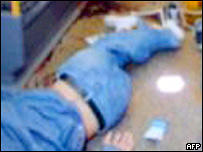


Mark Whitby said: "I was sitting on the train... I heard a load of noise, people saying, 'Get out, get down'.
"I saw an Asian guy. He ran on to the train, he was hotly pursued by three plain clothes officers, one of them was wielding a black handgun.
"He half tripped... they pushed him to the floor and basically unloaded five shots into him," he told BBC News 24.
"As [the suspect] got onto the train I looked at his face, he looked sort of left and right, but he basically looked like a cornered rabbit, a cornered fox.
"He looked absolutely petrified and then he sort of tripped, but they were hotly pursuing him, [they] couldn't have been any more than two or three feet behind him at this time and he half tripped and was half pushed to the floor and the policeman nearest to me had the black automatic pistol in his left hand.
"He held it down to the guy and unloaded five shots into him.
"He [the suspect] had a baseball cap on and quite a sort of thickish coat - it was a coat you'd wear in winter, sort of like a padded jacket.
"He might have had something concealed under there, I don't know. But it looked sort of out of place with the sort of weather we've been having, the sort of hot humid weather.
"He was largely built, he was quite a chubby sort of guy"


It doesn't help that the media takes the stories and prints them without question. On 7/7 I swapped channels to see how the BBC, ITV and Fox News were covering it. Fox was clearly getting its coverage and info via Sky, Murdoch's satellite service in the UK, but adding comment from studio guests and reporters in London via phone. Fox's coverage was awful with the descriptions of the city bearing little relationship to the truth and seeming to come more from a Dickensian depiction of the place than any other. Bloomsbury, the area of town where the bus blew up, was described in overly romantic terms, for example, more because of its historic associations than its present situation.

The thing that marked out the BBC's coverage from that of other stations was that while other agencies were reporting everything - every rumour, every estimated death toll - the BBC only reported official sources. This meant that ITV and Fox were reporting estimated deaths of between 30 and 50 (only guesses because no one had even reached the body-strewn carriages underground at the time), while the BBC reported one confirmed death and several injuries. After the event the BBC was criticised for being the mouthpiece of officialdom but to my mind what it showed was that when news agencies report rumour and gossip as fact, they soon become facts. Take the 'discovery' of WMD in Iraq that recent polls showed a large proportion of US citizens to believe had happened, even though none have been found. But if you remember, there were constant reports during the Iraq war of things being found (that later, but less publicly, turned out to be harmless) and images of reporters and soldiers donning chemical suits.

It's a difficult line to draw for the BBC because on the one hand - as here - being conservative with your reporting means that while you're less sensational than other channels you end up telling the truth in the long run. But on the other, when you make such a thing of reporting official figures you're at the mercy of what those in charge want to release. And there's the conspiracy thing again...

When I was stuck in London on 21 July after the second attempted bombing there was little information, and most people were unconcerned. But I did hear people talking on the streets about what was happening. Most of what I heard was obviously untrue, but they were citing reliable sources such as 'a guy I know' and 'some woman'. This was less than an hour after we'd been kicked off the underground. I rang home and spoke to a friend who was staying with me and she was watching it on TV and although she knew a bit more than I did (that there'd been an incident) she knew nothing more than that. Eventually I used my Palm Treo to access the internet and read the Guardian blog which carries an unedited feed of information that's coming into the paper's news desk. There were a few more 'facts' on there but essentially it seemed the events were less dramatic than 7/7. That didn't stop the stories I could hear from those around me, however. And I knew that it was those stories which would probably be reported as news on TV because the sad fact is that in an age of rolling news, when you have to fill your airtime with nothing but specualtion (laughably prefaced with the words 'It's dangerous to speculate at this time but...') then rumours are all you've got.

(The question that occurs to me, however, is why did I implicitly trust the Guardian's website more than I trusted any other source? One of the paper's mottos is 'Speech is free, but facts are sacred', if that's anything to go by).

Anyway, back to the Fortean Times. It carries an image from a recent Minsitry of Defence exhibition of WW2 paintings. It's 'Premonition' painted in the 1930s by German exile Walter Nessler. It showed, with remarkable foresight, the effects of the blitz on London, years before it happened. (The example above is poor quality - the actual painting is remarkably detailed).
But the reason people are looking at it again is that the painting makes a great play of the city's public transport and two buses are depicted with numbers: 30 is the number of the bus that was blown up and the other '77' is the date of the bombing (the painting even has a blemish between the numerals making it look like 7.7). It makes you think for a minute, but there's a boxout near the painting in the magazine about the numerology of the 7/7 bombings and how the number 7 crops up so frequently (7/7/2005, for example contains three sevens: 2+0+0+5 being the third). But all these permutations, like the accompanying ones for 9/11 are quite ludicrous as they depend on some odd combinations of numbers and mathematical trickery. Like the eyewitnesses to the shooting mentioned above, all they prove is that the human mind likes patterns and rationality, even if the result is something far from rational.

Bookmark and Share

Wednesday, September 14, 2005

Yahoo lands Chinese journalist in prison

From The Guardian, George Monbiot writes:

"In April, Shi Tao, a journalist working for a Chinese newspaper, was sentenced to 10 years in prison for "providing state secrets to foreign entities". He had passed details of a censorship order to the Asia Democracy Forum and the website Democracy News.


The pressure group Reporters Without Borders (RSF) was mystified by the ease with which Mr Tao had been caught. He had sent the message through an anonymous Yahoo! account. But the police had gone straight to his offices and picked him up. How did they know who he was?
Last week RSF obtained a translation of the verdict, and there they found the answer. Mr Tao's account information was "furnished by Yahoo Holdings". Yahoo!, the document says, gave the government his telephone number and the address of his office."

Read the full article

Bookmark and Share

Monday, September 12, 2005

Quark's new identity is old...

I gather I'm not the only one to spot this but in case you hadn't heard, Quark today revealed a new identity which bears a striking resemblance to one already happily being used...

Spot the difference:


The middle bit (the counter if you want to be technical) is slightly different but that's about it.
It's interesting that the stylised letter is a 'Q' in one and an 'A' in another.

Bookmark and Share

Monday, September 05, 2005

Technical difficulties

Along with my podcast feed not appearing to work properly (though that's most likely my fault) it seems that some of my past posts are springing zombie-like from the grave and being seen as 'new' in my newsreader. This is extremely annoying so apologies - I'm looking into what might be causing the problem.

Lots of new posts to upload soon - I've been busy with the book and a conference paper but have a few things saved up, so stay tuned!

Bookmark and Share

Friday, September 02, 2005

CRAP generator

With the new academic year approaching I thought a tool to help generate comments on students' work might be useful.
Introducing the Critical Response to Art Projects auto-comment generator!

You should see the flash file below - a bit small here, but if you download the standalone it'll work full screen. (The 'quit' button only works in the standalone version)


Download Mac standalone
Download PC standalone

Bookmark and Share

Saturday, August 27, 2005

Podcast available

I finally got round to figuring out how to publish a podcast late last night - blimey, it's not as simple as people make out! There are rumours flying around that Apple might create a program that allows you to record and publish podcasts with chapter points, changing images etc and I really hope they do.
I tried so many techniques last night (admittedly late and, er, a little drunk) and the easiest was the one I should've tried earlier but didn't realise existed: feedburner.com (who I use to convert my Atom feed into RSS) provide a facility that detects audio and video files and wraps them in the required enclosure.
Anyway - the upshot of this is that you can now subscribe to my podcast using various bits of software. To subscribe in iTunes (my preferred method now) just drag the 'XML' badge on the right sidebar into your podcast directory. It's pretty much the same for other programs too but the actual URL is: http://feeds.feedburner.com/AWordInYourEar

I'm not sure if I'll get into the podcasting thing (I don't have the voice for it! Plus I'm better at writing than making this stuff up verbally) - the idea is to use it with students and now it seems so easy I'm looking forward to giving it a go.

Podcast

[UPDATE: Well I don't know wht's happening - one minute the podcasts are there in iTunes, the next it says they don't exist. This is more difficult than I thought - am I missing something obvious? I'll try again at the weekend...]

Bookmark and Share

Friday, August 26, 2005

In my opinion

I’ve reviewed a few books in the past few years, all related to education and/or art and design (a term I hate as it implies the two are one and the same). In every case I’ve enjoyed the books I’ve read – even the one I really hated: Class War by Chris Woodhead, a bitter polemic that makes more bizarre claims than you’ll hear from any religious extremist, and making the author a prime candidate for deportation as a proponent of hatred towards educationalists.

But this week my latest review appeared in The Times Higher Educational Supplement (26 August 2005) of Graphic Design School by David Dabner. Reviewing it had been a tricky business for several reasons. Firstly, this is a small world and as I’m currently facing the end of my contract and looking, increasingly desperately, for a new job, I knew that if I didn’t like what I read and told the truth I might find a few doors closing. Dabner works at a university where I have links, largely through my work teaching on their postgraduate certificate in education – a qualification all lecturers are having to gain (quite rightly) but which many deem beneath them though not, I hasten to add, Dabner, so far as I know. If worst came to worst and I couldn’t find a full-time teaching post I knew it was a fairly safe-ish bet that I could get some part-time teaching hours at this place to tide me over (although to be honest it would still not be enough to pay the rent).

So the pressure was on because the likelihood of getting a job, or more likely keeping it, if I wrote a bad review would be remote. Academics, I know from bitter personal experience, don’t like each other but they don’t like people who criticise their colleagues even more. And it isn’t just that particular institution I’m talking about – the fact is that everyone knows everybody else and I could be criticising the Devil himslef but if someone once worked with him (something I don't doubt in some cases) I’d find myself sent to Coventry (except even there I bet I’d be ignored. If you’re already in Coventry, where do they send you?)

The second difficulty arises from the fact that I have a book coming out myself in November. In fact I’ve got two coming out – a book on branding I’ve provided some sections for, and one on Visual Communication I’ve co-written with a well-respected designer. At the time of doing the review I’d just submitted the final manuscript to the publisher and, although relieved, I have to say I was going through the ‘oh my God it’s crap’ phase. I used to think it was just me, that I can never like what I’ve done until a year or so down the line, but I think most people suffer from this. At school I would never let people see my work, and as a designer I would hold off until the deadline (or after) before saying ‘here, what do you think?’
So I was thinking to myself ‘what goes around comes around’ and that if I submitted a negative review I’d find myself being reviewed by someone who felt I was going to get what I deserved.

The third reason, and the biggest, was simply politeness. Somebody has written a book and had it published. That in itself is an achievement, something I can relate to. Just flicking through the pages I was overcome by respect for the mind-boggling complexity of chapters, headings, box-outs, picture captions and footnotes. Would a negative review send the guy into a depression? I know that’s what will happen to me if I stumble upon less than positive feedback of my efforts.

There’s a common phrase in education of the ‘shit sandwich’, a model for providing students with feedback. Start off with the praise, then give them the criticisms, then no matter what the grade they got, end with more praise even if it’s just ‘well-formatted’ or ‘some interesting points of view’. It’s quite a good model actually, less formulaic and more constructive than it sounds and so, I thought, maybe I should use it here.

I have a bit of a process when I write reviews: I skim through the book first to get the general gist and write an immediate response to what I think the arguments are. If you read a lot of book reviews you’ll notice that many talk more about the subject than the actual book, and this is my preparation for that bit. Book reviewing is less about the book than placing it in a context and commenting on its contribution or failings in that context.
Then I read the book more closely and make a mental note of sections that stand out, for good or bad.
Finally I put it away for a bit. I might ‘free write’ my immediate thoughts but either way, I put it away for some time partly out of procrastination and partly because I want my thoughts to mellow. Something that makes you angry one minute might later, after much thought, turn out to be a good point that you simply weren’t willing to accept. I see a lot of this in student essays, incidentally. There’ll always be a body of students who think an idea you introduced them to is stupid and misses the point. In fact this sometimes comes out in the end of year feedback they provide on the course – among the positive comments there’ll be a few that are quite scathing about something and although it’s easy to get upset about them I know from experience that it’s often those students who, when it comes to their third year dissertation, will come up with the goods because they’ve engaged with the arguments and mellowed over time. Well, not always. Sometimes they just don’t like me.

So after the cogitation comes the writing process and again there’s a formula: general comment about the subject, how the book fits in to it, specific points and maybe a quotation or two, show off about your own knowledge, find something to praise or criticise (whichever provides a balance to what’s gone before) and then mention who you’d recommend it to (if at all). ‘Job’s a good ‘un’, as we say in Yorkshire.
Then if time allows leave it again and come back to it. Often I rewrite large sections, move bits around and generally mollify my language.

In the case of this book it needed a lot of mollification. It wasn’t the author’s fault – the problem with this book was that it reflected what I see as a bad state of affairs in graphic design education: the focus on the visual and the idea that all you need to do to be a graphic designer is learn how to use InDesign or QuarkXpress, Dreamweaver and Flash, and learn how to use a digital camera. The book is so broad in its coverage that it says not very much about lots of stuff. In that, it’s a perfect textbook for so many graphic design courses but that doesn’t excuse it. Remember, when someone is asked to review a book they are asked because of their assumed knowledge of the subject or their known views. Newspapers want a review that engages with the book and asks questions of it, that spark a debate. The idea isn’t that the reviewer knows more about the subject than the reviewee, or that their word is sacrosanct. In this case I was asked, I presume, because I’m known to the paper as someone with strong views on graphic design education and as a member of the UK’s higher education academy subject centre for art, design and media. Given that, I told myself, it’s appropriate to say what you think.

There were three main criticisms of the book: its scope, its contradictions and its mistakes.
Scope I’ve already mentioned but to elaborate: animation is not, I believe, graphic design. Nor is photography. There are so many ‘best bits’ of other subjects that graphic design has pilfered in recent years that we no longer seem to know what graphic design itself is. At my last college there were three year degrees in photography, packaging and animation and yet the course I inherited seemed to think you could do each of those in five weeks. If the other courses had run five week modules in graphic design there’d have been uproar.
I don’t deny having a knowledge of those areas helps, as designers often work with or commission photographers, animators and packaging experts. But to suggest that you can be as good as them in, as in this case, two double page spreads, made me a little cross.

As for contradictions, one stood out in particular. On one page about ideas generation (and I take my hat off to the author for claiming, as I do, that creativity can be generated rather than being inate in just a few people) the book warns students to ‘avoid clichés’. I’ve said it before and I’ll say it again: why are clichés seen as bad? It’s another word for ‘easily understood sign’. The ultimate irony here is that just above this particular instruction is a rough for an advertising campaign for the London Underground. It’s a picture of the open doors of a tube train and the words (I’m paraphrasing here) ‘Opening doors to London’ or something. Whatever, it actually works quite well and is exactly the sort of thing you see. It’s a student effort, as so many of the examples in the book are and it’s rather good. But it’s a cliché. Is it there to illustrate the point that you should avoid clichés or is it a contradiction? Either way, in telling students to ‘avoid clichés’ in precisely the easy way that so many lecturers do without providing reasons or examples, he misses the point that humans communicate through clichés.

As for mistakes, there are several. In the section on advertising the text says something along the lines of ‘few people get to work in an agency without an art school background’. Right. Well ignoring the accountants and marketing people, the copywriters and project managers, oh and the ‘creatives’ who tend to come from politics, English, history and psychology degrees (to name a few) you’re left with the art school people. So yes, I suppose if you ignore 90% of the non-art school backgrounds the assertion is true.

What really got my goat though was the section on colours and what they mean. Green apparently means nature and youth. Doesn’t it also mean sickness and envy? Or ‘go’? Or ‘nothing to declare’? The answer, of course, is that it means nothing unless it has a context. Basically the author ignores and even contradicts basic visual theory – something a lot of studio tutors do. The peach is the claim that green causes less eye strain than other colours which is why we find the countryside so relaxing! Oh stop, my sides are splitting! Nothing to do with fresh air, exercise, silence, sun at all, then. And if green is so relaxing how come the first company I worked in spent a small fortune getting filters for the green monitors all the secretaries were using at the time?

Oh dear oh dear. You see, it’s things like that that clinched it for me. If a student had written these things in an essay it would have taken a great deal to pass them, so as I said in the review, for a book the publishers are selling as an essential textbook it is unforgivable.

So that’s the shit in the sandwich – what about the praise? Well my knowledge of how publishers and editors work means I was quite charitable in my review as I know from my own experience that when you’re writing a book you end up putting down complete and utter rubbish. It’s fatigue more than anything else. In my book for example I got the basics of semiotics completely wrong at one point and inadvertently misrepresented the ideas of some well-known authors. Not because I’m crap, but because we all make mistakes. It’s the editor’s job to spot these but it doesn’t always happen if you’ve got an editor who is either not knowledgeable about the topic or, as is usually the case, also working on umpteen other books at the same time. But I suspect that a lot of the problems in the book are to do with bad editing than anything else. Sadly this point was left out of the published review.

Another good point is that, despite the silly errors, the author knows his stuff and writes well. It is actually an interesting book to dip into. After writing the review I gave my copy to a student I bumped into and she told me she found it useful for a specific problem – but the implication there is that apart from the one section she found useful the rest of it was not. A symptom of the breadth of the book certainly, but evidence that the author and publisher would have been better off producing either a series of books on different aspects of graphic design, or getting rid of the other subjects and expanding the core elements.

So as I said, the review was published today. It’s odd seeing your work in the finished format – it stops being your own and you can be objective when you read it, unlike when you look at the original Word document. The same thing happened this week when I received the proofs of my book and I read it almost as though someone else had written it (and I’m a lot happier with it than I was). The review is rather negative and although I stand by my criticisms I can’t help wishing some of my positive points, no matter how trivial, had made it through the editing stage (my own and the publication’s). I know if I received a similar review of my own work I’d be angry and depressed and for that I’m very sorry. Ultimately though I was asked for my opinion and I gave it. I have no doubt that others would offer a different opinion and, although I ended the review by saying I couldn’t recommend it, I’d say here that if for no other reason than seeing if you agree with me, you should get your hands on a copy. There are certainly bits that could be useful – the section on mood boards for example is actually one I might photocopy and give out to students who’ve never been shown one. But as a whole it’s a let down – not because it’s bad (it isn’t) or because it contains basic errors (which it does) but because at the end of the day graphic design doesn’t know what it is, only that it wants to be the best bits of everything else.

Graphic Design School: The Principles and Practices of Graphic Design
By David Dabner
Thames & Hudson, 192pp, £14.95
ISBN 0 500 28526 8


Buy from Amazon.com (USA)

Podcast of this post

Bookmark and Share

Monday, August 01, 2005

Book review problems: to be polite or honest, that is the question...

Here's a sticky problem. I've been asked to review a book on graphic design for the 'Times Higher Educational Supplement'.

The book isn't very good - it fails to put design in any sort of context and makes some fundamental errors when it discusses things like colour theory.
I've just finished writing the review and it is pretty stinging; I'm going to sit on it for a couple of days before I send it off in the hope I can tone it down a bit.

So here's the dilemma: it isn't a book I would recommend (mind you, it's better than many out there) and it deserves to have its faults highlighted (god knows the same's going to happen to me in a few months' time!)
But the author works at a college I may want to work at soon, (indeed I do have strong links with the place already) and the publishers are ones I might want to approach myself in the near future. How do I give an honest review without shooting myself in the foot and (more conscious-prickingly) without causing major offence to a colleague?

It's such a small world...

I wonder if I can ask for the review to be anonymous? I might ring the editor later...

Bookmark and Share

Visit my 'official' site

www.jonathanbaldwin.co.uk
contains links to my articles and books.

Tags

Books by Jonathan Baldwin

Visual Communication: From Theory to Practice (Winner of 'Best Higher Education Title' at the British Book Awards 2006) by Jonathan Baldwin and Lucienne Roberts Buy from Amazon.com Buy from Amazon.co.uk

More Than A Name: An introduction to branding by Melissa Davis and Jonathan Baldwin Buy from Amazon.com Buy from Amazon.co.uk

Followers