A blog about design, education and anything else that takes my fancy

Saturday, August 27, 2005

Podcast available

I finally got round to figuring out how to publish a podcast late last night - blimey, it's not as simple as people make out! There are rumours flying around that Apple might create a program that allows you to record and publish podcasts with chapter points, changing images etc and I really hope they do.
I tried so many techniques last night (admittedly late and, er, a little drunk) and the easiest was the one I should've tried earlier but didn't realise existed: feedburner.com (who I use to convert my Atom feed into RSS) provide a facility that detects audio and video files and wraps them in the required enclosure.
Anyway - the upshot of this is that you can now subscribe to my podcast using various bits of software. To subscribe in iTunes (my preferred method now) just drag the 'XML' badge on the right sidebar into your podcast directory. It's pretty much the same for other programs too but the actual URL is: http://feeds.feedburner.com/AWordInYourEar

I'm not sure if I'll get into the podcasting thing (I don't have the voice for it! Plus I'm better at writing than making this stuff up verbally) - the idea is to use it with students and now it seems so easy I'm looking forward to giving it a go.

Podcast

[UPDATE: Well I don't know wht's happening - one minute the podcasts are there in iTunes, the next it says they don't exist. This is more difficult than I thought - am I missing something obvious? I'll try again at the weekend...]

Bookmark and Share

Friday, August 26, 2005

In my opinion

I’ve reviewed a few books in the past few years, all related to education and/or art and design (a term I hate as it implies the two are one and the same). In every case I’ve enjoyed the books I’ve read – even the one I really hated: Class War by Chris Woodhead, a bitter polemic that makes more bizarre claims than you’ll hear from any religious extremist, and making the author a prime candidate for deportation as a proponent of hatred towards educationalists.

But this week my latest review appeared in The Times Higher Educational Supplement (26 August 2005) of Graphic Design School by David Dabner. Reviewing it had been a tricky business for several reasons. Firstly, this is a small world and as I’m currently facing the end of my contract and looking, increasingly desperately, for a new job, I knew that if I didn’t like what I read and told the truth I might find a few doors closing. Dabner works at a university where I have links, largely through my work teaching on their postgraduate certificate in education – a qualification all lecturers are having to gain (quite rightly) but which many deem beneath them though not, I hasten to add, Dabner, so far as I know. If worst came to worst and I couldn’t find a full-time teaching post I knew it was a fairly safe-ish bet that I could get some part-time teaching hours at this place to tide me over (although to be honest it would still not be enough to pay the rent).

So the pressure was on because the likelihood of getting a job, or more likely keeping it, if I wrote a bad review would be remote. Academics, I know from bitter personal experience, don’t like each other but they don’t like people who criticise their colleagues even more. And it isn’t just that particular institution I’m talking about – the fact is that everyone knows everybody else and I could be criticising the Devil himslef but if someone once worked with him (something I don't doubt in some cases) I’d find myself sent to Coventry (except even there I bet I’d be ignored. If you’re already in Coventry, where do they send you?)

The second difficulty arises from the fact that I have a book coming out myself in November. In fact I’ve got two coming out – a book on branding I’ve provided some sections for, and one on Visual Communication I’ve co-written with a well-respected designer. At the time of doing the review I’d just submitted the final manuscript to the publisher and, although relieved, I have to say I was going through the ‘oh my God it’s crap’ phase. I used to think it was just me, that I can never like what I’ve done until a year or so down the line, but I think most people suffer from this. At school I would never let people see my work, and as a designer I would hold off until the deadline (or after) before saying ‘here, what do you think?’
So I was thinking to myself ‘what goes around comes around’ and that if I submitted a negative review I’d find myself being reviewed by someone who felt I was going to get what I deserved.

The third reason, and the biggest, was simply politeness. Somebody has written a book and had it published. That in itself is an achievement, something I can relate to. Just flicking through the pages I was overcome by respect for the mind-boggling complexity of chapters, headings, box-outs, picture captions and footnotes. Would a negative review send the guy into a depression? I know that’s what will happen to me if I stumble upon less than positive feedback of my efforts.

There’s a common phrase in education of the ‘shit sandwich’, a model for providing students with feedback. Start off with the praise, then give them the criticisms, then no matter what the grade they got, end with more praise even if it’s just ‘well-formatted’ or ‘some interesting points of view’. It’s quite a good model actually, less formulaic and more constructive than it sounds and so, I thought, maybe I should use it here.

I have a bit of a process when I write reviews: I skim through the book first to get the general gist and write an immediate response to what I think the arguments are. If you read a lot of book reviews you’ll notice that many talk more about the subject than the actual book, and this is my preparation for that bit. Book reviewing is less about the book than placing it in a context and commenting on its contribution or failings in that context.
Then I read the book more closely and make a mental note of sections that stand out, for good or bad.
Finally I put it away for a bit. I might ‘free write’ my immediate thoughts but either way, I put it away for some time partly out of procrastination and partly because I want my thoughts to mellow. Something that makes you angry one minute might later, after much thought, turn out to be a good point that you simply weren’t willing to accept. I see a lot of this in student essays, incidentally. There’ll always be a body of students who think an idea you introduced them to is stupid and misses the point. In fact this sometimes comes out in the end of year feedback they provide on the course – among the positive comments there’ll be a few that are quite scathing about something and although it’s easy to get upset about them I know from experience that it’s often those students who, when it comes to their third year dissertation, will come up with the goods because they’ve engaged with the arguments and mellowed over time. Well, not always. Sometimes they just don’t like me.

So after the cogitation comes the writing process and again there’s a formula: general comment about the subject, how the book fits in to it, specific points and maybe a quotation or two, show off about your own knowledge, find something to praise or criticise (whichever provides a balance to what’s gone before) and then mention who you’d recommend it to (if at all). ‘Job’s a good ‘un’, as we say in Yorkshire.
Then if time allows leave it again and come back to it. Often I rewrite large sections, move bits around and generally mollify my language.

In the case of this book it needed a lot of mollification. It wasn’t the author’s fault – the problem with this book was that it reflected what I see as a bad state of affairs in graphic design education: the focus on the visual and the idea that all you need to do to be a graphic designer is learn how to use InDesign or QuarkXpress, Dreamweaver and Flash, and learn how to use a digital camera. The book is so broad in its coverage that it says not very much about lots of stuff. In that, it’s a perfect textbook for so many graphic design courses but that doesn’t excuse it. Remember, when someone is asked to review a book they are asked because of their assumed knowledge of the subject or their known views. Newspapers want a review that engages with the book and asks questions of it, that spark a debate. The idea isn’t that the reviewer knows more about the subject than the reviewee, or that their word is sacrosanct. In this case I was asked, I presume, because I’m known to the paper as someone with strong views on graphic design education and as a member of the UK’s higher education academy subject centre for art, design and media. Given that, I told myself, it’s appropriate to say what you think.

There were three main criticisms of the book: its scope, its contradictions and its mistakes.
Scope I’ve already mentioned but to elaborate: animation is not, I believe, graphic design. Nor is photography. There are so many ‘best bits’ of other subjects that graphic design has pilfered in recent years that we no longer seem to know what graphic design itself is. At my last college there were three year degrees in photography, packaging and animation and yet the course I inherited seemed to think you could do each of those in five weeks. If the other courses had run five week modules in graphic design there’d have been uproar.
I don’t deny having a knowledge of those areas helps, as designers often work with or commission photographers, animators and packaging experts. But to suggest that you can be as good as them in, as in this case, two double page spreads, made me a little cross.

As for contradictions, one stood out in particular. On one page about ideas generation (and I take my hat off to the author for claiming, as I do, that creativity can be generated rather than being inate in just a few people) the book warns students to ‘avoid clichés’. I’ve said it before and I’ll say it again: why are clichés seen as bad? It’s another word for ‘easily understood sign’. The ultimate irony here is that just above this particular instruction is a rough for an advertising campaign for the London Underground. It’s a picture of the open doors of a tube train and the words (I’m paraphrasing here) ‘Opening doors to London’ or something. Whatever, it actually works quite well and is exactly the sort of thing you see. It’s a student effort, as so many of the examples in the book are and it’s rather good. But it’s a cliché. Is it there to illustrate the point that you should avoid clichés or is it a contradiction? Either way, in telling students to ‘avoid clichés’ in precisely the easy way that so many lecturers do without providing reasons or examples, he misses the point that humans communicate through clichés.

As for mistakes, there are several. In the section on advertising the text says something along the lines of ‘few people get to work in an agency without an art school background’. Right. Well ignoring the accountants and marketing people, the copywriters and project managers, oh and the ‘creatives’ who tend to come from politics, English, history and psychology degrees (to name a few) you’re left with the art school people. So yes, I suppose if you ignore 90% of the non-art school backgrounds the assertion is true.

What really got my goat though was the section on colours and what they mean. Green apparently means nature and youth. Doesn’t it also mean sickness and envy? Or ‘go’? Or ‘nothing to declare’? The answer, of course, is that it means nothing unless it has a context. Basically the author ignores and even contradicts basic visual theory – something a lot of studio tutors do. The peach is the claim that green causes less eye strain than other colours which is why we find the countryside so relaxing! Oh stop, my sides are splitting! Nothing to do with fresh air, exercise, silence, sun at all, then. And if green is so relaxing how come the first company I worked in spent a small fortune getting filters for the green monitors all the secretaries were using at the time?

Oh dear oh dear. You see, it’s things like that that clinched it for me. If a student had written these things in an essay it would have taken a great deal to pass them, so as I said in the review, for a book the publishers are selling as an essential textbook it is unforgivable.

So that’s the shit in the sandwich – what about the praise? Well my knowledge of how publishers and editors work means I was quite charitable in my review as I know from my own experience that when you’re writing a book you end up putting down complete and utter rubbish. It’s fatigue more than anything else. In my book for example I got the basics of semiotics completely wrong at one point and inadvertently misrepresented the ideas of some well-known authors. Not because I’m crap, but because we all make mistakes. It’s the editor’s job to spot these but it doesn’t always happen if you’ve got an editor who is either not knowledgeable about the topic or, as is usually the case, also working on umpteen other books at the same time. But I suspect that a lot of the problems in the book are to do with bad editing than anything else. Sadly this point was left out of the published review.

Another good point is that, despite the silly errors, the author knows his stuff and writes well. It is actually an interesting book to dip into. After writing the review I gave my copy to a student I bumped into and she told me she found it useful for a specific problem – but the implication there is that apart from the one section she found useful the rest of it was not. A symptom of the breadth of the book certainly, but evidence that the author and publisher would have been better off producing either a series of books on different aspects of graphic design, or getting rid of the other subjects and expanding the core elements.

So as I said, the review was published today. It’s odd seeing your work in the finished format – it stops being your own and you can be objective when you read it, unlike when you look at the original Word document. The same thing happened this week when I received the proofs of my book and I read it almost as though someone else had written it (and I’m a lot happier with it than I was). The review is rather negative and although I stand by my criticisms I can’t help wishing some of my positive points, no matter how trivial, had made it through the editing stage (my own and the publication’s). I know if I received a similar review of my own work I’d be angry and depressed and for that I’m very sorry. Ultimately though I was asked for my opinion and I gave it. I have no doubt that others would offer a different opinion and, although I ended the review by saying I couldn’t recommend it, I’d say here that if for no other reason than seeing if you agree with me, you should get your hands on a copy. There are certainly bits that could be useful – the section on mood boards for example is actually one I might photocopy and give out to students who’ve never been shown one. But as a whole it’s a let down – not because it’s bad (it isn’t) or because it contains basic errors (which it does) but because at the end of the day graphic design doesn’t know what it is, only that it wants to be the best bits of everything else.

Graphic Design School: The Principles and Practices of Graphic Design
By David Dabner
Thames & Hudson, 192pp, £14.95
ISBN 0 500 28526 8


Buy from Amazon.com (USA)

Podcast of this post

Bookmark and Share

Monday, August 01, 2005

Book review problems: to be polite or honest, that is the question...

Here's a sticky problem. I've been asked to review a book on graphic design for the 'Times Higher Educational Supplement'.

The book isn't very good - it fails to put design in any sort of context and makes some fundamental errors when it discusses things like colour theory.
I've just finished writing the review and it is pretty stinging; I'm going to sit on it for a couple of days before I send it off in the hope I can tone it down a bit.

So here's the dilemma: it isn't a book I would recommend (mind you, it's better than many out there) and it deserves to have its faults highlighted (god knows the same's going to happen to me in a few months' time!)
But the author works at a college I may want to work at soon, (indeed I do have strong links with the place already) and the publishers are ones I might want to approach myself in the near future. How do I give an honest review without shooting myself in the foot and (more conscious-prickingly) without causing major offence to a colleague?

It's such a small world...

I wonder if I can ask for the review to be anonymous? I might ring the editor later...

Bookmark and Share

Saturday, July 30, 2005

Cutting edge

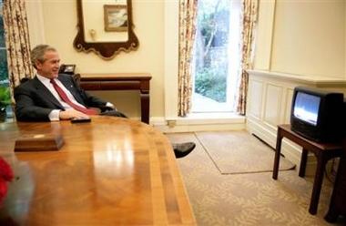
This is how the (unelected) leader of the free world watched the launch of the space shuttle last week:


Is it just me or do you find it slightly unnerving that a guy this powerful makes do with such a crappy TV? Now the whole choking-on-pretzel-while-watching-TV thing starts to make sense. You really shouldn't swallow while on all fours squinting at a screen that small.

Bookmark and Share

Job applications

I hate writing job applications - in fact, I've sometimes failed to apply for jobs simply because I hate the whole form-filling, personal-statement-making process.

There's a fine line to be made between showing off and being too humble. In the case of applications for academic posts, it's like making blind bids on eBay. You have to beat your competitor but you don't want to bet too much too fast, or you risk threatening the people making the selection (you really don't want to claim you're the world's expert on XYZ when everyone knows that the person with the job of choosing the successful applicant is firmly of the opinion that she is).

There's a need to make out that you're a star, an expert in your field and a possible attractor of prestige and cash. Yet there's a contradiction in all this: just about every academic post's job description fouses on teaching ability; yet I can guarantee that, from experience, this has nothing whatsoever to do with the actual selection, particularly now that every university in the UK is gearing up for the Research Assesment Exercise. This, for those who don't know, is a long drawn-out process in which universities are rated by the amount and quality of research they do. The score a university receives translates in to funding for the next half decade. Consequently appointments tend to be based on the probable contribution you will make to the RAE results. Thus a researcher who publishes 10 papers in journals that are highly respected but largely unread, but who can't teach for toffee because he hates looking people in the eyes and has zero social skills will be preferred over someone who can make a subject fascinating to passers-by but is so busy teaching the damn subject that they never get round to writing for a journal.

NATFHE, the teaching union I'm a member of, has just published some research that looks at the increasing (but long-practiced) tendency for universities to give all their full-time posts to researchers and give the teaching to part-time, hourly paid lecturers whose contracts are termly and thus have to decide whether to hang on for a telephone call the day before a course starts or accept a full-time job in a call centre. It's not a great way to develop future minds, really, is it? What's the point in publishing loads of research if there aren't going to be any people to read it in a few years because they've all been so badly taught by overstrecthed, undervalued and constantly changing teachers that they leave university as soon as they can and get jobs dishing out French fries?

So the application process is about ticking all the boxes on the job description about 'ability to plan curricula', 'respect for student contributions to their own and each others' learning', 'knowledge of national academic standards' etc while the interview is about making out that given the chance you're the next Albert Einstein of your subject area. Personally I think I'm more like the Jonny Ball of mine (you need to be British and of a certain age to get that reference, so apologies) thus am unlikely to succeed at any of these applications.

Still, birthday number 35 is rapidly looming and I need a full-time job if I'm to retire before the age of 80...

(Here's another thing - can no one in personnel departments use Microsoft Word? I seem to spend all my time correcting formatting errors and overcoming bizarre tabbing and tables instead of actually typing anything. One form I filled in the other week converted everything I typed into 14pt bold italic green helvetica!)

Bookmark and Share

Tuesday, July 26, 2005

Mr Potato Head Joins the Dark Side

No this is not a joke. Introducing the 'Spud Trooper', in shops from September...

Bookmark and Share

Saturday, July 23, 2005

This is what I mean by 'good' design

Now this is what I call good design - a simple idea, simply implemented, that is going to have significant effects.
The only question is: why did no one think of it before?


Labels improve patient drug use

A GP has designed a way to help patients understand why they are taking particular medications.
Dr Nigel Masters, from Hazlemere, Buckinghamshire, adds phrases such as "to lower cholesterol" to prescriptions.

He said it helps patients, particularly those on a number of drugs, understand why they should keep taking them.

Developing Patient Partnerships said the idea would help people be more involved in looking after their health.

Dr Marshall had the idea for labelling drugs with the reasons they were being given around three years ago when he was writing out repeat prescriptions for elderly people and having to double-check what some of them were for.

"I thought 'if I can't remember, how can the patient?'"

"Patients were taking these medications on trust, and compliance can be an issue.

"But people need to know why they are taking something."

Dr Marshall began by putting information on repeat prescriptions for the elderly.

He then added explanations to prescriptions for people with diabetes and asthma, before deciding to expand the idea to all those who needed repeat prescriptions.

Dr Masters has compiled a list of almost 600 drugs and reasons for taking them.

For example, a prescription for the drug amlodipine carries the label "to lower blood pressure". Diclofenac gel can be given "for arthritis pain".

Where conditions may be more sensitive, the wording is less direct.

The cancer drug tamoxifen carries the explanation "to prevent recurrence of disease" while sildenafil, better known as Viagra, is labelled "to prevent ED" - erectile dysfunction.

Prescriptions also carry health check reminders. So a prescription for the contraceptive pill will say "check blood pressure yearly", reminding the doctor, patient and pharmacist of the need for regular tests.

Dr Marshall said patient confidentiality was an issue.

He said patients could choose not to have the explanations on their prescriptions.

But he added: "Very few have done so. And this idea has been well received by staff here and at the pharmacy."

Dr Marshall, whose five-doctor practice has 5,800 patients, said: "Virtually every repeat prescription in the practice now has this labelling."

He said that for the scheme to be more widely used, the system needed to be computerised so more practices could make use of it.

"It needs to be an automated and standardised system."

His idea has already won an enterprise award voted for by GPs.

Dr David Wrigley, a GP from Lancashire and deputy chairman of the Developing Patient Partnerships, said: "This simple approach offers patients the opportunity to be more involved with their health and to take more control over managing their medicines as well as improving safety.

"There may issues around confidentiality but the control this gives to people could far outweigh these concerns."


Story from BBC NEWS:
http://news.bbc.co.uk/go/pr/fr/-/1/hi/health/4708587.stm

Published: 2005/07/22 23:40:50 GMT

© BBC MMV

Bookmark and Share

Thursday, July 21, 2005

The Thick Of It: So much for 'terror'

I was in London today for a meeting (about which more later).
I'd gone to London earlier in the week for the Proms, the first time since the bombs in 7 July. I was thinking today, as I was heading for the station, how my overwhelming feeling on that earlier journey was the degree of suspicion with which I found myself looking at anyone vaguely 'muslim'. I was appalled at myself. If the intention of the bombers was to turn even the most (I would hope) tolerant, liberal and anti-imperialist westerners into paranoid xenophobes, they succeeded.

The meeting ended at around 1pm and I made my way from just opposite BBC Broadcasting House to Oxford Circus, about five minutes' walk away. I got into the station, navigated round the groups of tourists asking for directions, and set off down the escalator for the Victoria line. Automated announcements were explaining the disruption to Circle Line services with the words 'due to the incident on 7 July...' Why the coyness, I wondered? 'Incident'? As though saying 'bombs' or 'explosions' would puncture the odd self-imposed obliviousness I think most of us were enjoying.

At the bottom of the escalator, the tunnel splits into three, with the middle route being the one I wanted. Something looked a bit odd and I realised it was completely empty. In fact, there weren't many people around at all. Then I saw a woman in London Underground uniform standing in front of a barrier, waving us away saying the line was closed and we had to use the Central line instead. A new announcement was saying 'due to a passenger incident' which is a euphamism either for someone throwing themselves in front of a train.
So back and down the right hand tunnel to get to the next station with a Victoria Line connection.
I'd just stepped on the down escalator (Oxford Circus is a long way underground) when the alams started ringing and yet another automated announcement came on asking us to evacuate the station immediately. The response? None - most people appeared to ignore it, partly because once you're on the escalator there's nothing much you can do. I suppose we could have stopped it and walked up, but either it didn't occur to anyone or we decided it would cause more problems than it was worth.

The journey from the escalator to the platform is remarkably long at that point, and rather winding. The announcement mentioned finding the nearest exit and I was scanning the walls for clues. But there were no exits before we hit the platform and there my suspicions about Londoners were confirmed. Some of us spotted the exit signs and walked calmly towards them, alarms ringing in our ears. But others just stood on the edge of the platform and waited for the next train. It wasn't that they were foreign and couldn't understand the announcement; these people were British and simply didn't want to give up a rare good spot on the platform.

Amusingly (well, to me at least) I found myself going into 'tutor mode' - my usual response to a fire alarm is to ensure I'm the last person to leave the room and be the one that closes the door behind everyone. I actually had to resist the urge to do the same here, shepherding the lingerers towards the exit. My better judgement got me and rather than risk a withering look or even a 'fuck off' I abandoned them to their fate and walked right round again and joined the growing crowd heading for above ground.

It was all very, very calm. There's no terror to this terrorism, Londoners don't respond to explosions, rumours of explosions or even people jumping in front of trains by collapsing in fear and fits of trembling. They wander over to a map of the underground and try to figure out an alternative route.

One moment of surrealism came when we passed a member of the underground staff who was blocking off one of the tunnels and telling us to 'catch a bus'. This, of course, was what a lot of people did at King's Cross two weeks ago, ending up on the number 30 with one of the bombers.

Reaching Oxford Street I was hit by the sounds of sirens, with ambulances, police cars and the like zooming in all directions. I rang my friend who's staying with me at the moment and asked if she knew what was going on. Apparently it had just come on TV that there'd been reports of small explosions and smoke at Oval station.
I suddenly realised that I didn't know how to get to Victoria without using the tube. I could have caught a bus but I wasn't on the right route and, anyway, it seemed everyone else was having the same idea. So I wandered down Regent Street until I could find a bus stop with the magic word 'Victoria'. Using my Palm Treo I connected to the web and found the Guardian's news blog which was posting unfiltered reports from journalists as information was coming in. Meantime, overheard snippets of conversation from people ranged from hoaxes to chemical attack (mental note: always wear clean underwear when visiting London).

Half the people were checking their phones, the other half was either oblivious to what was going on or just didn't care and carried on shopping and site seeing. I eventually got a number 19 bus to Hyde Park Corner then walked through the park towards Buckingham Palace. Remarkably there was a garden party in progress and I found myself surrounded by hundreds of people in various types of posh dress, from sailors to 'ordinary people' who (excuse the snobbery) couldn't hide their humble origins with the 'mutton-as-lamb' choices they'd made. Mind you, even the more obviously well-to-do types looked bizarre.
It took me about four hours to get home, compared with the usual 90 minutes. The heat was unbearable, and I was tired, thirsty and knackered. But safe.

Final analysis? Well, like I said, London's an odd target. After the last bombs people harked back to the blitz and the IRA bombs in the 80s and early 90s. There's none of the panic or stand-and-stare reaction we saw with 9/11 (mind you, what happened there was somewhat different), just a calm indignation and underplayed annoyance. We're not terrorised, we're annoyed. It's like someone mildly unpleasant gatecrashing your party - you put up with it and simmer inwardly. We're not emptionally repressed, as some people (the Spanish in particular) accused a couple of weeks ago. You only had to watch the Victory Cleebrations in the mall a couple of days after the first bombs to see that, or the remarkable two minutes silence a week later.

Something remarkable was the increased amount of eye contact between people. If you've never been on the tube you may not be aware that golden rule number one is don't look at anyone. But today, while waiting at the bus stop (for a bus that never came) a lorry passed by and pulled up at traffic lights. Its brakes were obviously dodgy because there was an almighty BANG! and yoiu could see from the faces of everyone around that for a brief second we thought 'this is it'. A full minute or so later I looked at the man next to me and raised an eyebrow. He visibly relaxed and smiled back at me - then the moment was over and I returned to my middle-distance stare. When I did get on the bus the driver was chatty, the other passengers polite... yes this is changing London but not for the worse. I'm still ashamed of myself for being suspicious, and viewing every large bag as something to put somebody between it and me. But apart from that, I'm not sure what the bombs are achieving except a backlash on peaceful people and a stengthening of support for the government.

Me, I'm just waiting for Bush to declare he's going to invade Leeds.

I've got some video footage of the evacuation and a couple of stills of somepolice action that I may post tomorrow if I figure out how.

Bookmark and Share

Visit my 'official' site

www.jonathanbaldwin.co.uk
contains links to my articles and books.

Tags

Books by Jonathan Baldwin

Visual Communication: From Theory to Practice (Winner of 'Best Higher Education Title' at the British Book Awards 2006) by Jonathan Baldwin and Lucienne Roberts Buy from Amazon.com Buy from Amazon.co.uk

More Than A Name: An introduction to branding by Melissa Davis and Jonathan Baldwin Buy from Amazon.com Buy from Amazon.co.uk

Followers